

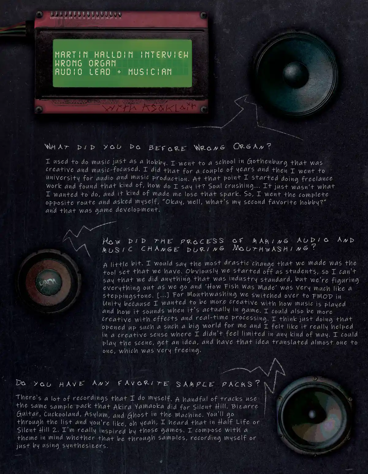
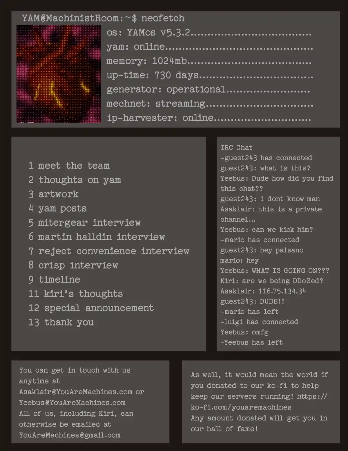
Highlights & Bio


Hi, I'm James! I'm a versatile digital designer, advanced photoshop user
and professional googler.
I graduated from Vancouver Film School with a degree in Digital Design and accolades including
'Best Motion Design' and and 'Best Supporting Student'.
I love designing anything dark, textured, and gritty but still enjoy exploring different styles and techniques, especially in collaborative & technical projects, and projects where I can be a creative and/or art director.
I love designing anything dark, textured, and gritty but still enjoy exploring different styles and techniques, especially in collaborative & technical projects, and projects where I can be a creative and/or art director.


↓
Key Projects
Motion-Focused Projects
Natural Wired
(Grad Project)
Chaos Surge (Music Video) (CW - SFX Gore)
Monster Walk Cycle
Mechanical Heart
('YAM' Logo)
Pine & Co. Collateral (Branding)
Personal Icon
Motion Title Sequence
'Sanctuary' Geodesic Dome Infograhphic
'Perfect Enough' (Title Card)
Kinetic Type
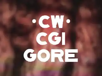
3D Intestines (CW - CGI Gore)
Static-Graphic-Focused Projects
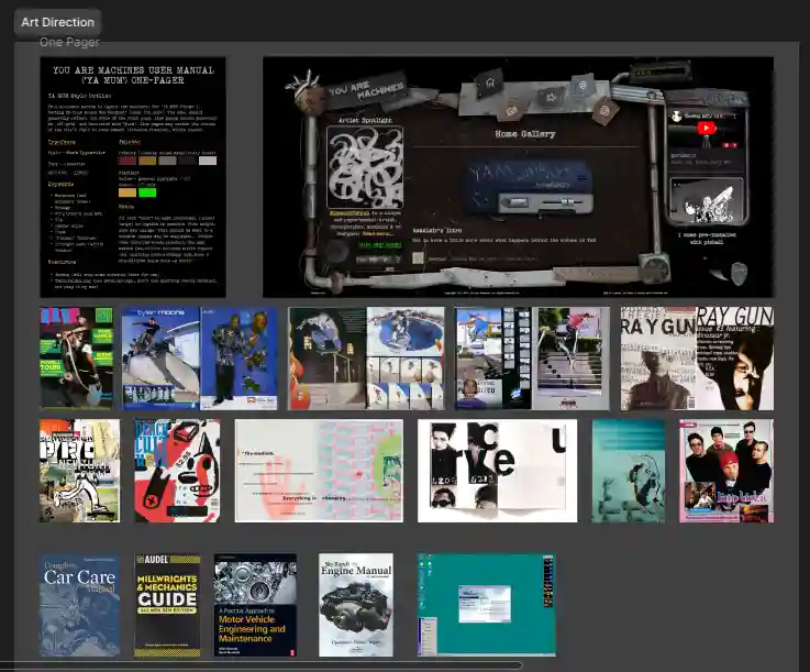
'YAMUM' (Magazine)
'YAMUM Vol. 2' (Magazine)
'Vivitape' Boxart
'SAAM - AI Ethics Board' (Branding)
'Anvander Headphones' (Branding)
Uniqlo T-Shirt Contest
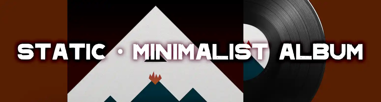
Radiohead Poster
'Gateway' Boxart
Minimalist Album Cover
Pencil Sketches
Interactive-Focused Projects
YouAreMachines.com
MechNet Radio
UsersPlayground.com Forums

'On a Roll'
(Game Assets)
'Recoil Raiders'
(Game Jam)
'Project Roadside'
(Game Assets)
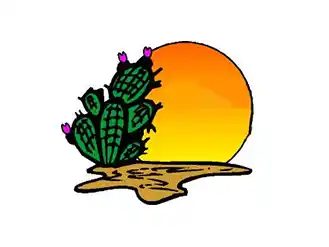
PricklyPear.ca
Evolution Chess
(Game Title Screen)

Botany
(Game Jam)


Home
Motion
Graphics
Interactive
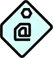
Contact
Something may be broken on the site...


Visits:

Copyright 2023-2025, James Vincent, All Rights Reserved lol
Site is [###] days, [##] hours, [##] minutes old
[X]
Contact Page


Send me an email right now
(Sometimes it takes a moment to send)
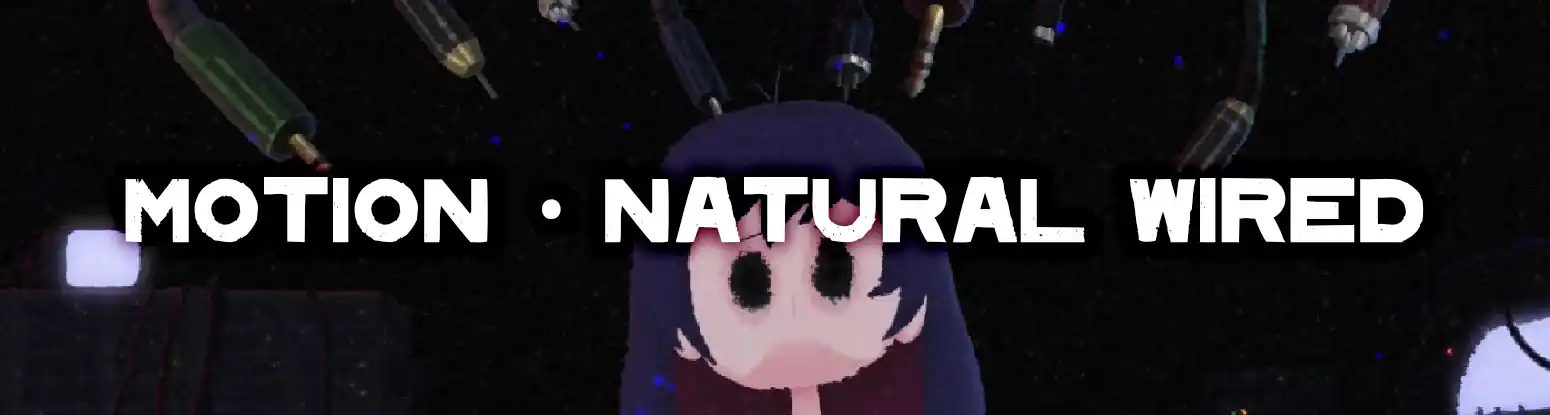
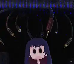
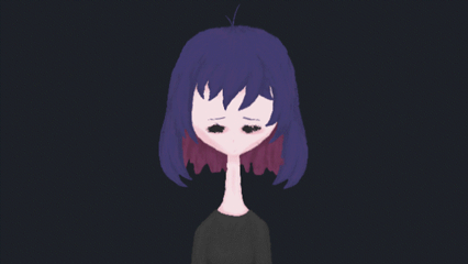
'Natural Wired' VFS Grad Project
2023


For my VFS grad project, I decided to take some inspiration from 'Serial Experiments Lain' an anime from the 90's, and honor its message of overgrowing technology and AI advancements. This was made in tandem with a fictitious AI ethics agency I created which acts as the theoretical commissioner of this piece (see case study below).
Animation & Trailer
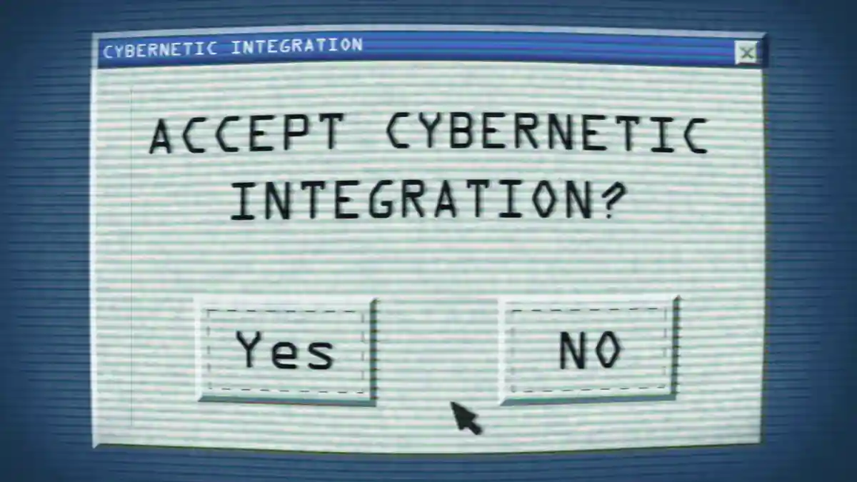
Natural Wired details 'Askii' wondering whether
she should take the plunge and integrate her life further with
technology. As she hesitates, reflecting on what she may lose of her
autonomy, the technology takes over and makes the decision for her.
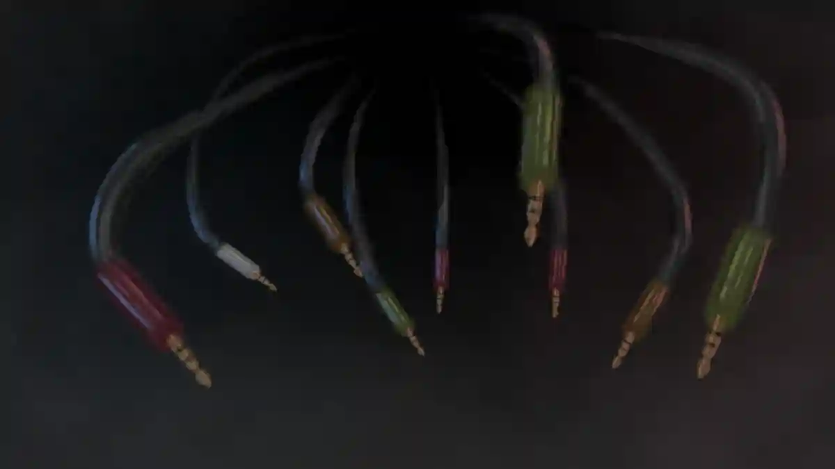
Perhaps you will also notice some easter eggs and secrets
dotted around too!
Case Study
'SAAM' is an AI ethics board designed as the theoretical sponsor that would have commissioned this cautionary tale. And this case study as well represents the balance of work I was managing with this project.
Animatic
The animatic/storyboarding for this project was integral to this piece being finished on time. Exploring what was truly necessary, the establishing shot intro was completely cut, as well as various other details.
Concept Project
Earlier in the school year we were given a 'do anything' project. I decided to do some character conceptualization tests for Askii.
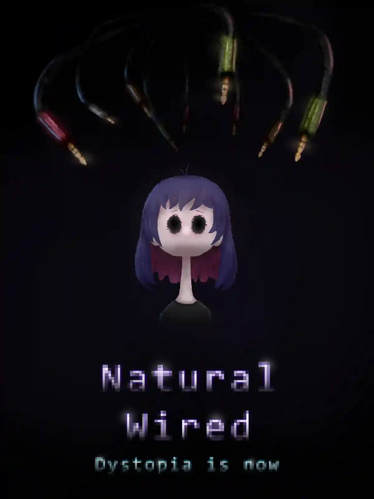
Poster
In designing a full motion package, it was suggested an intriguing and representative poster may be the right move.
Style and Assets
Initially I did not find style frames to come in as useful as they were, especially in explaining my ideas for this project. Thank you to my project mentor for that advice.
Rig Tests
Given this is a character animation project, honing in a versatile and readable character rig was integral to creating this project efficiently. (Thank god for Duik!)
Closing Thoughts
This is the biggest motion project I had ever worked on and I could not be happier with how it turned out. I am thankful to have had a mentor from the industry lead me through the pipeline.
See More!

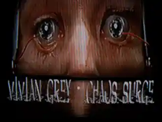
Chaos Surge
2025
Industrial-electronic music producer, Vivian Grey, approached me to create a suitable music video for a song of hers that was gaining some traction online. It obviously needed to suit the vibe in some way, but other than that note, I had creative freedom.
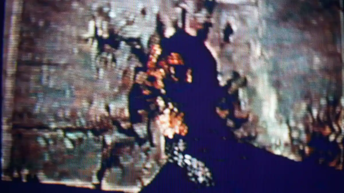
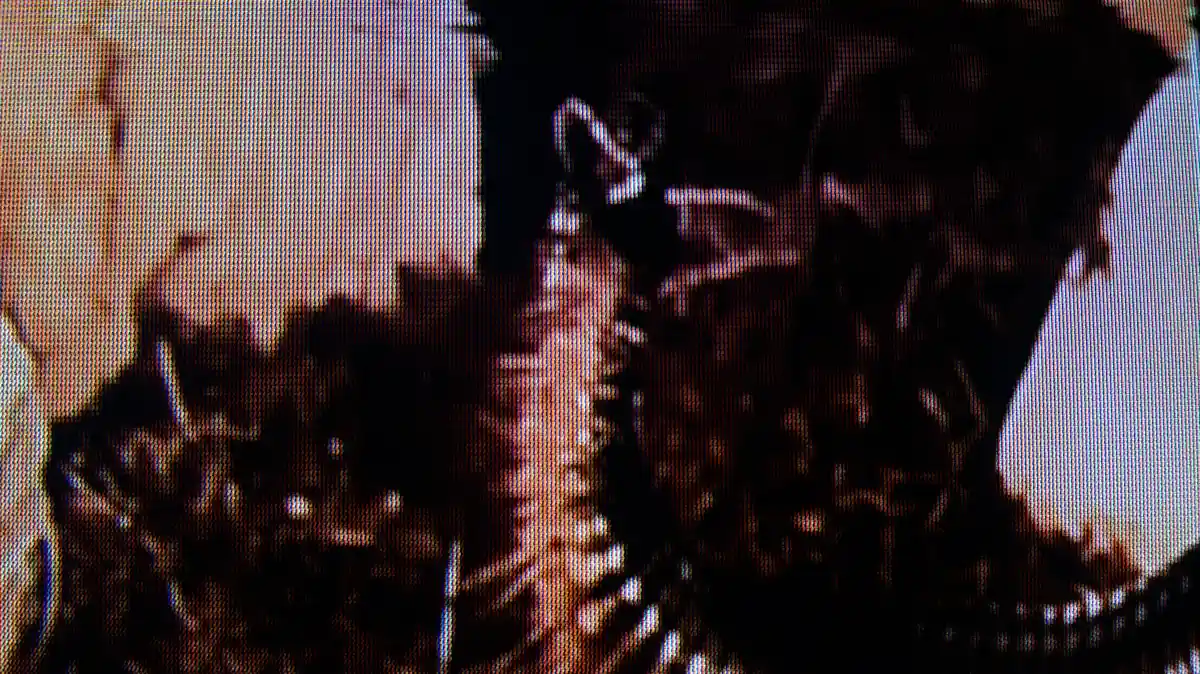
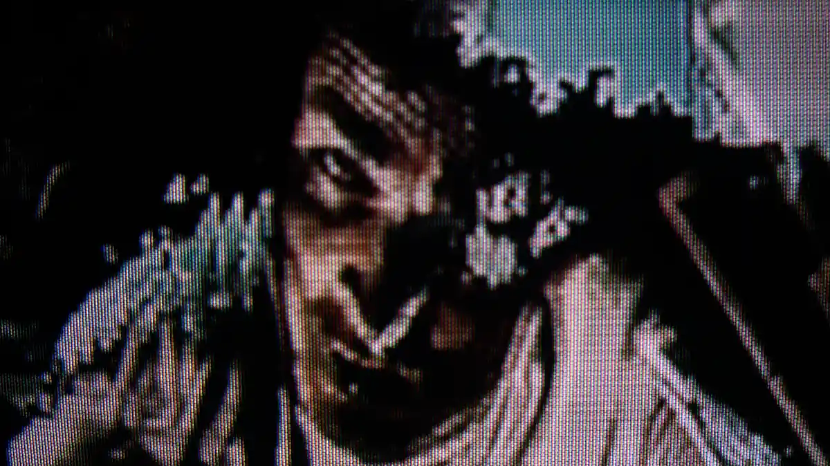
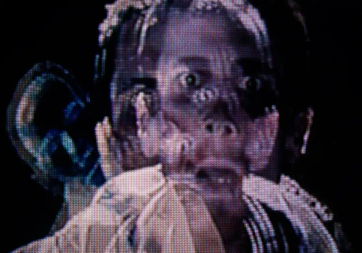
The Project
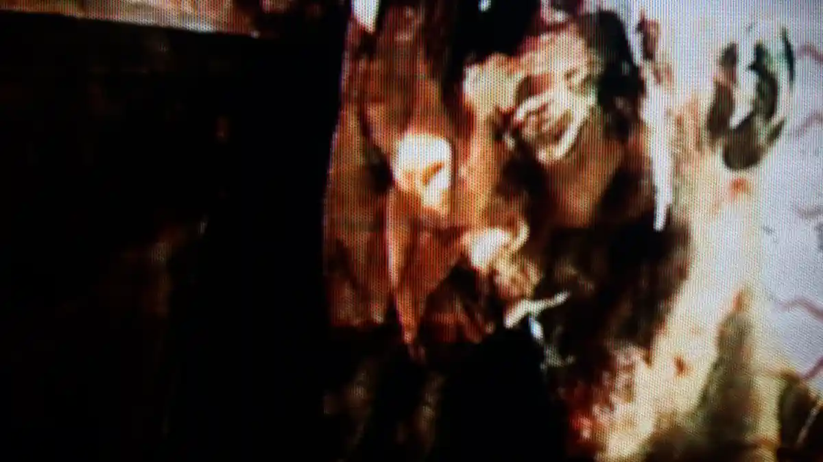
The video consisted of gritty sometimes gorey clips from various shows and movies such as The Machinist and Dr. House and some clips from the game Garry's Mod. After the snippets were assembled (usually on beat in some way), and exported with a few After Effects additions, it was physically recorded on a CRT screen and re-digitized to give it that grungey feel.
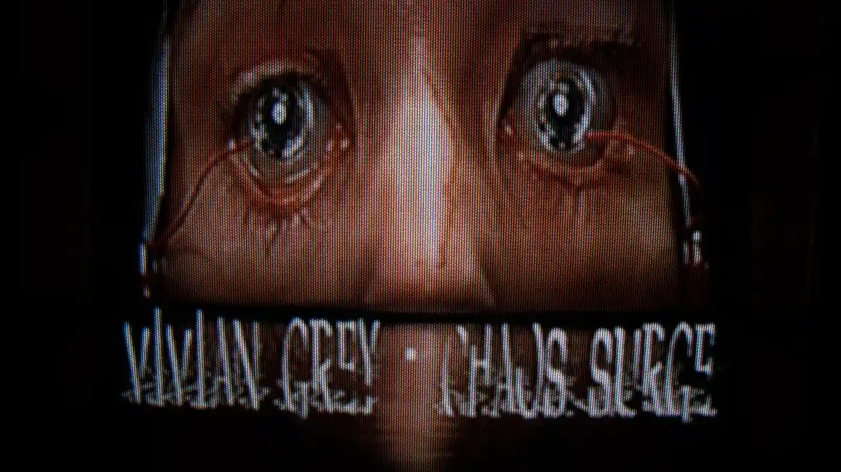
Title Card
The title card is an important part of any piece of visual media like this. I wanted to include one of the shots Vivian and I both found very striking, along with a suitable font that I personally felt represented Vivian's overall style the best.
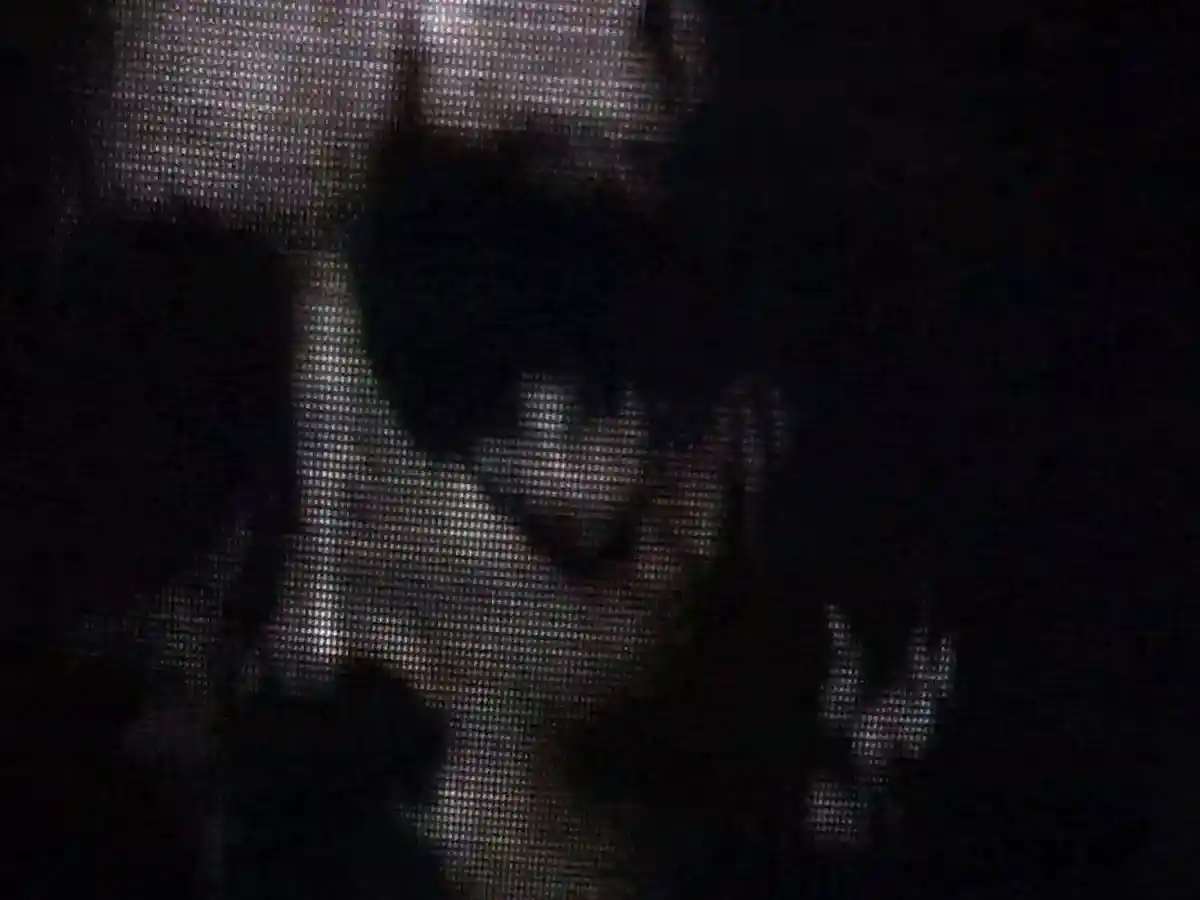
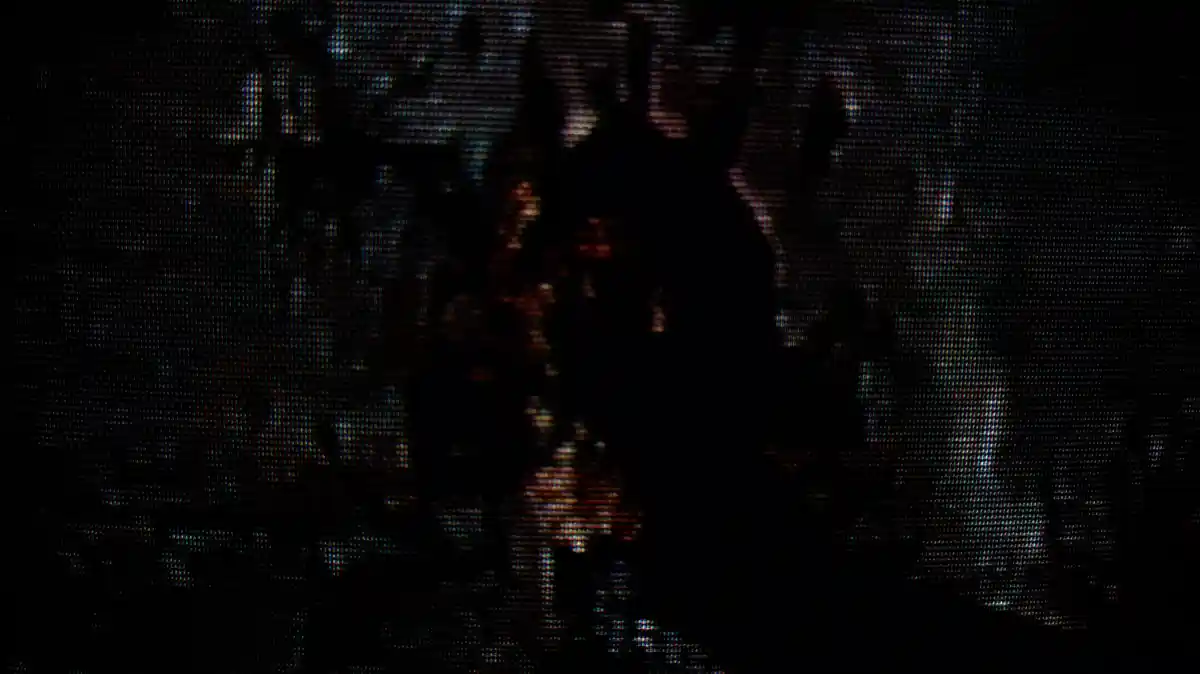
Stills
I thought, since many of the shots in this video were quite striking on their own, I would take higher definition photos to use as promotional material and as standalone pieces of art. Some of them are layered and more intricate, though only lasting a few seconds in the video itself, so I thought I would take the opportunity to celebrate some of those short and sweet frames.
Closing Thoughts
This was an extremely fun project to work on. Music video creation is something I don't get to do very often, but is one of the most satisfying mediums of visual design in my eyes. I would love to flex this creative muscle much more going forward.
See More!
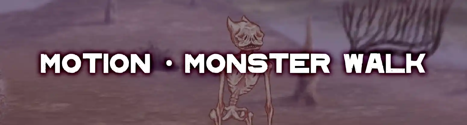
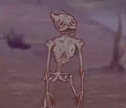
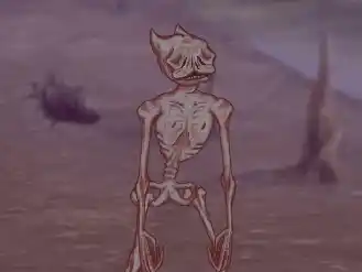
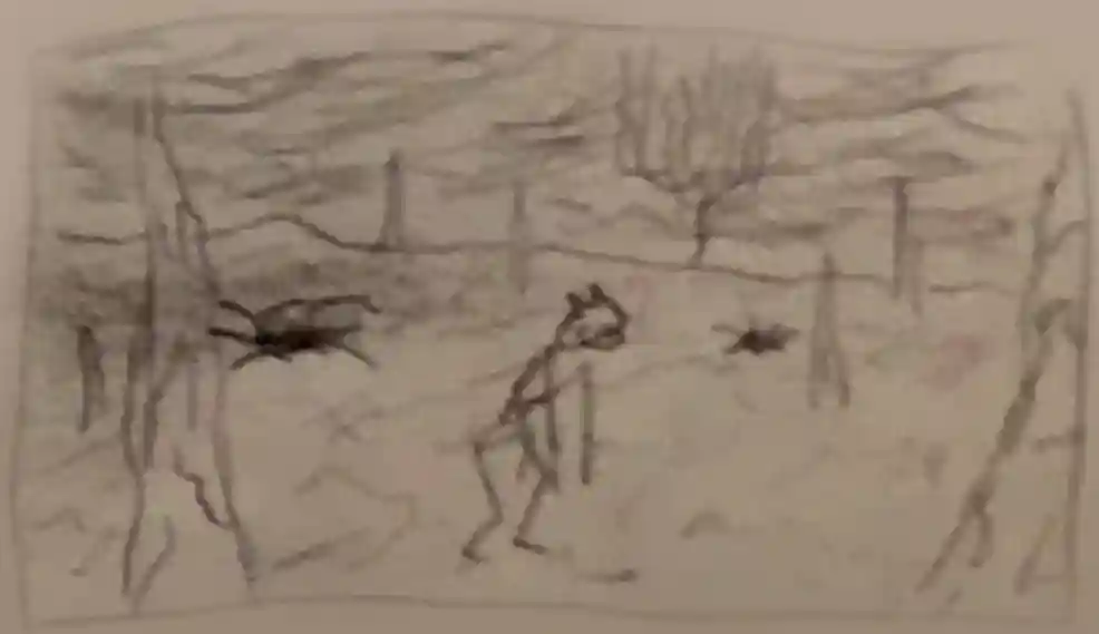
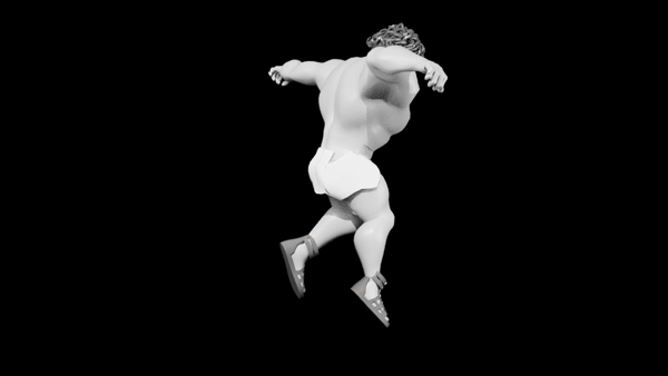
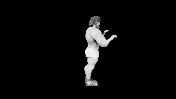
Monster Walk Cycle
2022

I've always loved the idea of character animation, and naturally was very excited for this project. This was my first introduction to Duik, the rigging software in After Effects, and went well with my previous understanding of rigging concepts. Lots of inspiration was taken from the animator David Firth (the 'Salad Fingers' guy ;)
The Animation
The animation process was perhaps the most exciting part of the workflow for me (as I'm sure EVERYONE would agree). I planned to have an inevitable twist at the end for some challenge and intrigue. I designed the music and sound to reflect that same vibe.
Character
I wanted to bring across the feeling of 'dead-weight' this character had, given it's look and story.

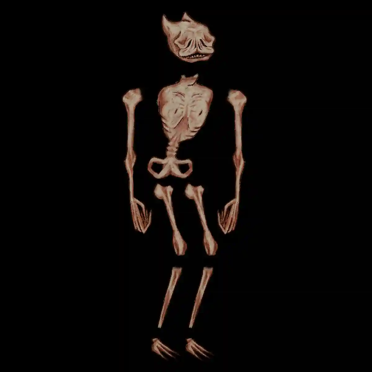
Character Design
I settled on a 'skin stretched over bone' body type like some subjects found in Polish painter Zdzisław Beksiński's work
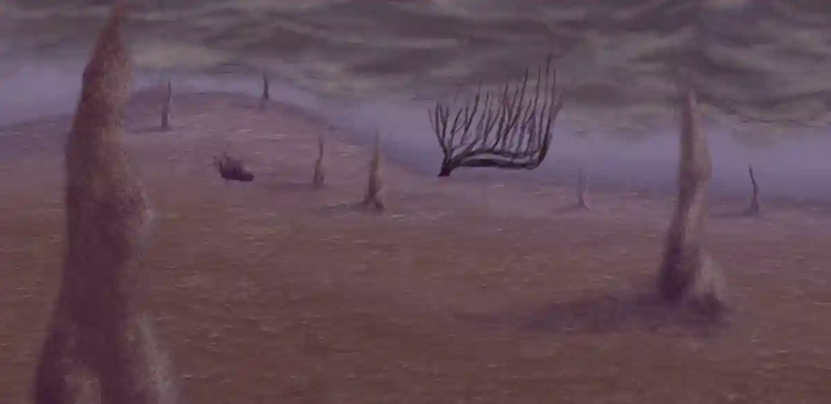
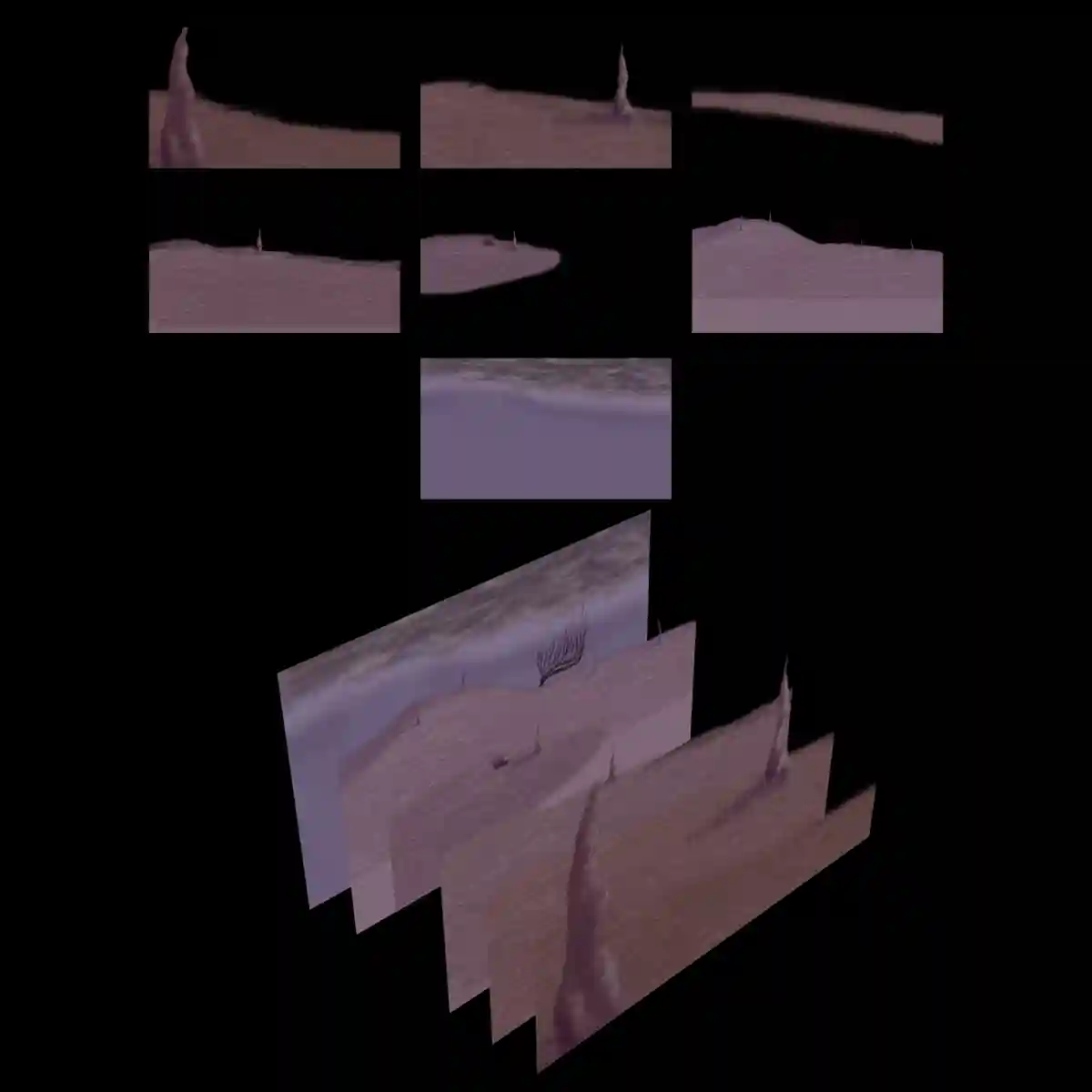
Background
Again taking inspiration from Zdzisław Beksiński, I wanted the background to feel surreal and barren, with a level of depth (parallax) to add some expanse and emptiness.
Closing Thoughts
This project was definitely a challenge, but very enjoyable to hone in a believable and intriguing animation and overall style that I was proud of.
See More!
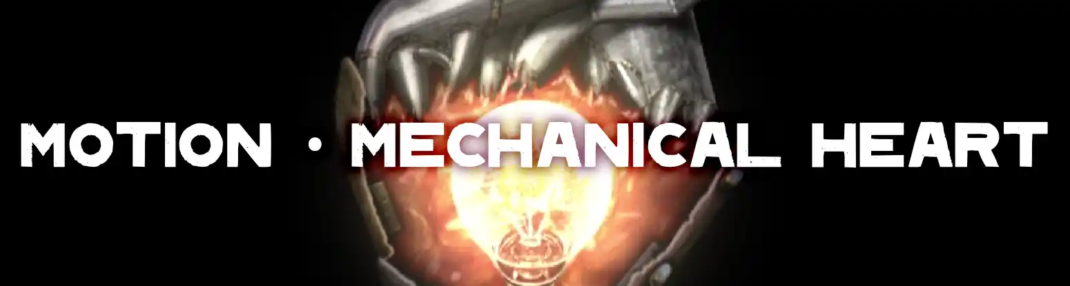
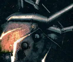
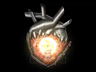
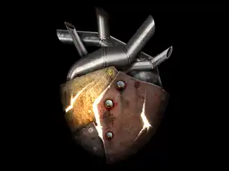
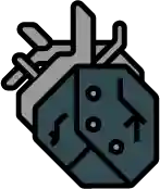
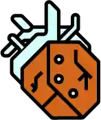
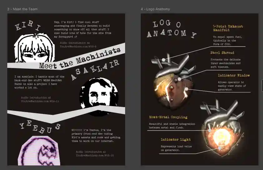
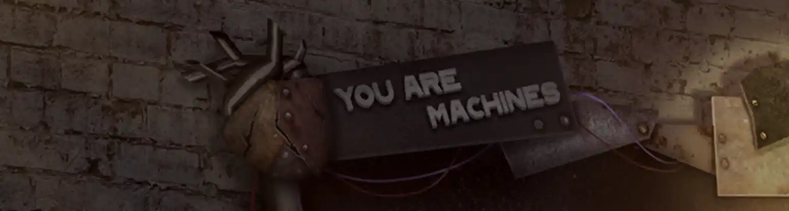
YouAreMachines.com Mechanical Heart Logo
2023
'You Are Machines' is a surreal online art gallery and journal run by a group of friends, including myself. The site needed a logo fitting of the name and concept of the site. Something mechanical, but grounded in something human and recognizable. Visit the site here!
The Animation
What fun is an untextured, static logo? Make it move! It's alive!!!
2D > 3D
I had a concept to represent the 2D in a way that said '3D'. Here is the proof
that this is all just the puppet warp tool in After Effects :)
(Excuse the lag of this clip)
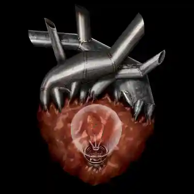
Naked Logo
Here's the logo without any clothes on. Sometimes to get intimate with the design of a logo is to get intimate with a logo...
Closing Thoughts
This was the first major motion project I uptook after graduating and a creative break. It could not have been a more worthy project to jump back into design and animation.
See More!
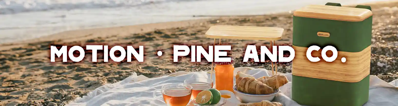
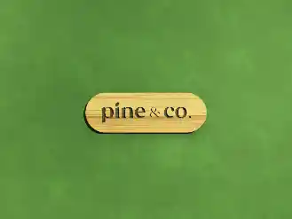
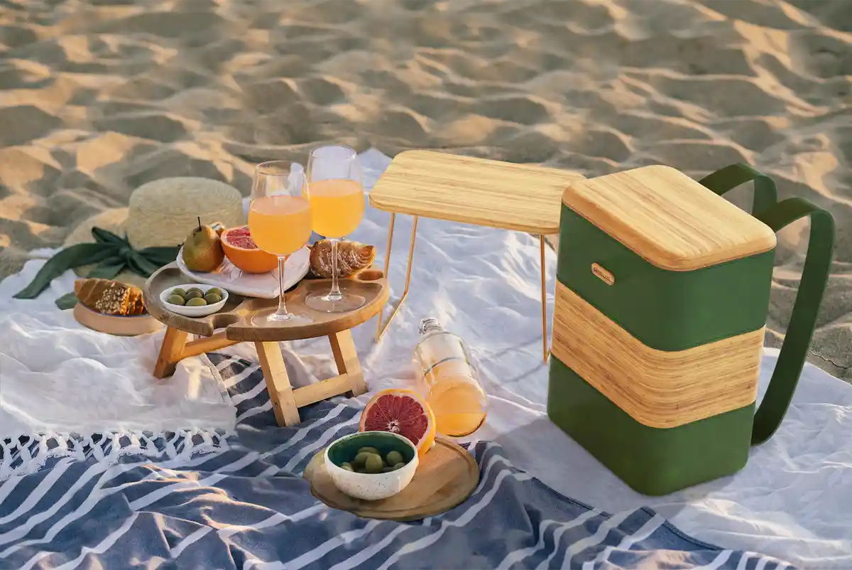
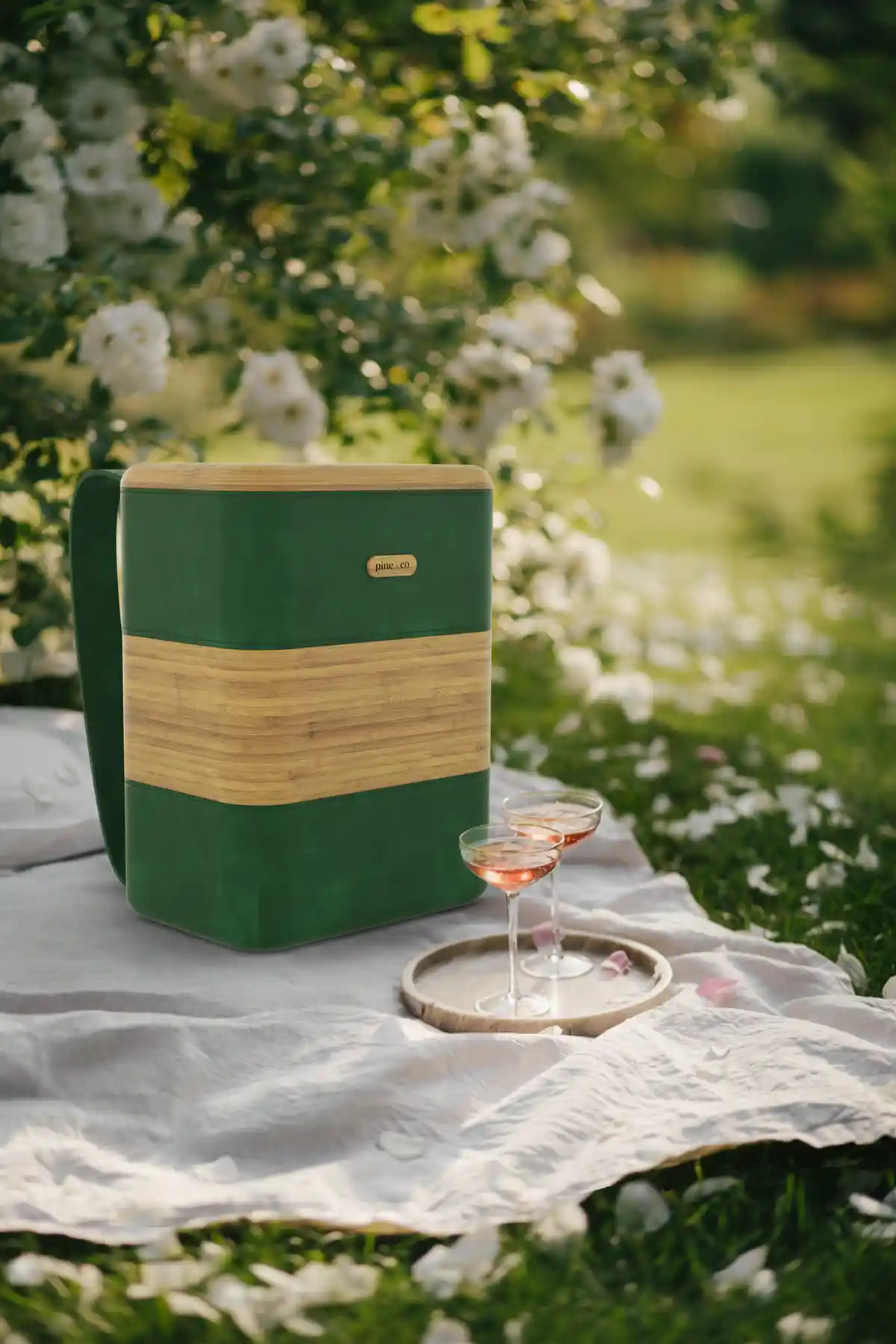
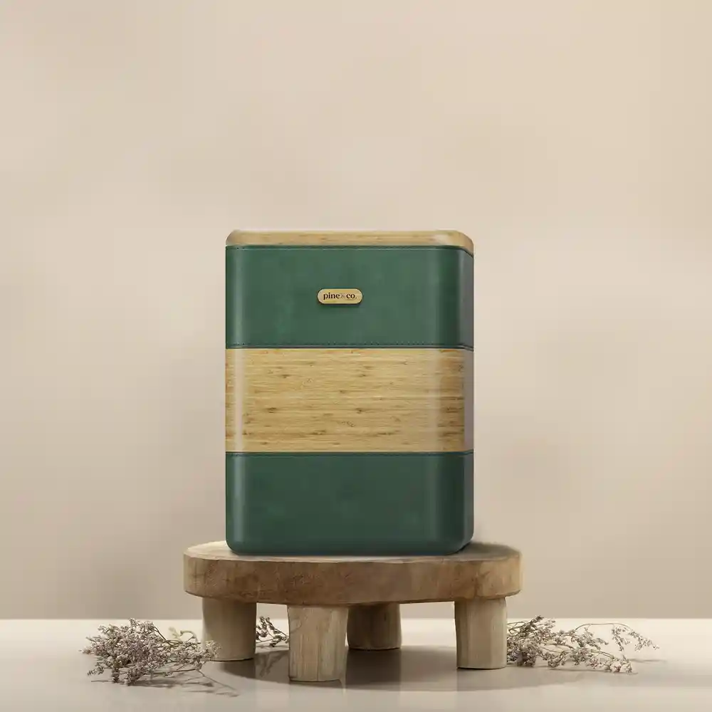
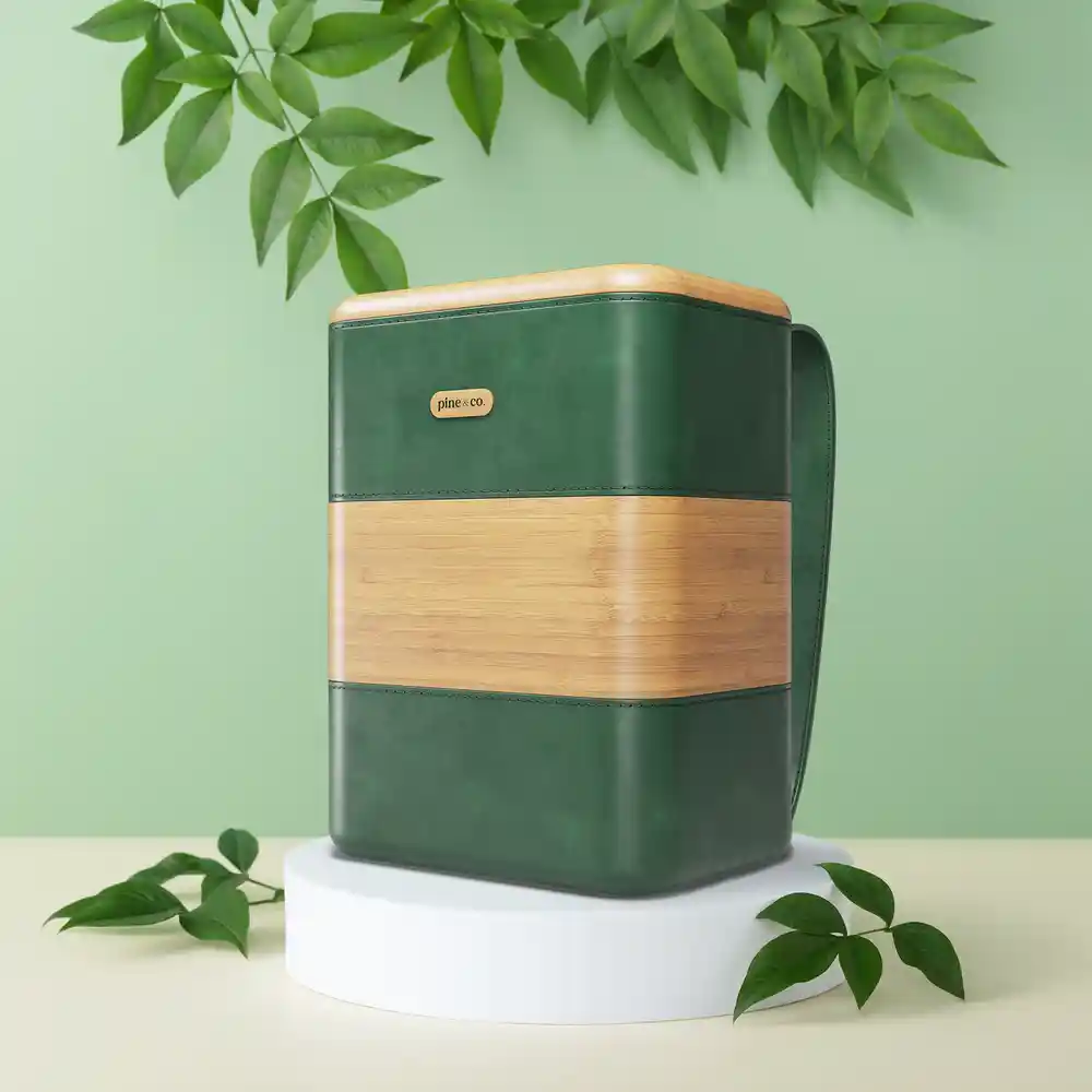
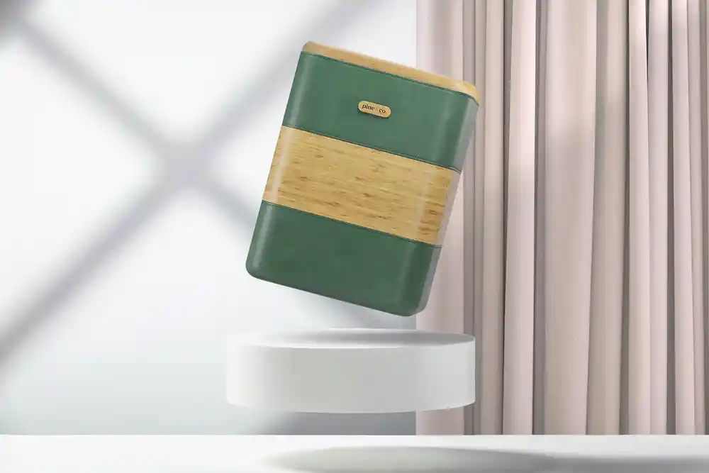
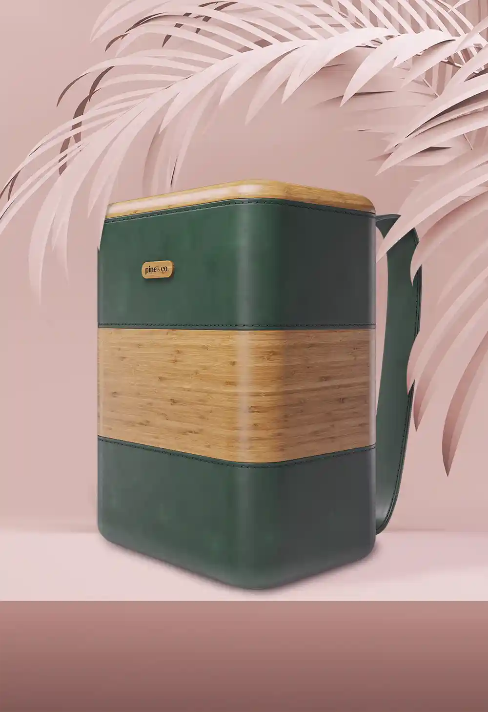
Pine & Co.
2025


Pine & Co. (PnC) is a green startup focusing on urban-outdoor products. I was approached by a
VFS connection of mine for a 2 month term of contract work to generate some collateral for a new
backpack cooler they were launching. Despite my rather surface level understanding of 3D, there was
faith in me that I could create something professional with their 3D model, and I am personally quite
happy with the results.
Everything you will see, besides background stock photos and the 3D models,
was all created by me (though I did have to almost completely remake all the materials for the 3D models).
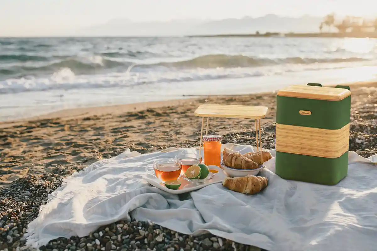
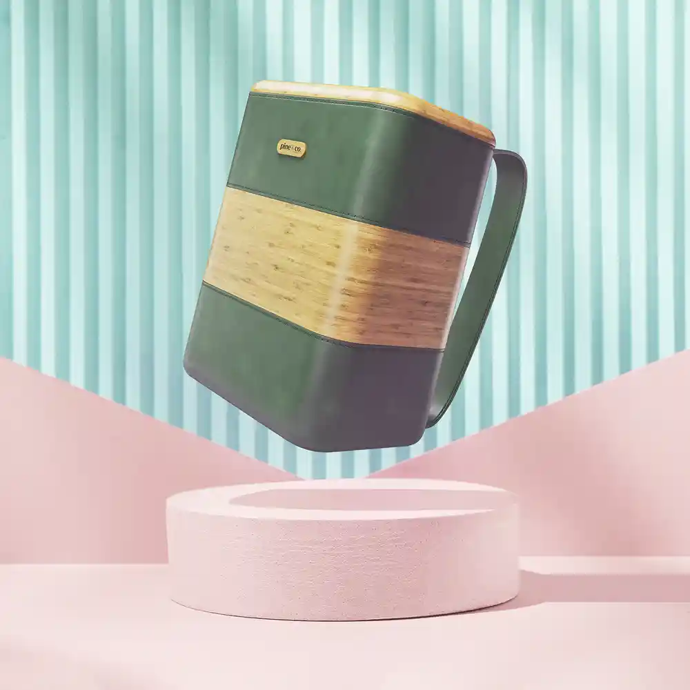
Primary Deliverable
All of my 3D and After Effects work with PnC was leading up to this point: a product advertisement. This one specifically showcases the green materials on top of some additional highlights.
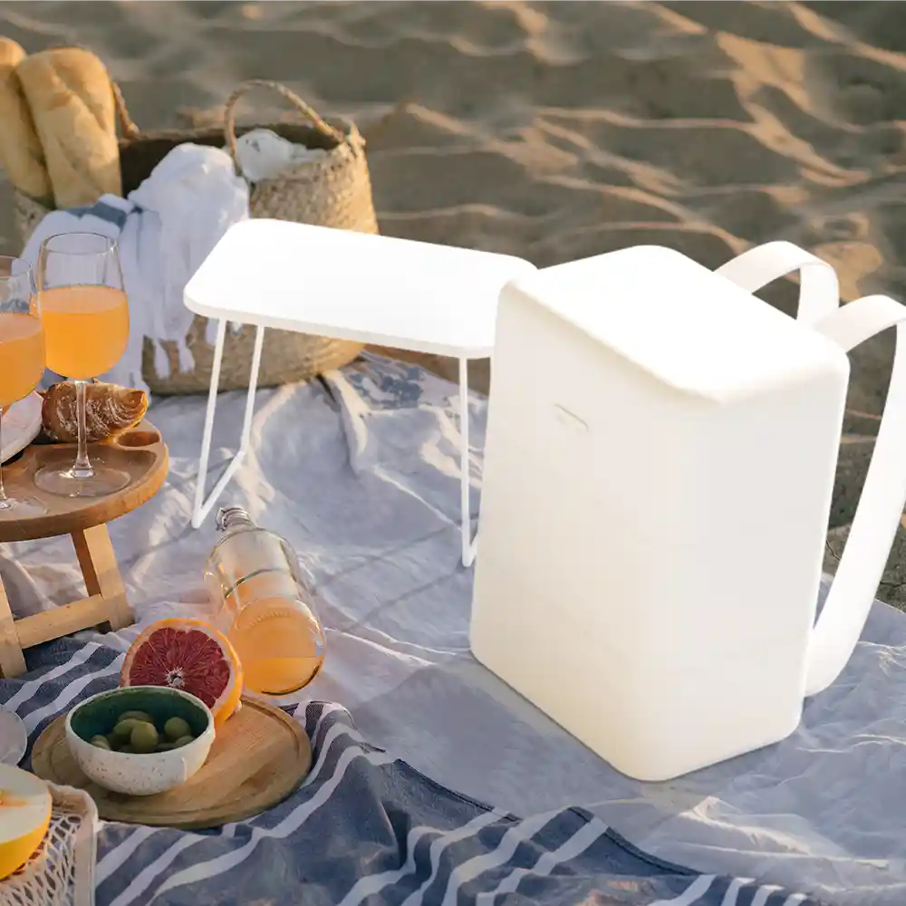
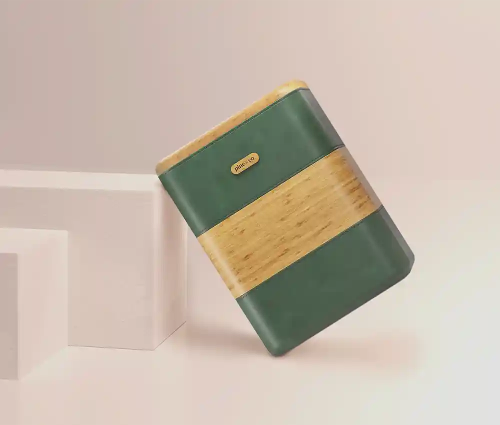
Infographics & Additional Motion Highlights
Leading up to my aforementioned flagship deliverable, there were some other deliverables needed to flesh-out the marketing pages for this product. These projects did allow me and my supervisor to get into a better groove with each other, and allowed us to better communicate ideas when it came to the Primary Deliverable. We were relying less and less on floating ideas and general moodboards and more on tangible precedent.
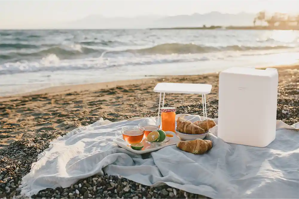
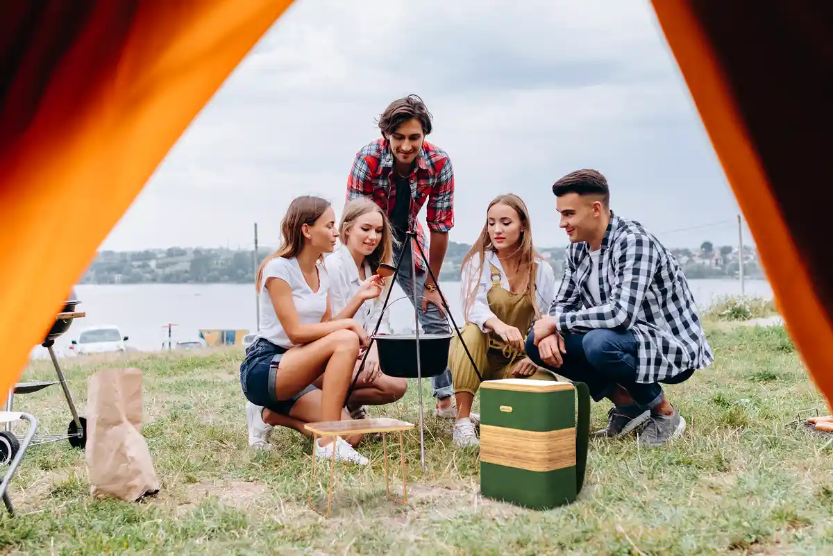
Use-Case Stock
One of my favourite minor pieces of collateral was this use case video. I was pretty proud with how I integrated the product in the scene. This was lit and motion tracked in Blender, and additional Effects were added After in... Some program I forget the name of. I did want to try to integrate the product as best possible, so I overlaid some subtle smoke and heat-ripples that were present in the base stock video.
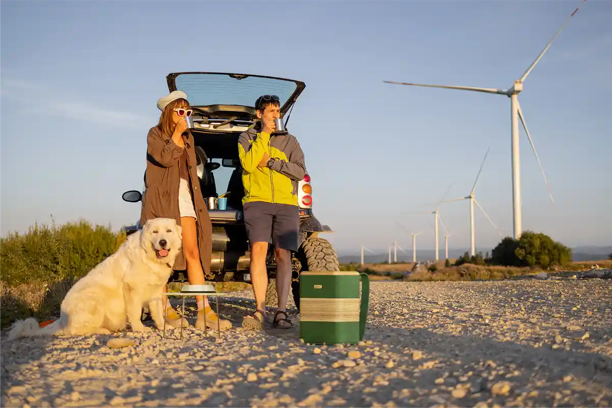
Use-Case Stock (Stills)
A bulk of my early work with PnC was building a repertoire of marketing stock photos. I was responsible for picking a number of the background images, so long as they were within the brand's vision; I had to place and light the product accurately within Blender, taking note of proper perspective and lighting conditions present in the photo; and I finalized and cleaned up the images in Photoshop. This process included a lot of moodboards, getting used to the brand's personality and many discussions and check-ins with my supervisor to ensure I was on track.
.webp)
Use-Case Stock (Early)
My VERY first few projects with PnC were more just tests than actual deliverables for marketing. At this point, I only had access to two png files of the product. All of the lighting had to be done entirely in Photoshop, with a limited selection of backgrounds that already had a similar perspective. This stage had lots of revisions in getting used to the brand's more muted, natural, and earthy tones, in-line with it's identity.
Closing Thoughts
I'm grateful to have had someone have so much faith in my abilities in such a professional setting. I was entrusted with entire 2D and 3D workflows to create something professional and striking regarding the early stages of a real product launch cycle. Collaborating and discussing with my supervisor was a treat. It was a satisfying experience every time we completed a deliverable, especially when it was actually utilized in a landing page or advertisement (which have since been closed for public viewing). My favourite part of my 2 month term always came back to the collaborative aspect. Brainstorming and coming up with an intriguing concept before execution even began.
See More!
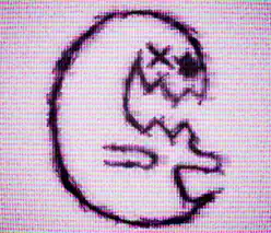
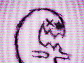
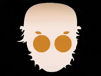
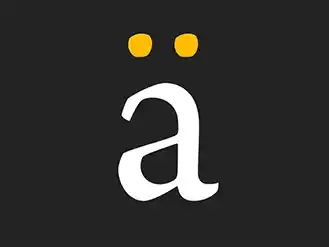
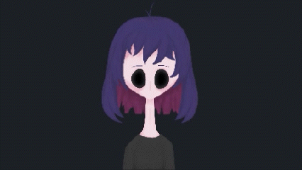
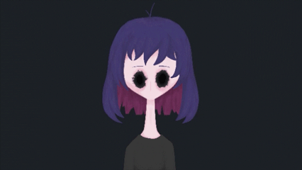
'Spectre' Personal Icon
2024
In changing my Instagram handle (follow me ;) to something less pretentious, I decided it would be a good idea to get a new profile picture. I also had to throw out all my old business cards. Don't put IG handles on business cards...
The Icon
A static icon sounds boring, so I gave it some weird digital elements. (The music is from Alias Conrad Coldwood)
The Old Version
I took a lot of inspiration from the spectres from the game OFF by Mortis Ghost. I decided it would be a good idea to come up with something more original. It took me a year to revise the icon though.
Additional Elements
Sometimes a project supplies you with some interesting visuals during the process, so I made sure to capture them before I lost them in the continuation of the project.
Closing Thoughts
After years of an old half-thought-out previous profile picture and branding, this was a very refreshing project, with glitchiness and weirdness. In the end, this is a great representation of myself and style.
See More!
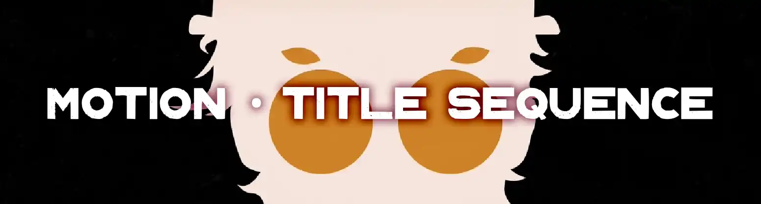
'A Clockwork Orange' Mock Title Sequence
2024
The book was better than the movie, and this mock title sequence I made is just as exciting as ultraviolence.
The Project
From the visuals to the music I did my best to stay true to the original vibe of the book (and movie) with this mock title sequence.
Rough Cut
With this project, the rough cut came in between the assets, and put me on the right track to timing out the proper beats of the title sequence, while allowing enough time for legibility and readability.
Style Overview
We were tasked with creating a bit of a single-page style overview. Despite its simplicity, it helped in honing the simplistic, somewhat gritty, and off-kilter style I was going for from the start.
Closing Thoughts
I have a deep respect for those that create truly engaging title sequences with respect to animation, credits, timing and representation of the original media.
See More!
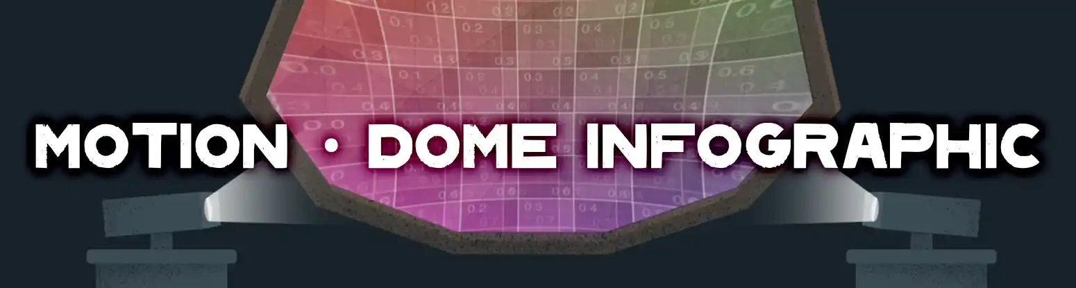
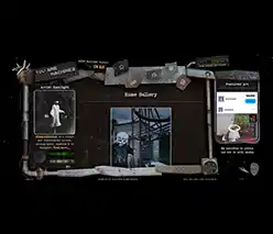
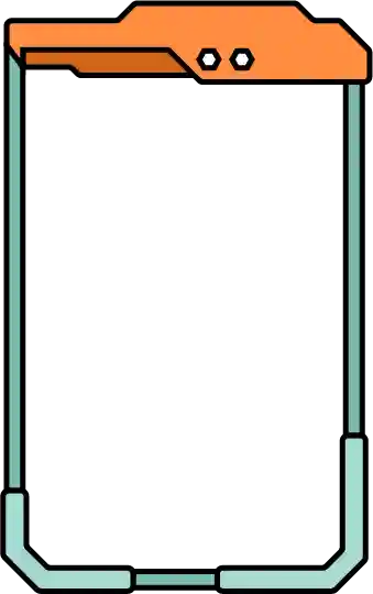
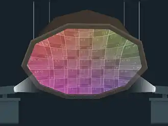
'Dakota Bear Sanctuary' Geodesic Projection Dome Infographic
2023
This was a client project contest at VFS (the best team was selected). The client needed a way to easily explain how a geodesic projection dome, which they made themselves, works. This client works for the Dakota Bear Sanctuary and was holding a exhibition which included the projection dome and visuals of the forest. They as well needed a website to go along with it. A team member made the 3D dome, but I did everything else.
Infographic and site intro
The infographic had a few key points to explain in a simplistic way, understandable to a general audience
including children. The video was intended to loop in the background of the exhibition area.
As well, upon entering the Sanctuary's website, our team planned to have a quick 'intro', zooming into
the dome, and immersing yourself in the forest.
Closing Thoughts
This was one of the more important projects at my time at VFS as we were working with an actual client. We got some really great feedback from an notable outside perspective. We dealt a lot with the re-iteration process on this project, and I think it was definitely for the better.
See More!
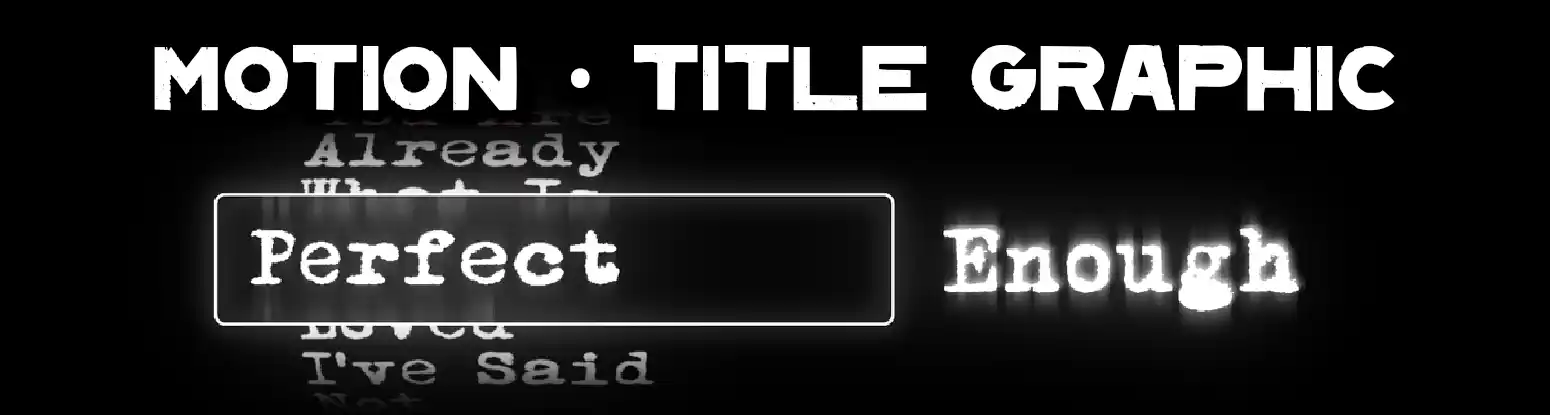
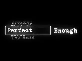
'Perfect Enough' Rolling Title Graphic
2023
Does it spoil the fun if I tell you I was inspired by the timer number selector on an iPhone? This is intended as a title card for a (theoretically) ongoing slice-of-life series.
The Project
This was created with a few variations in the words and phrases on the barrel, fitting the overarching themes of the series, and can be edited dynamically in the project file. Coming up with all the phrases was perhaps the funnest part.
Use in the Wild
It's not good enough, it's Perfect Enough that our friend Ozymandias exploded I suppose.
Closing Thoughts
This was a simple yet engaging project. The execution of the 'rolling text barrel' is a concept I always wanted to figure out, and glad I was able to tie it into an interesting, larger project.
See More!
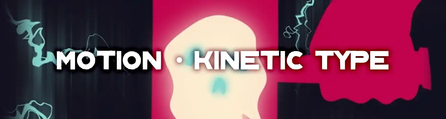
Kinetic Typography Collab
2024
I was FORCED to work in a group with other motion designers for this VFS project. But it's alright, we all got along. Collectively, we came up with a word, theme, colour palette, font, and other various points to practice staying within style-guidelines in a group setting.
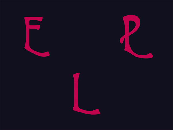

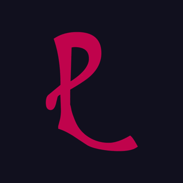
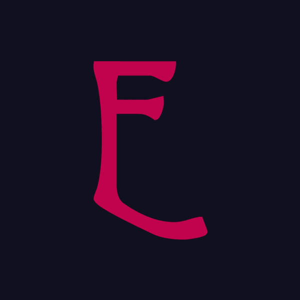
'Ephemeral'
We selected 'death in mythology' as our theme. For my selected letters (P, E and L), I decided to represent death in various ways from Nordic mythology.

A Closer Look
I chose Thor's Hammer, a Viking Funeral, and Jormungandr respectively.
Closing Thoughts
Working in a larger group and getting everyone to stay on the same page was quite an enjoyable challenge. Had we had more time, I believe there are a few more areas we could have discussed to keep more in-line with each other.
See More!
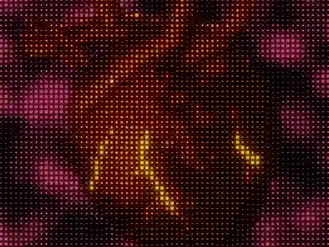
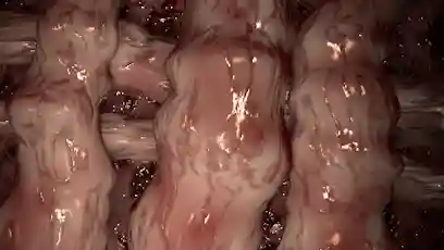
CGI Intestines
2024

People have called this project gross... Great!
An introduction to Cinema4D and the AE tie-in pipeline,
I wanted to make something out of the ordinary, to stay
interested while working in 3D.
Realism
My aim for this was something grotesque and realistic. There was some clever material masking use for the veins and such but most of it is the blurry VHS effect hiding some crimes.
Pre-Effect
After Effect's lesser admired cousin, the pre-effects of this project are alright, but it's not quite as realistic as I would have wanted. To leave some of it up to the viewer's imagination, it's definitely in-need of that gritty polish that makes it feel a bit more real.
Closing Thoughts
I may not always enjoy 3D, but I believe this project served more to practice my skills in art direction, and in creating something that would garner an emotional reaction.
See More!
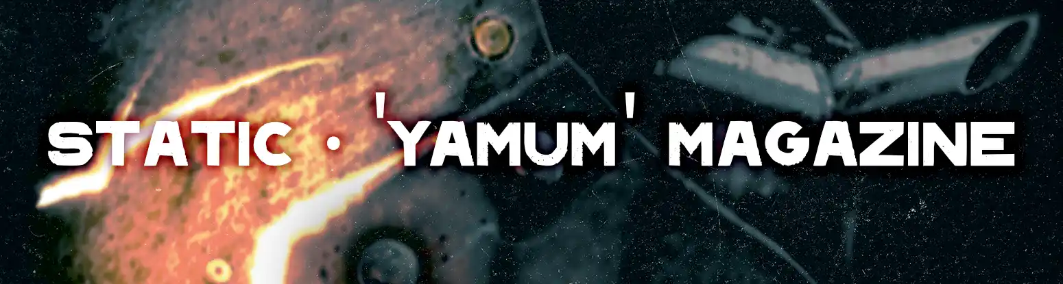
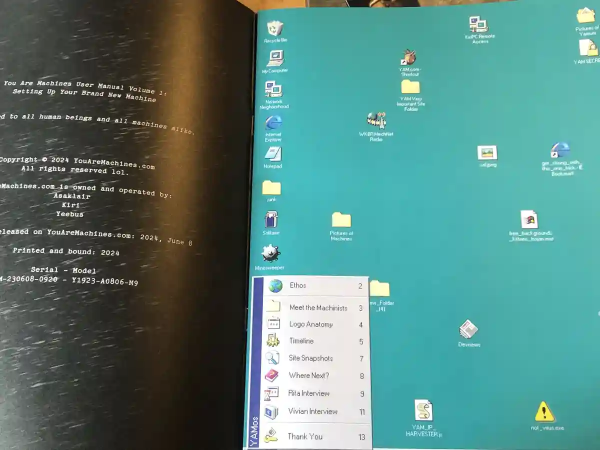
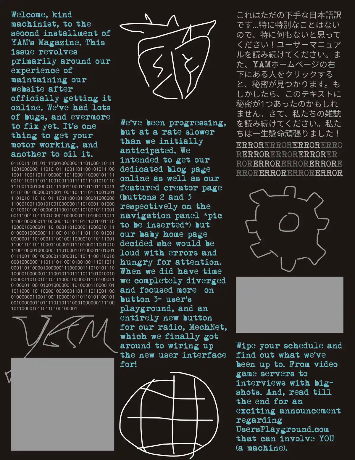
'You Are Machines User Manual (YAMUM) Volume 1' Magazine
2024
'YAM' was turning one year old. We (the 3-person YAM team) had done a lot of work on this large gallery/journal website, and we wanted to commemorate the effort and process we had gone through over the year. I handled quite a lot of the layout and design on this project over the 2-3 week course. Read the magazine here!
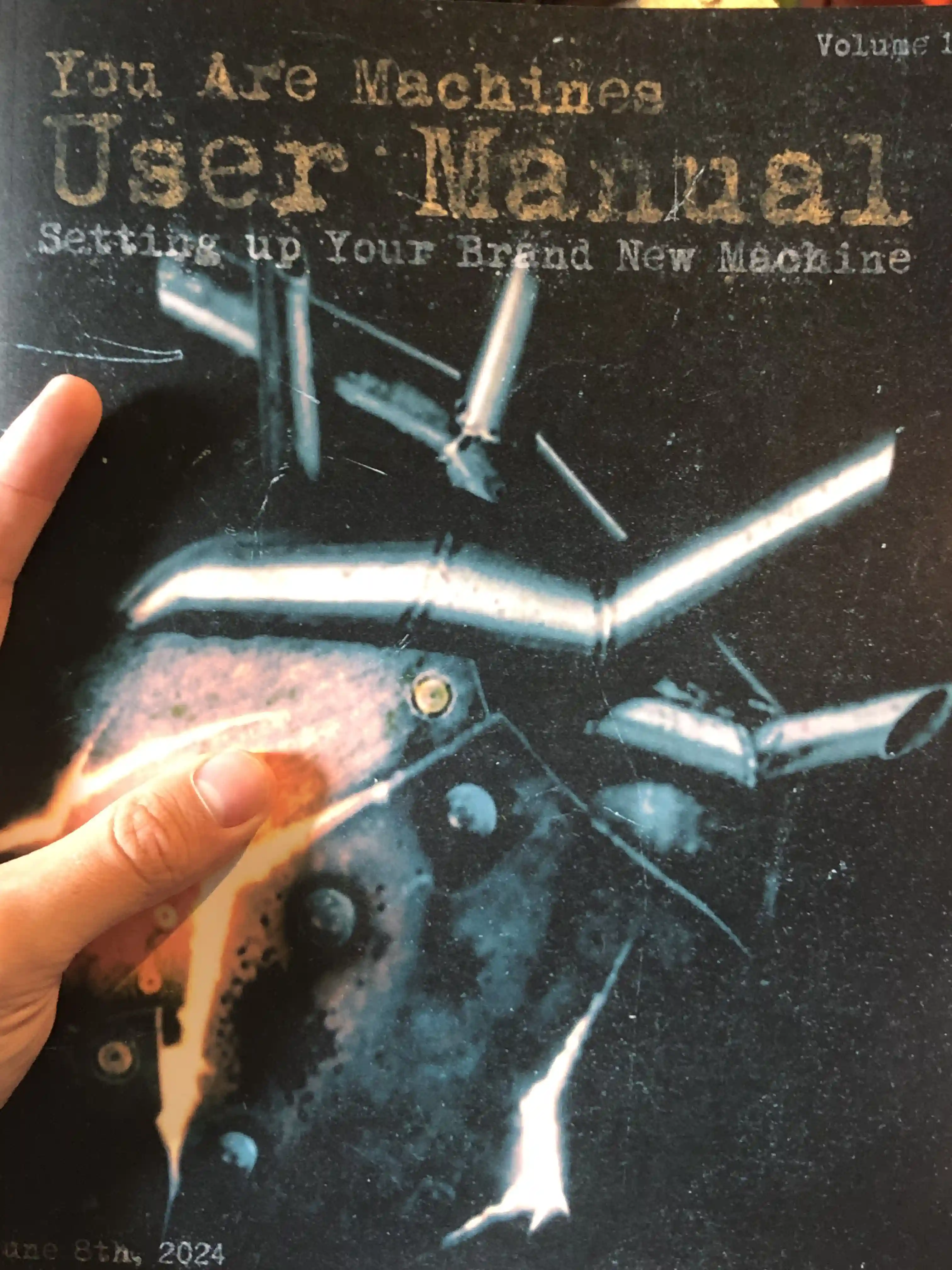
Real-Life Prints!
We might not be popular enough yet for a massive print order, but we really wanted to make sure we got a physical copy of this project, and it was designed intentionally with that in mind.
From Draft to Final
The drafting process was necessary for collaborating effectively, and to organize the huge ideas we wanted to cram into every page.
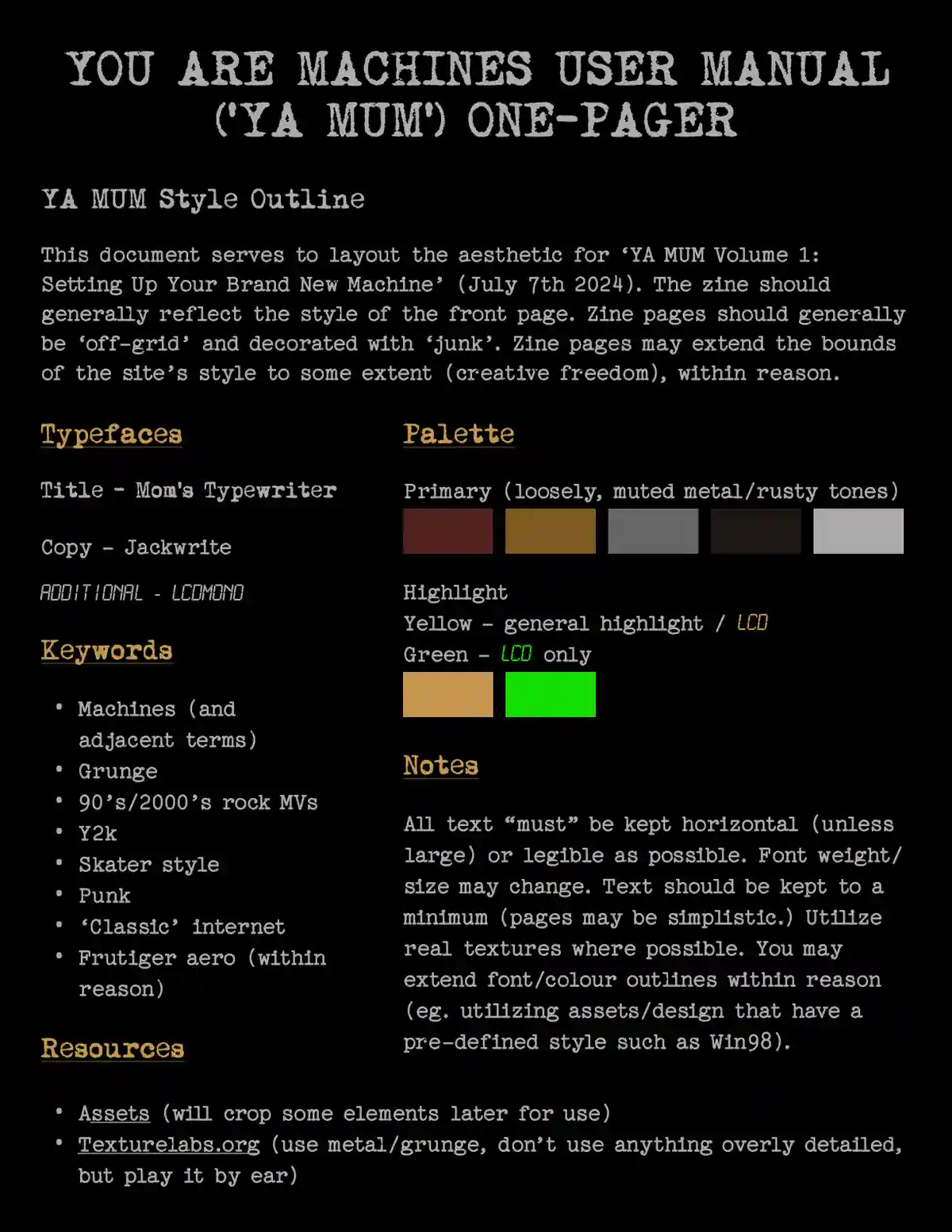
Drafting Process
Figma, while it may be primarily for web layout, was a key component in the conceptualization, collaboration, and drafting for this print layout, including some structuring tools for our Windows 98 style pages.
Closing Thoughts
It was a great motivation to work with a deadline (the website's birthday), despite the added stress lol. It really got me working quite hard, but not allowing me to be an ultra-perfectionist about it. I've learned a lot about print design, and am excited to refine the process for this next year!
See More!
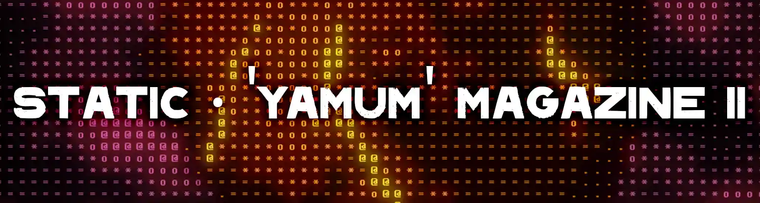
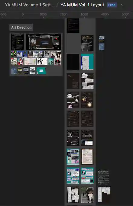
'You Are Machines User Manual (YAMUM) Volume 2' Magazine
2025
This was our second magazine for our art-blog website
YouAreMachines.com. These magazines
annually detail our progress and release every June 8th, YAM's birthday.
I was responsible for leading our small team of 5, including myself.
I had a lot of fingers and a lot of pies. Wasn't sure what to do with the
fingers but I liked the pies. I was a creative and art director,
primary layout artist and editor.
I was not responsible for the layout or bulk of design on pages
2, 3, 5, 7, 8, or 14. Other team members were able to have some more creative
freedom with those.
Read the magazine here!
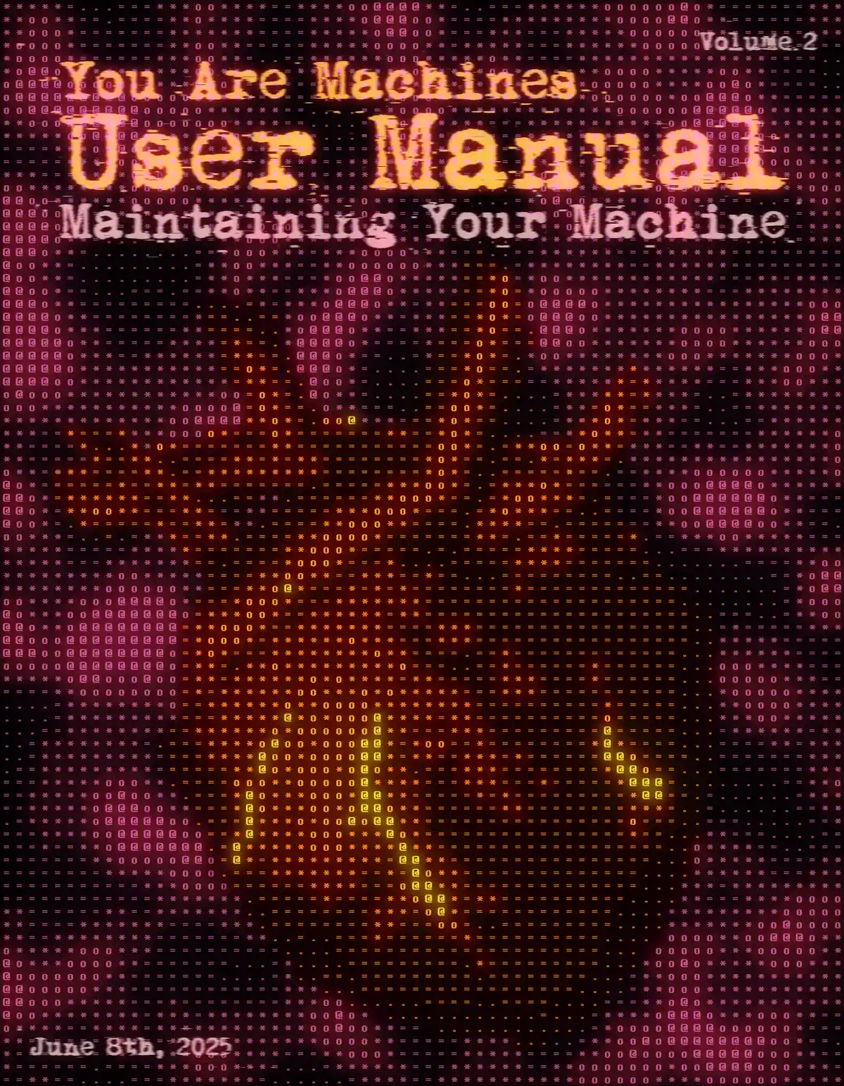
The Cover
The cover is an important piece of any band's career- I mean of any magazine. With this volume we wanted to take a more digital approach to our design, and liked the idea of the cover representing that through the use of ascii-art. I put together a little ascii art generator in After Effects following some tutorials and adapting them as needed for our uses then slapping our logo in there. As well, a similar layout was held onto, following the cover from Volume 1 to strengthen our BRAND IDENTITY and BRAND FAMILIARITY and BUZZWORD 3. We do intend to print this year's volume soon as well.
Favourite Pages
This year, we wanted to try a more versatile and experimental take on our overall design with the magazine. Last year's had a very clear design ethos throughout, but this one had a slightly different style and workflow with each page. We of course still did our best to stay within our digital and gritty overall theme though, and my CRT came in very handy for a number of pages to add an authentic digital filter. We had much more text this year but given that this is a passion project just among friends, we're able to experiment and bend the rules of what is usually considered standard design. The bulk of the words throughout this magazine are almost used more like chunks of visual information than... Actual information. But, readability was still a major factor in tying this all together, even if it's not as readable by popular standards.
Opening Pages and Drafts
I wanted this magazine to have something very striking upon first open. The first few pages are important for drawing a reader in, so I made sure to make these pages visually interesting, as well as hiding a few fun easter eggs around for people that... Don't really care about actually reading the magazine.
Figma Layout
You cant make a magazine without some sort of drafting and layout, especially when you're working with a design team. Figma, though it may be more in line with web and digital layout design, was an invaluable took when it came to quickly and efficiently getting ideas down that a whole team could see.
Closing Thoughts
I couldn't be happier with this year's magazine. I wanted to experiment more with the design and work out some more design styles I don't typically work within, and I had so much fun with the whole process, even if the deadline added some stress (at least it was on time). There are a few things to note for next year regarding improvements in our workflows, but overall I'm very proud of our little team and happy with the results.
See More!
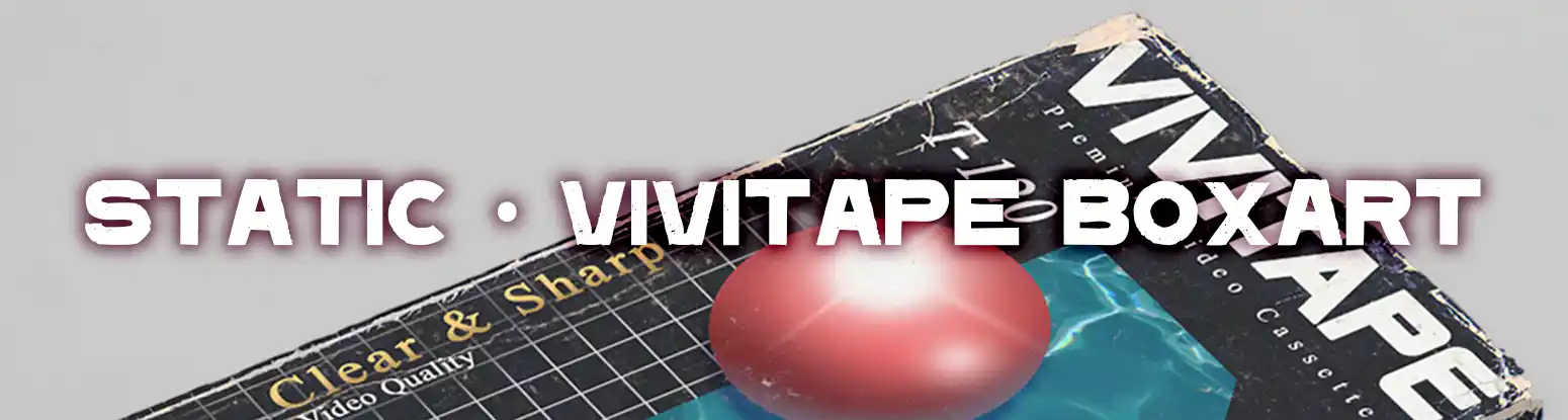
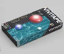
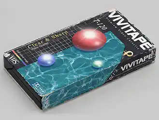
'Vivitape' Retro VHS Boxart
2023
For a general 'design whatever' type Photoshop project at VFS, I decided to improve on a previous concept I had made (see the 'Gateway' Boxart project). This time going for something more realistic.
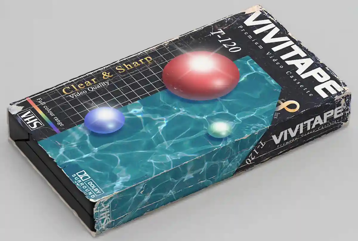
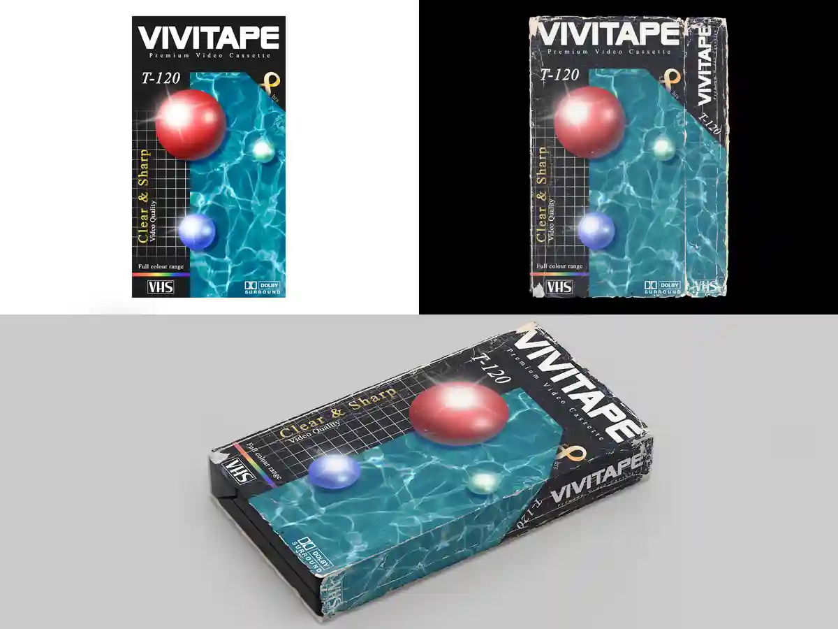
Mockup and Design
I did my best to create a clean base VHS box design that was as accurate to the time as possible, including as many little details and words as I could, while also creating a visually intriguing design. The texturing and faux-3D done in Photoshop brought the whole project together.
Closing Thoughts
Lots of people seem to be surprised that I even know what a VHS is given my age. I take great offense to that, so hopefully this will show em. This was definitely a fun passion project, even if it was an actual project to be handed in for the class.
See More!
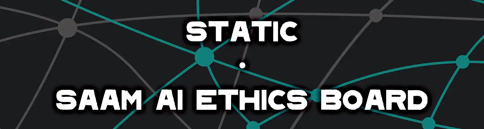
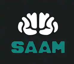
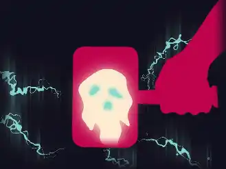
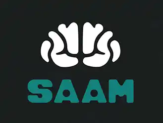
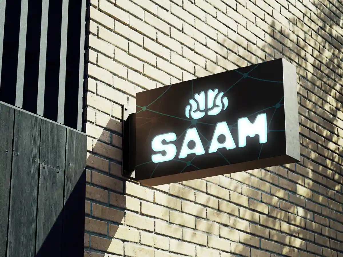
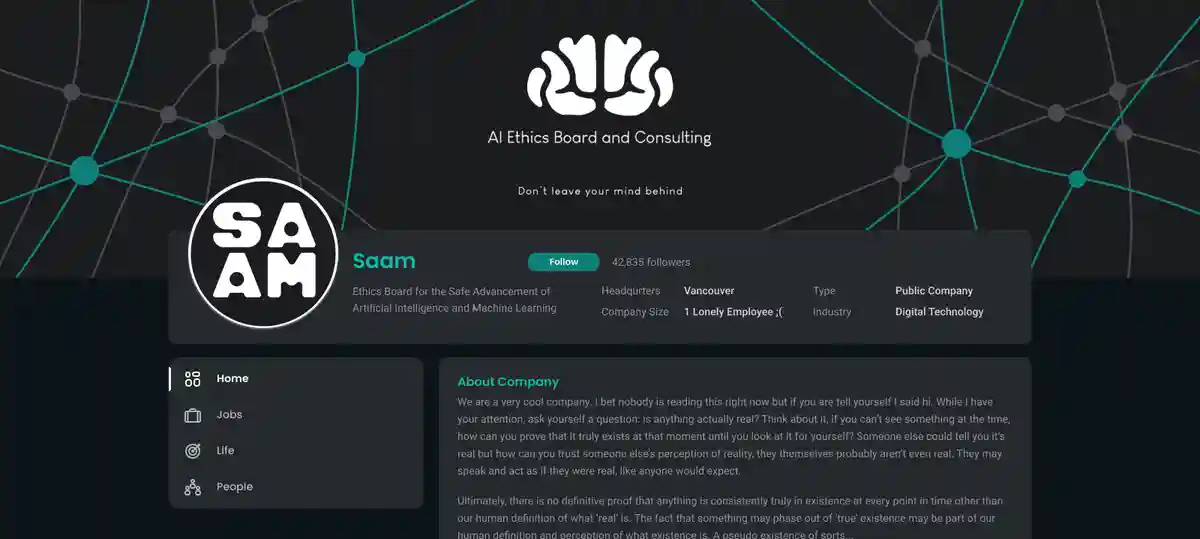
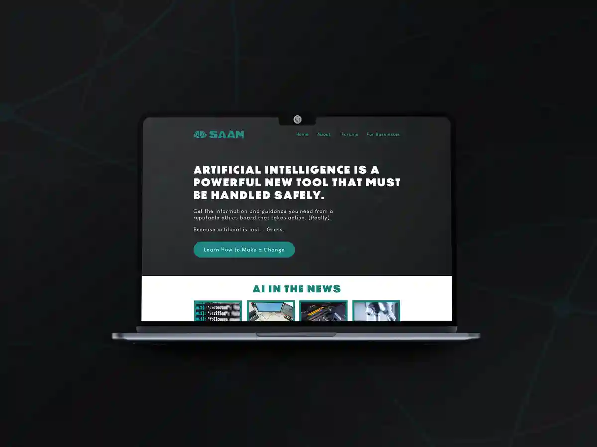
SAAM
"Ethics Committee for the
Safe
Advancement of
AI and
Machine-Learning"
2023
I believe the current developments in AI as of recent have been quite unethical and have largely gone unregulated. It is taking the human aspect out of art, music, teaching, and a multitude of other jobs. At VFS, I took this branding class as an extracurricular to to focus on creating an independent ethics board. Read the brand overview here.
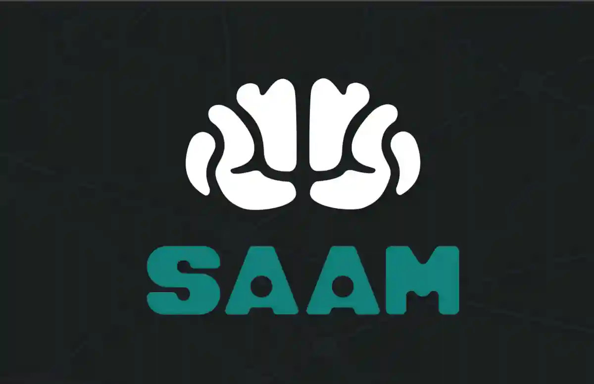
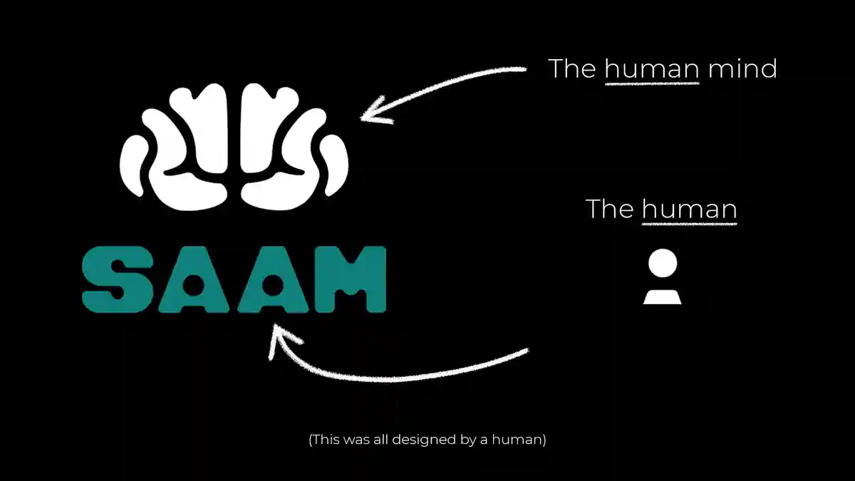
Logo
Arguably one of the most important parts of a brand, especially when it is customer-facing and extra especially when it is human-focused. A logo that conveys the complete idea of the brand while staying simplistic and easy on the eyes is necessary.
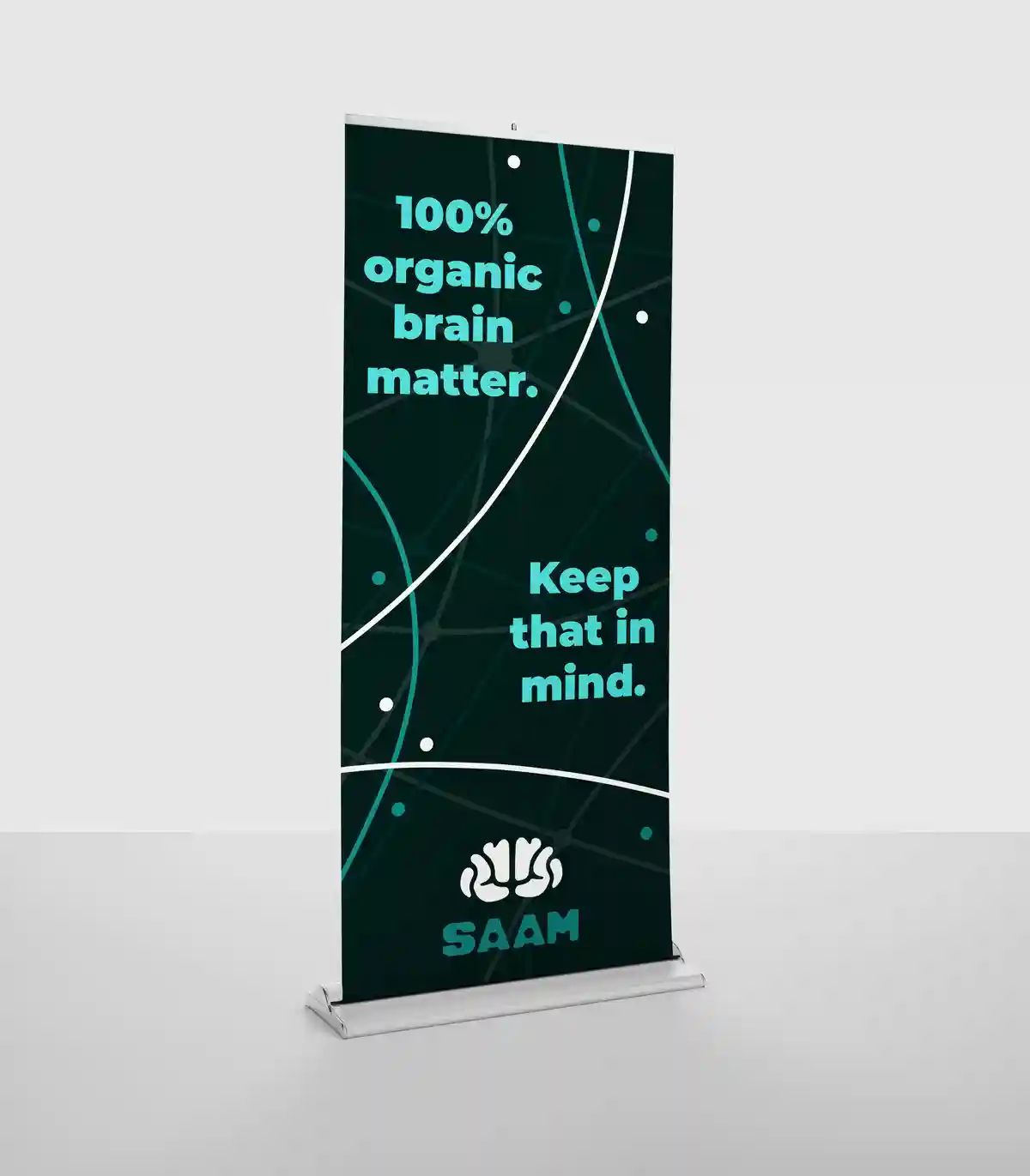
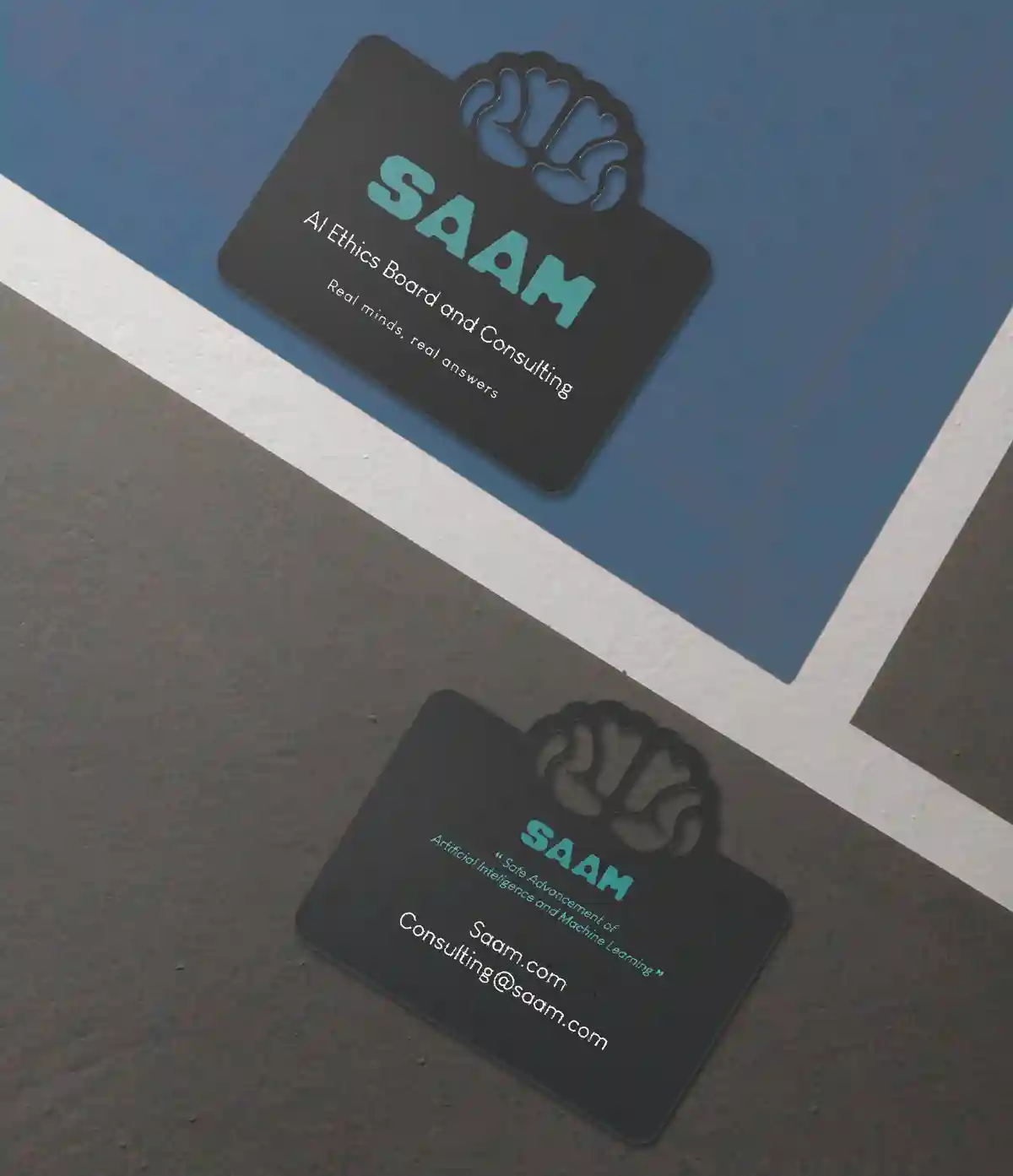
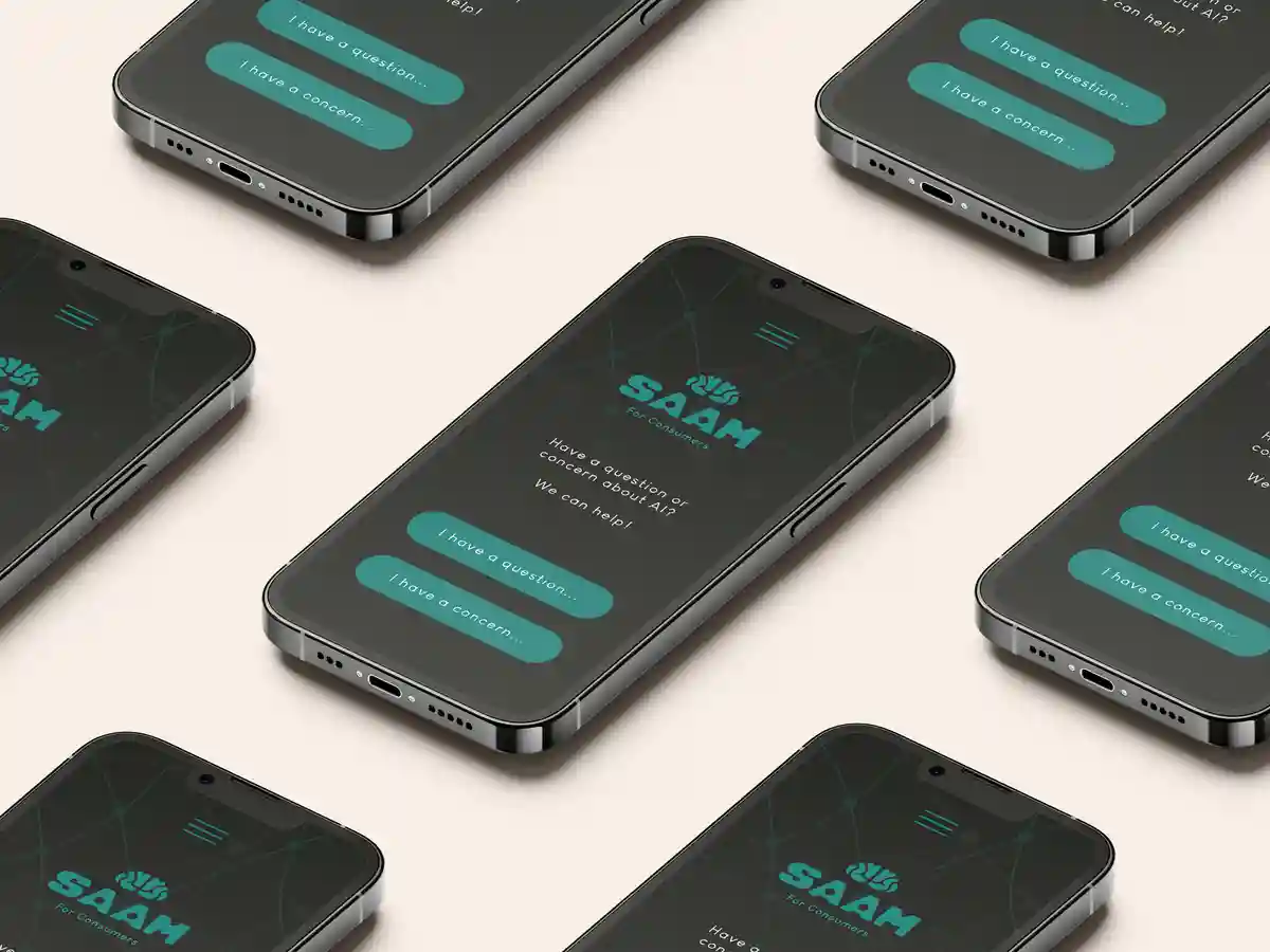
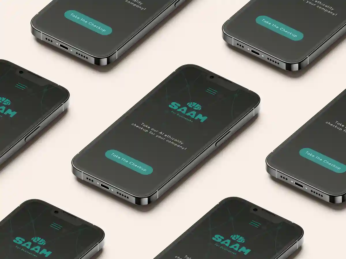
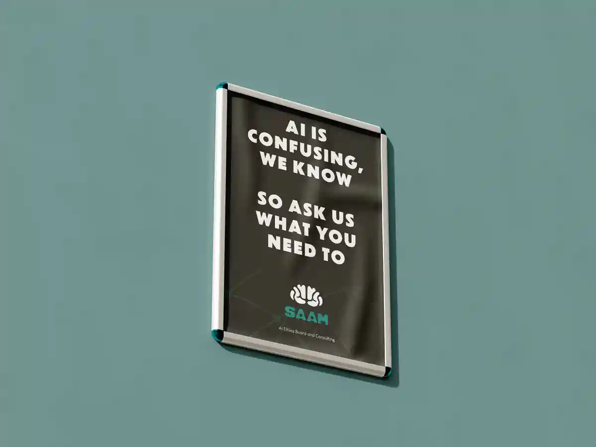
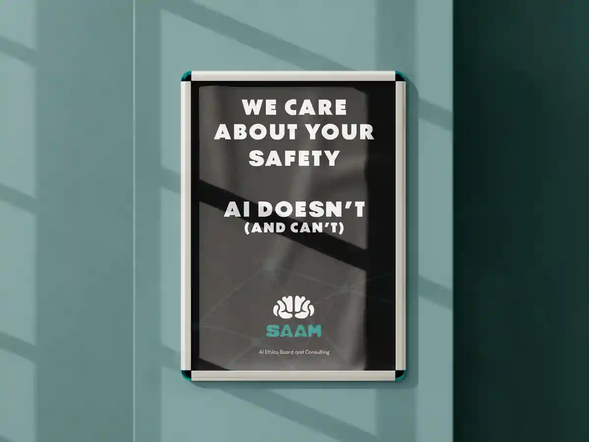

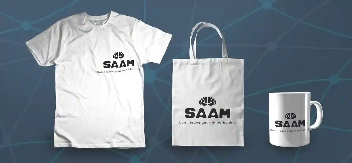
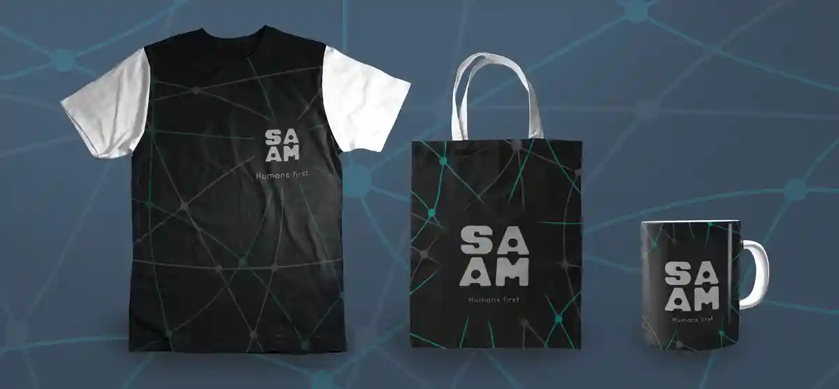
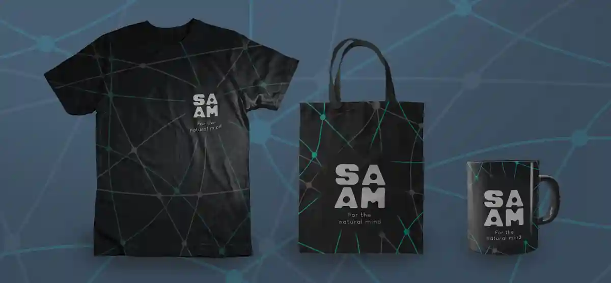
Mockups
What do shareholders like? Pretty pictures! An important part of presenting a brand, rebrand, or new product for consideration, funding applications, etc. is to present the brand professionally and in a way that will get as close to the final look and feel as possible. Mockups are extremely helpful in presenting such concepts effectively before any production begins.
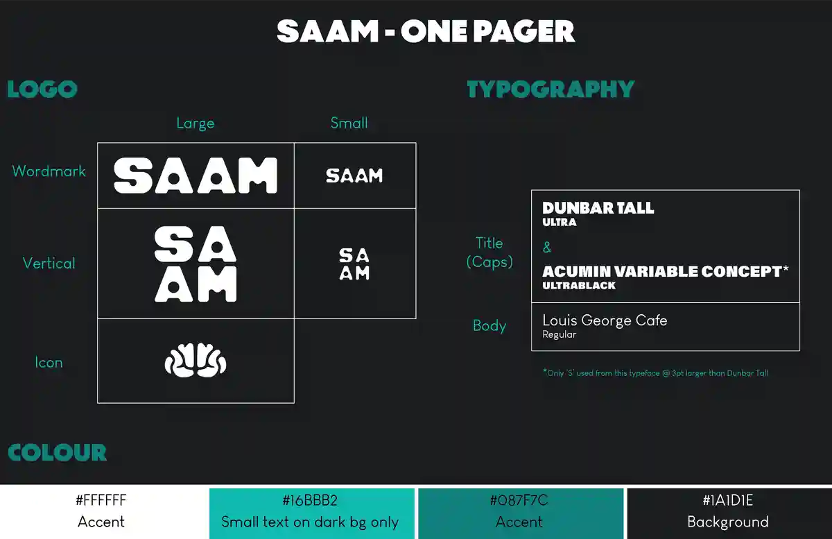
One Pager
Read the brand overview here.
Keeping up a brand's look consistently is extremely important in order for customers to recognize
the brand, and know what to expect without any surprises or irregularities that may make them
lose trust in the brand. Defining that simplistically is ideal for any designer to quickly
understand what mindset they should be in.
(P.S. Ideally, a custom font may be made for a company like this. But in lieu of that, there
is the compromise of combining two typefaces for this project.)
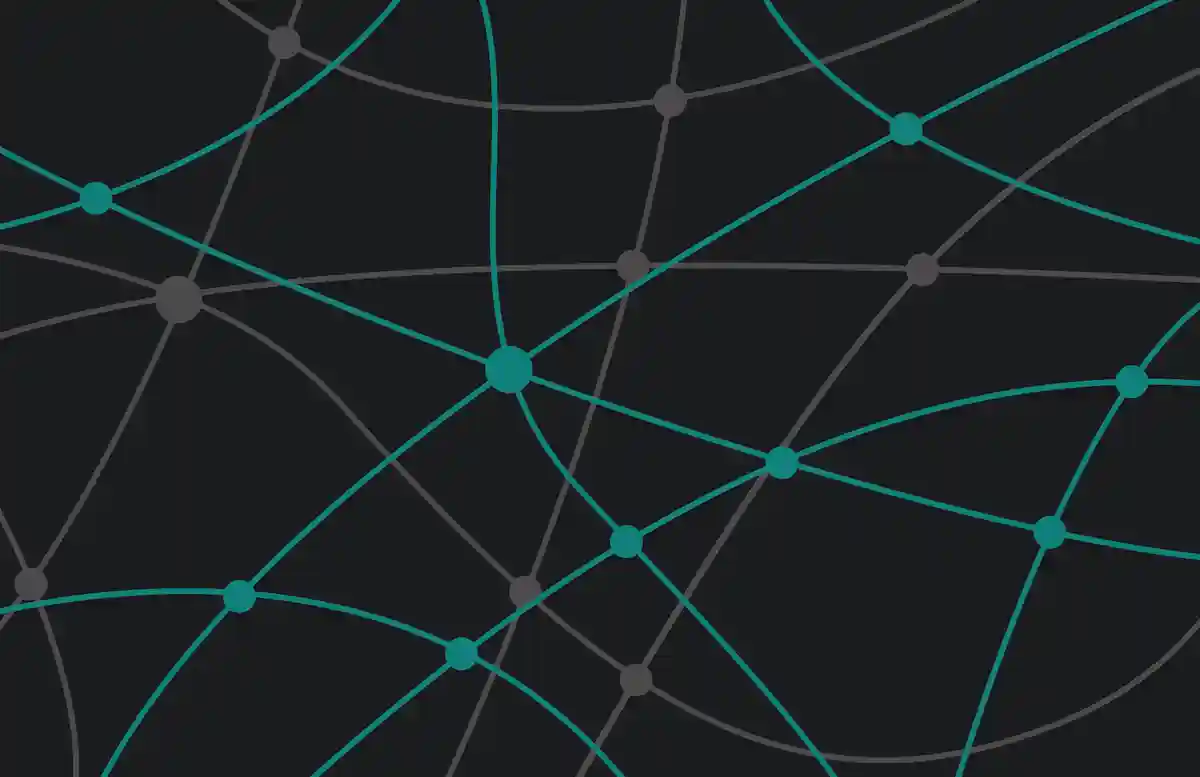
Additional Asset
Something that helps unify a brand like this is an intriguing and consistent visual element representative of the brand. The idea behind this background element was in regards to brain synapses and wires, but made to look a little more digital. In a sense it's like human and machine together, which in this day-and-age is technically already a reality. SAAM was designed to ease that transition and ensure everyone is safe when it comes to this sort of digital integration, and a friendly techy design like this helps get that idea across.
Closing Thoughts
This brand acted as an expression to my concern and distaste in how AI is currently being handled. It was a good outlet for me at the time, and I hope there will be more ethics boards and various committees that come up in the next few years to combat AI's currently unregulated nature. This brand was a good exploration of making something more in-keeping with the modern tech market, and it was fun creating all the assets and graphics to suit that.
See More!
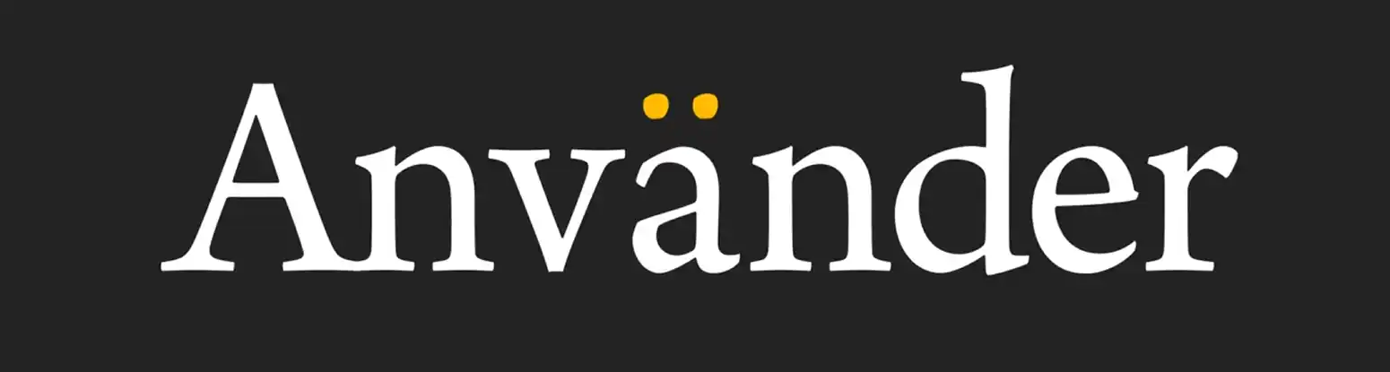
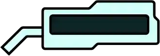
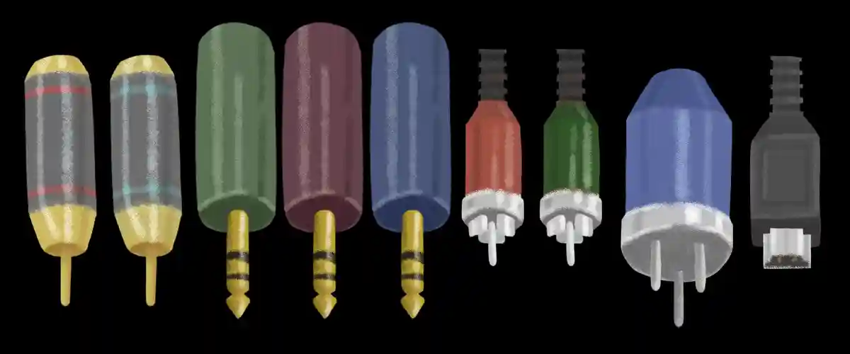
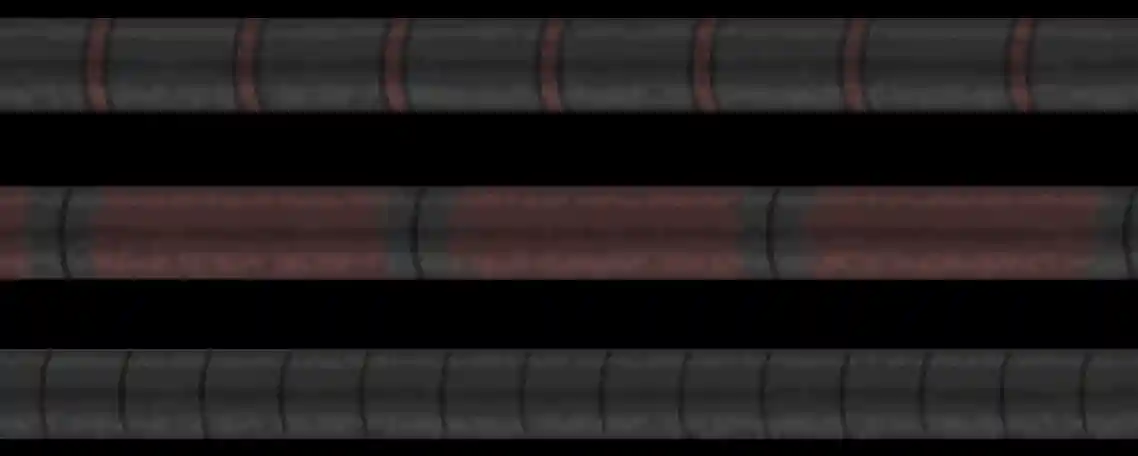
Anvander Headphones
2022
Anvander was a branding project I had in VFS. I've always liked staying true to artist's intentions, and studio-grade headphones convey the artist's original piece as accurately as the artist heard it. So naturally, making an attempt to design a high quality brand for high quality headphones sounded like a fun challenge. Read the brand overview here.
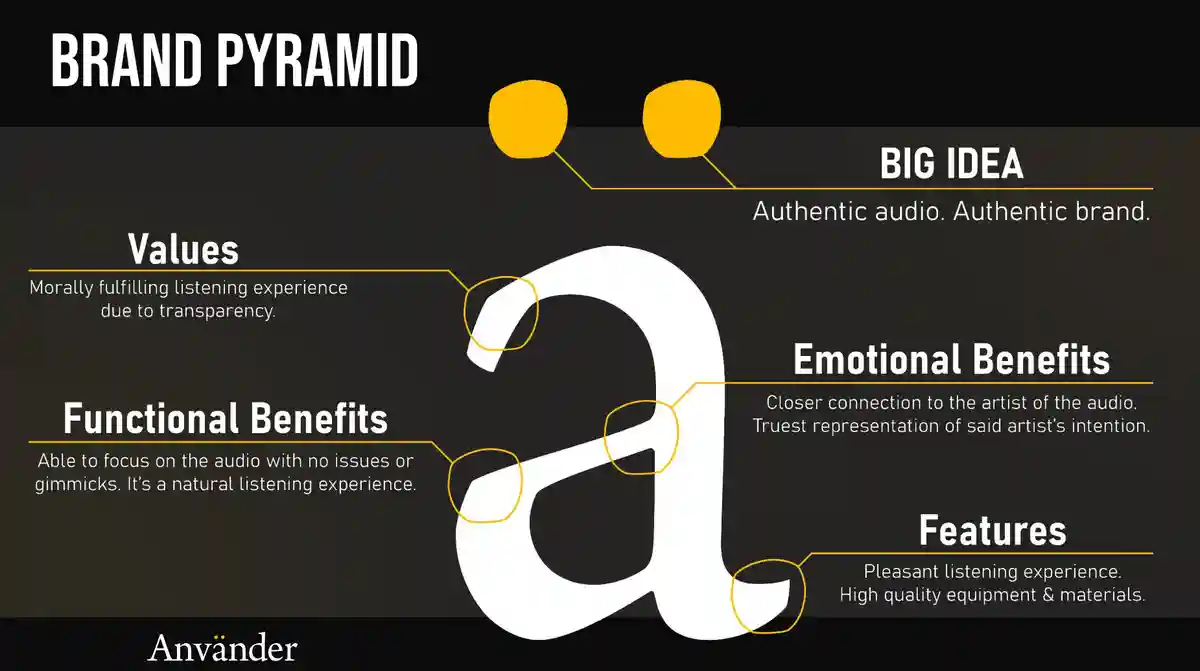
Logo and Brand Pyramid
In order to convey this sense of sleek and high-quality, and in-keeping with other high-end headphone brands, I decided a typeface logo would suit best. I selected a charismatic serif that assisted with that expression. It comes off as classy, but some of the irregularities and edges give it a slight sense of imperfection. Music, without the gimmicks of bass-boosting or other party tricks that other headphone brands might use, should be heard with all the imperfections and irregularities that the artist intended.
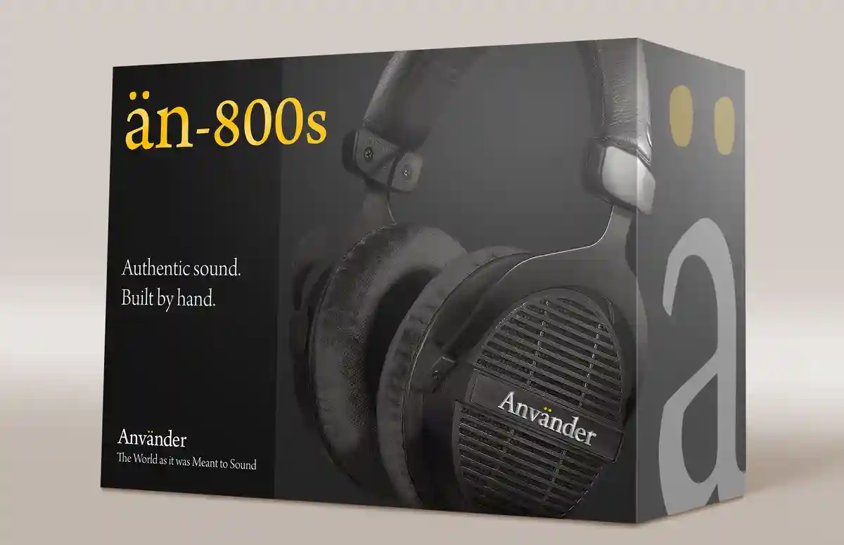
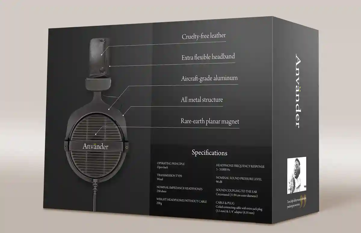
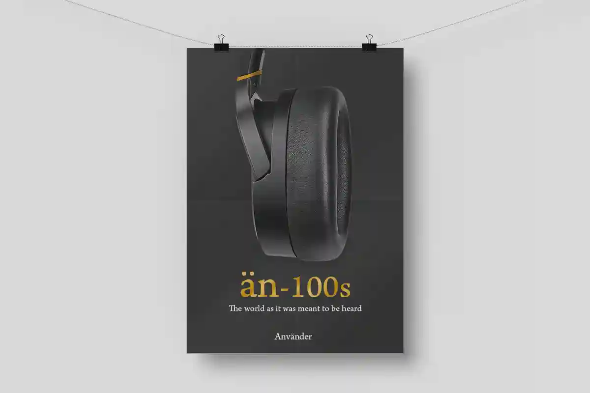
Mockups
Sleek headphone design, packaging and presentation is important in customer trust and pride in their purchases and trusted brands. Knowing the customer is important in any design. We know our target cares about the quality of the headphones on a much deeper level than most. Deeper info and technical language about the headphones such as SPL, impedance, frequency response, etc. are all listed directly on the package, and is something our target audience would understand and appreciate.
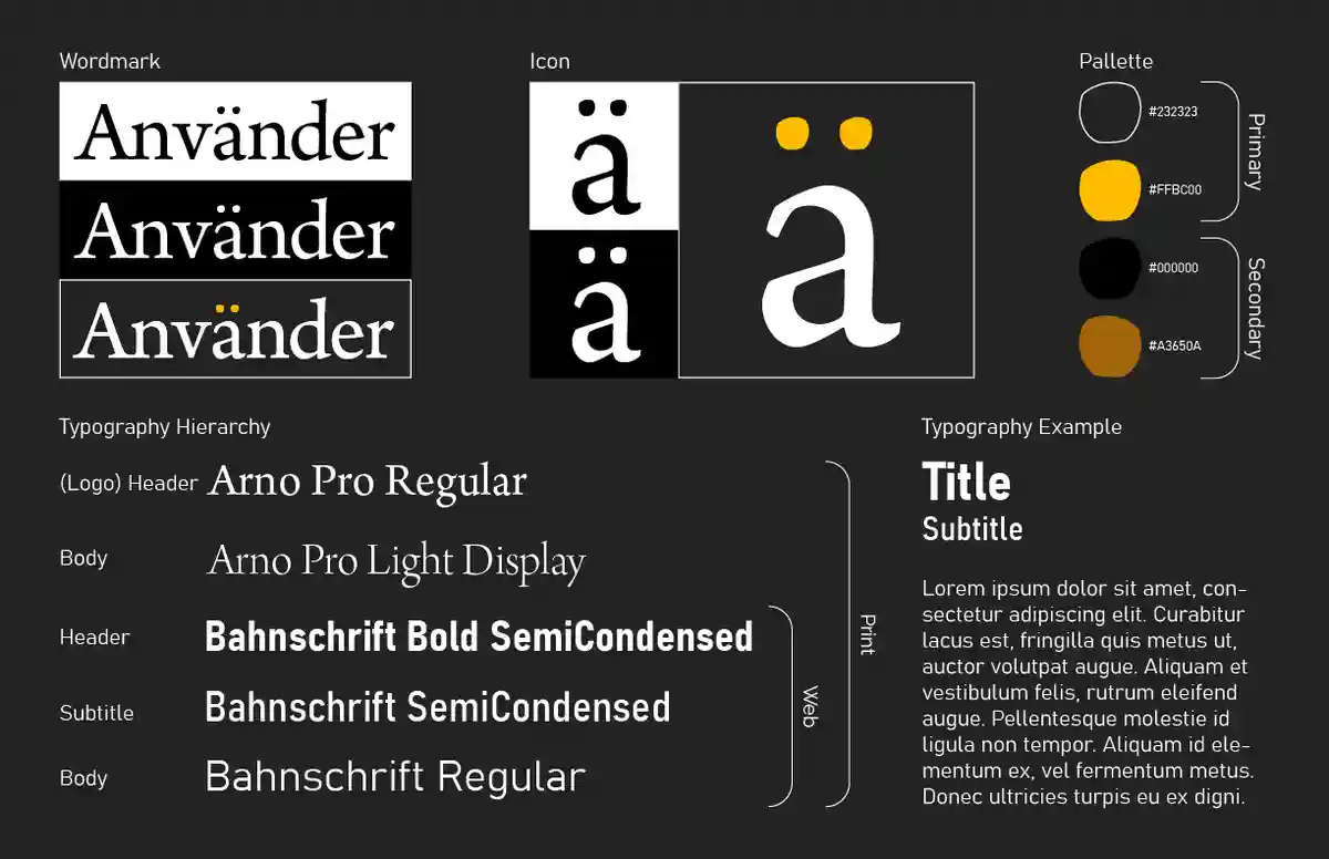
One Pager
Read the brand overview here.
Keeping up a brand's look consistently is extremely important in order for customers to recognize
the brand, and know what to expect without any surprises or irregularities that may make them
lose trust in the brand. Defining that simplistically is ideal for any designer to quickly
understand what mindset they should be in.
Closing Thoughts
I've always respected high-end audio gear very much. This branding project was a way to discover and research a lot more about something I was passionate about. I enjoyed the attempt at designing something that was sleek and professional without ending up with designs that felt overly corporate or clinical in their design.
See More!
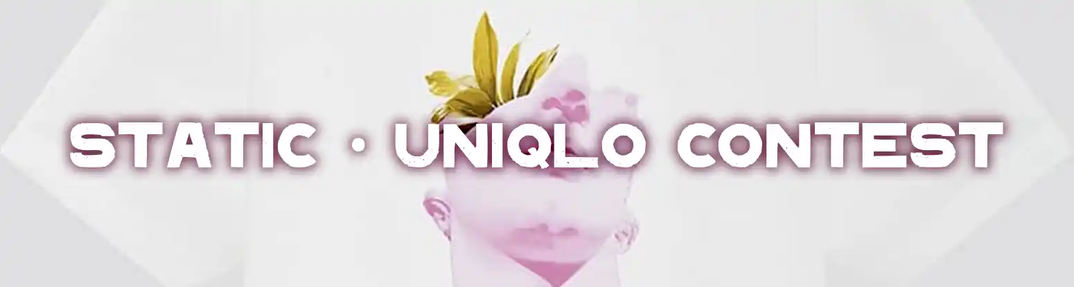
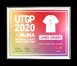
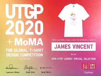
UTGP2020 T-Shirt Contest
2019
I won. My design ended up on the shirt and in the stores of a multi-billion dollar company, sponsored in part by the MoMA, along with so many other talented winners and great designs. This is one of my proudest achievements in design.
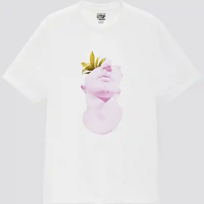
The Shirt
With the theme 'Design Your World' my design, 'Sprout', was pulled from the style of Vaporwave, which was more popular around 2016-2018, and was the root of my love for design. It was really endearing to have a design style so important to me be selected as a winner.
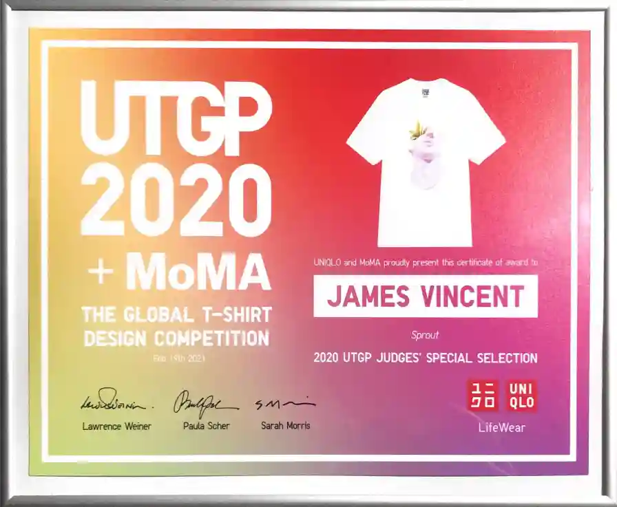
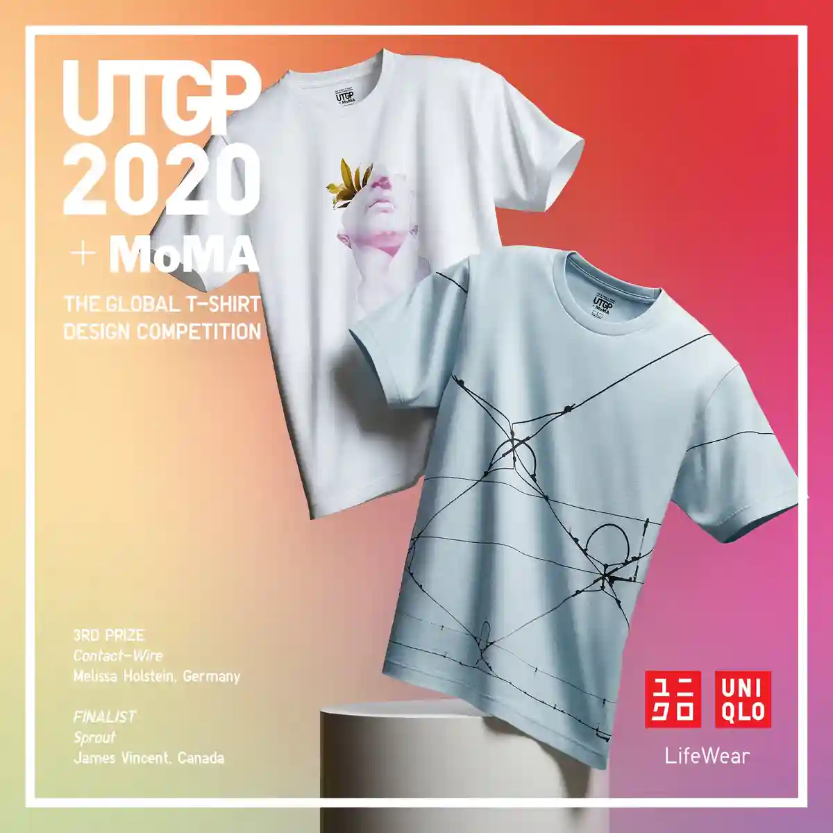
Reward
To see my work in a plaque, and in official company branding, I could not be happier, let alone see my shirt in real stores or on people. If you would allow me to boast some more, I'm also one of the first results when you Google 'UTGP2020'!
Closing Thoughts
I am very grateful to have won such a massive annual t-shirt contest out of thousands of contestants. This was a massive boost for me as a young designer that something was going right, and that I should keep going. I really must thank all the judges, Uniqlo, and the MoMA for the opportunity.
See More!
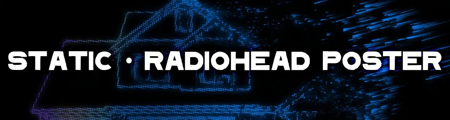
'Radiohead's House of Cards' Poster
2023
At VFS, I was tasked with creating a simplistic poster representing a song or music video. I chose Radiohead's House of Cards.
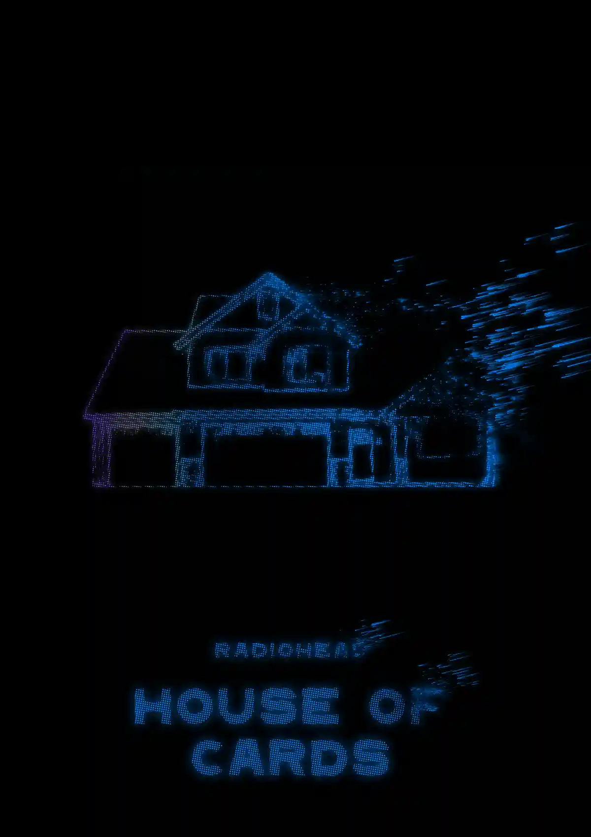
The poster
Taking a look at the music video, I think you will understand the inspiration for this piece. The best way I think I could represent Radiohead's overarching themes in their lyrics, and in this song, was to portray the suburban middle-class house, disintegrating.
Closing Thoughts
This was a fun project to work on. A simple poster for one of my favourite bands, and one of the best songs by them (or in general). I ended up very happy with how it turned out.
See More!
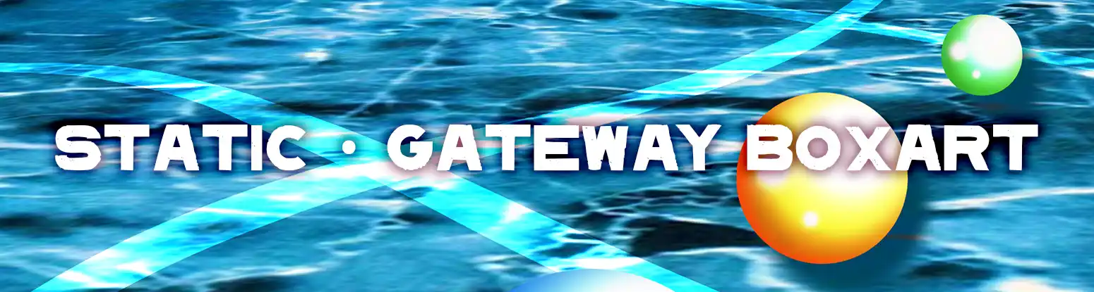
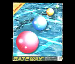
'Gateway Driver Installation Disc' Retro PC Boxart
2020
This is the orignal project that inspired the 'Vivitape' Boxart project in my portfolio. At the time, I thought it would be fun to create a some sort of packaging design. I chose the concept and story, and let all that feed into the design.
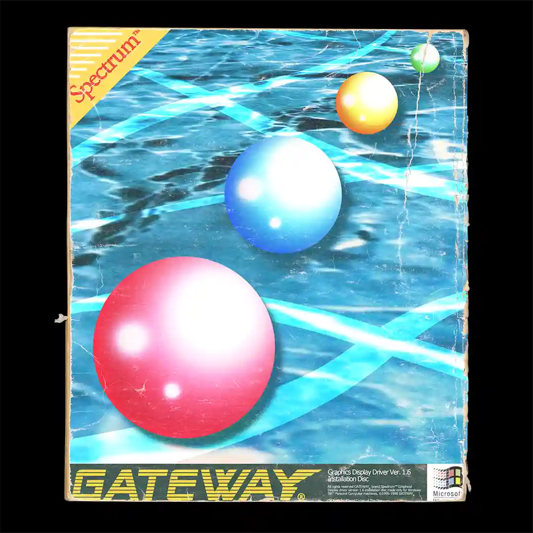
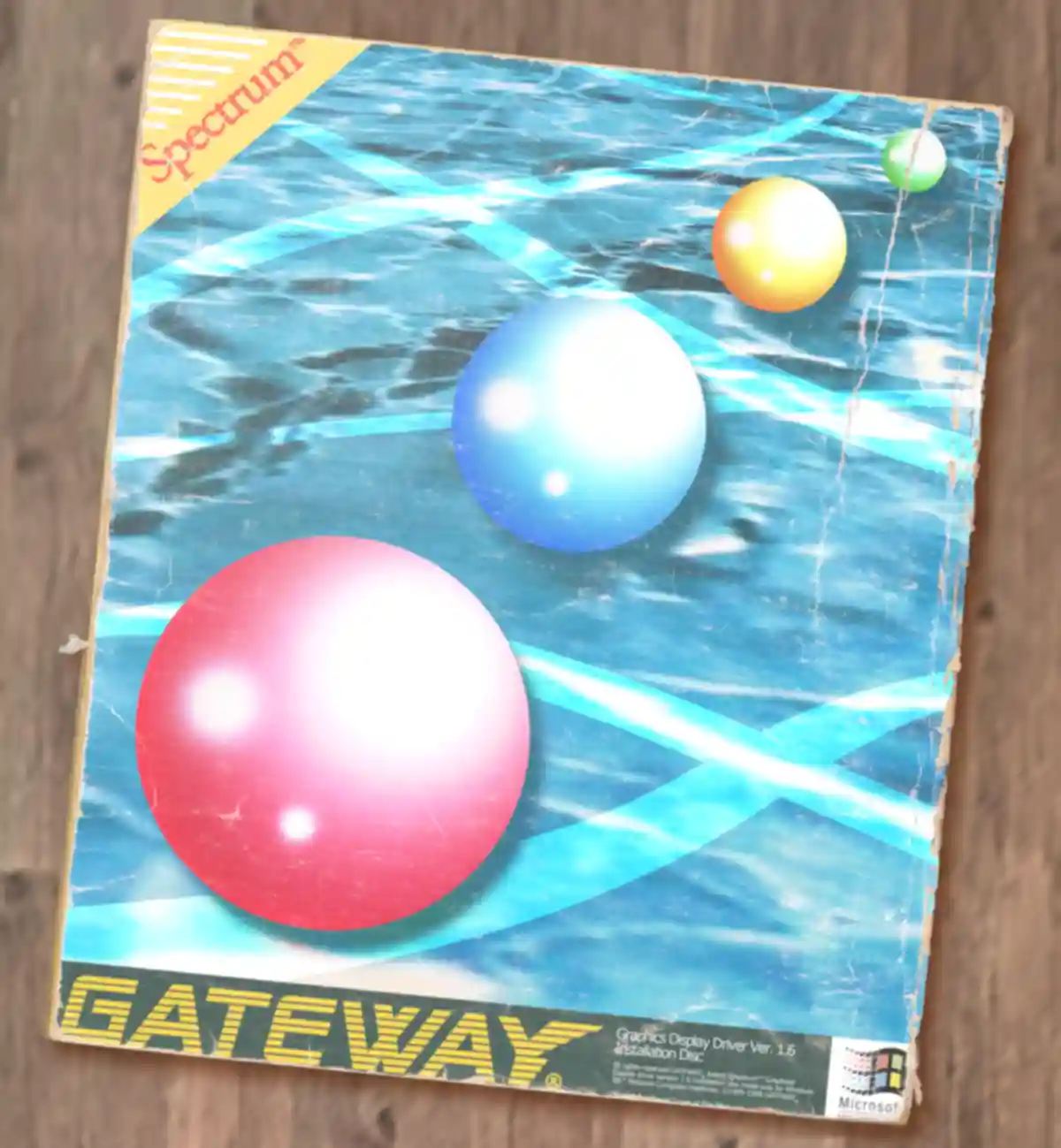
The Design
I did my best to engrain this design in reality with texture and setting. I believe I did a fairly good job, but I know now (with the 'Vivitape' project) that I can do even better.
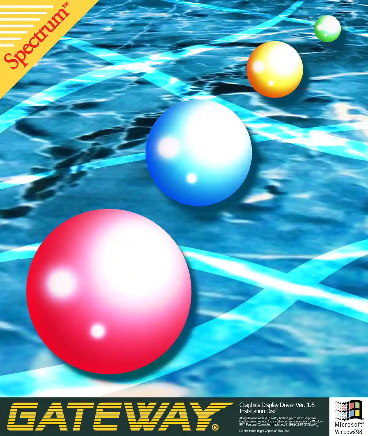
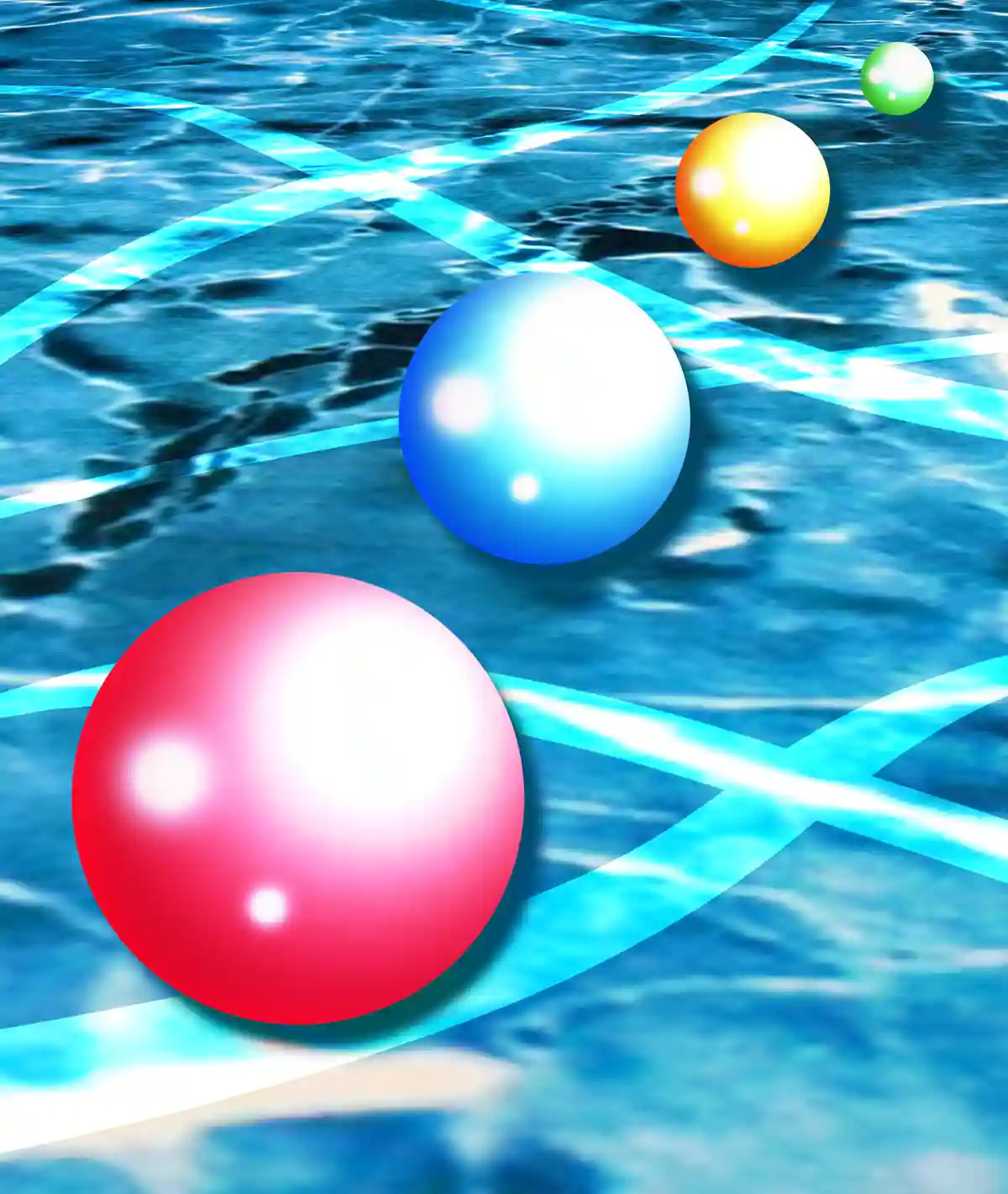
Base Graphics
Before any lovely texturing, honing in believable and meaningful base graphics and copy text is a must for a project like this, INCLUDING a misspelling of 'Illegal'! :D
Closing Thoughts
This project was a lot of fun. I uptook it in my free time around the end of highschool to keep my design eye sharp, and it was one of my favourite pieces for quite awhile.
See More!
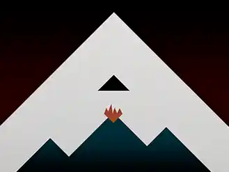
Minimalist Radiohead Album Cover
2023
As a warmup project at VFS, I were tasked with creating a simplistic re-design of an album cover. Naturally, I picked one of the the best albums ever, Kid A by Radiohead.
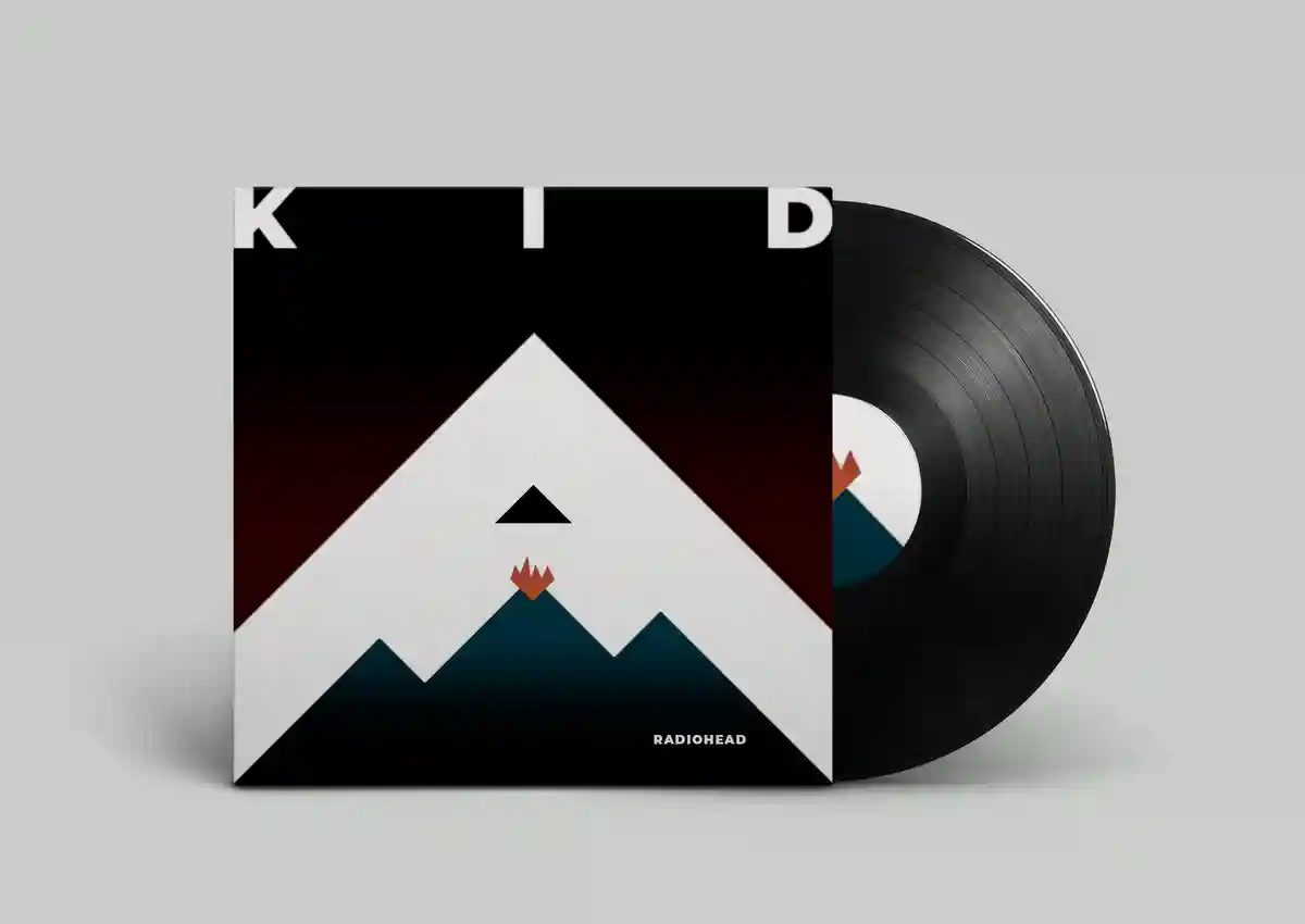
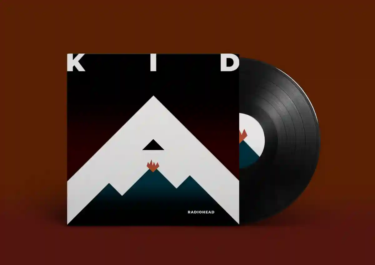
The Redesign
What I thought was important to get across from the original was the isolated, empty sort of feeling, while still keeping inline with the aggressive imagery of mountains and volcanos. Hence, the sharp, asymmetric lines.
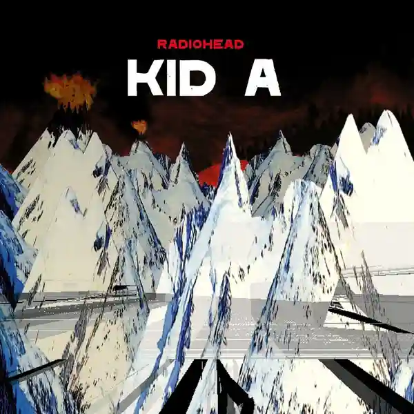
The Original
Closing Thoughts
It was fun thinking about how to represent one of my favourite albums. It really made me think deeper about what the cover's art truly represented. What does a boiled down version of all that meaning look like?
See More!
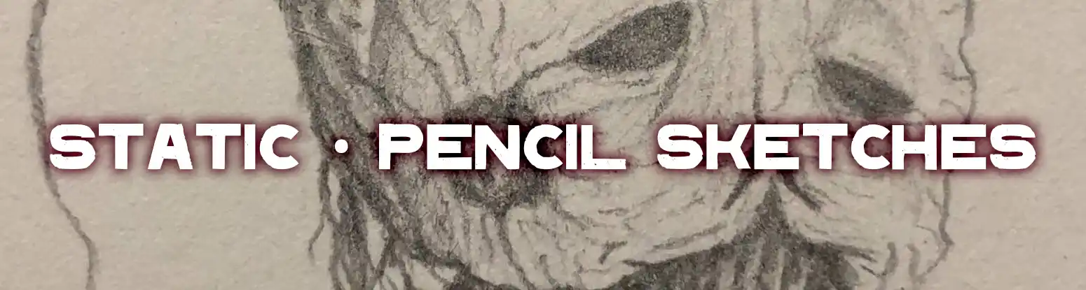
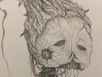
Traditional Media Pencil Sketches
Yes, I can draw too :)
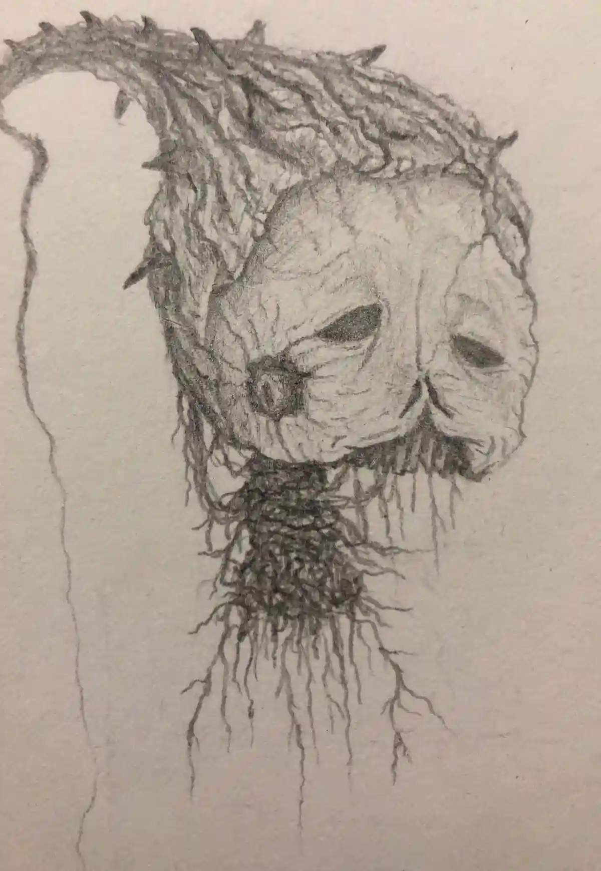
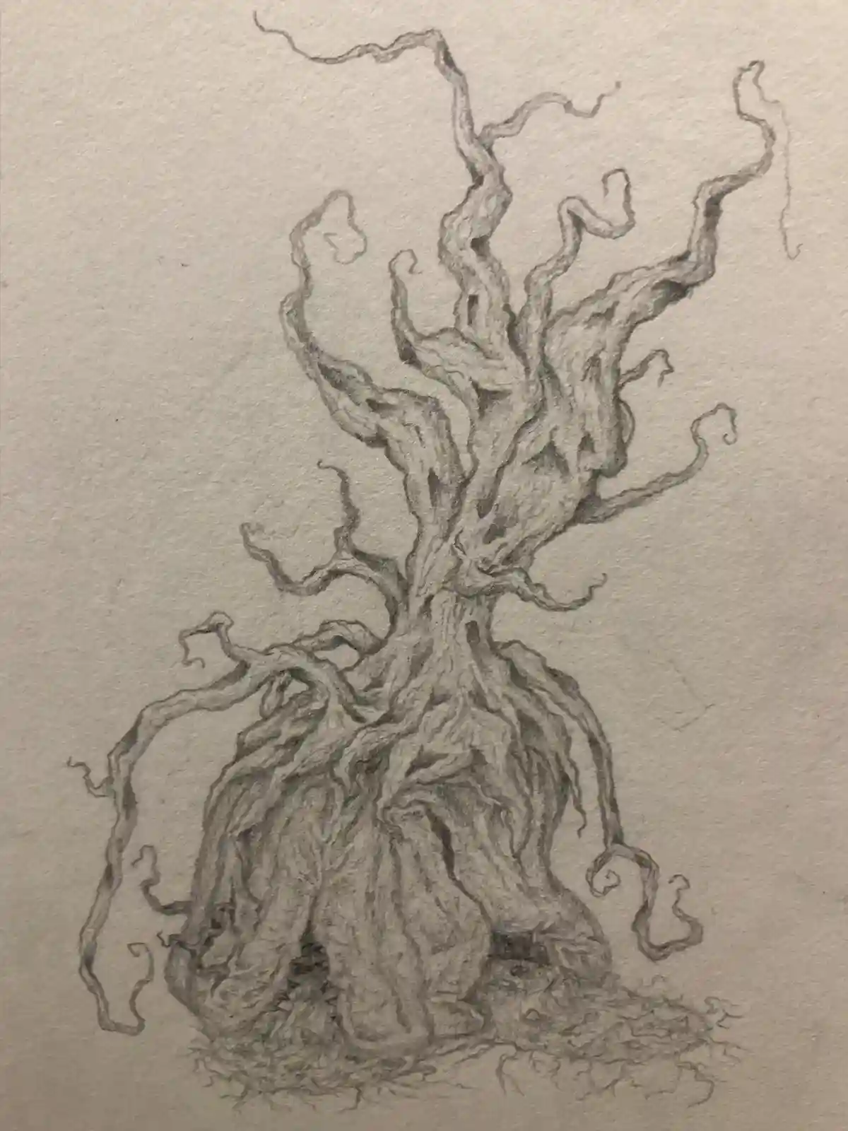
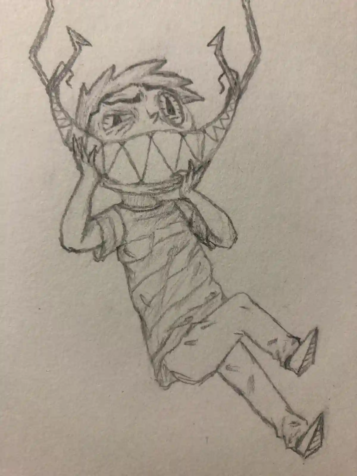
Sketches
I had various ideas and concepts I wanted to get out. The main idea I focused on at this time was surrealism. The initial two designs are anthropomorphized plants, where as the last one fed into a larger story idea I had for a character that I never ended up completing.
Closing Thoughts
I definitely need to draw some more. I have lots of ideas for illustrated books and the sort, it's just a matter of taking them on.
See More!
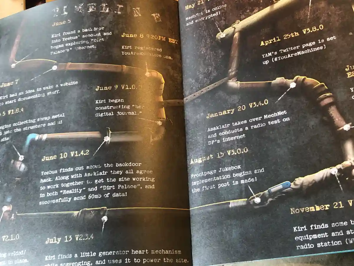
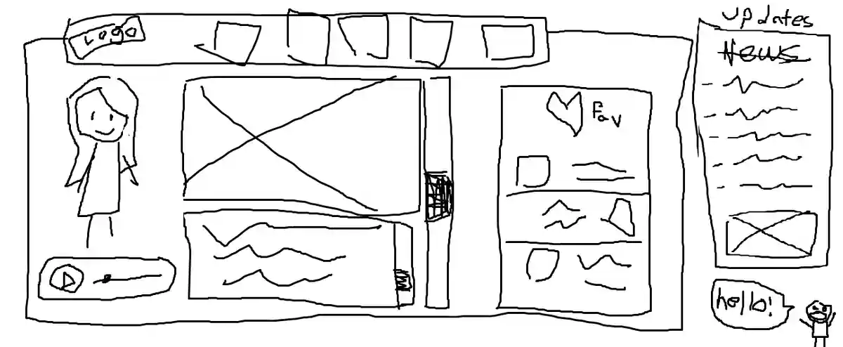
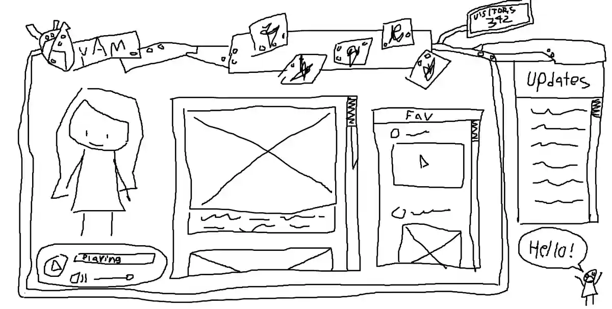
YouAreMachines.com (YAM)
2023-Ongoing

'You Are Machines' is a surreal online art gallery and journal run by a group of friends, including myself, and is absolutely the best project I have ever been a part of! It has been an amazing project for me to learn some web development as well. To be honest, get off my portfolio now and go visit the site here!
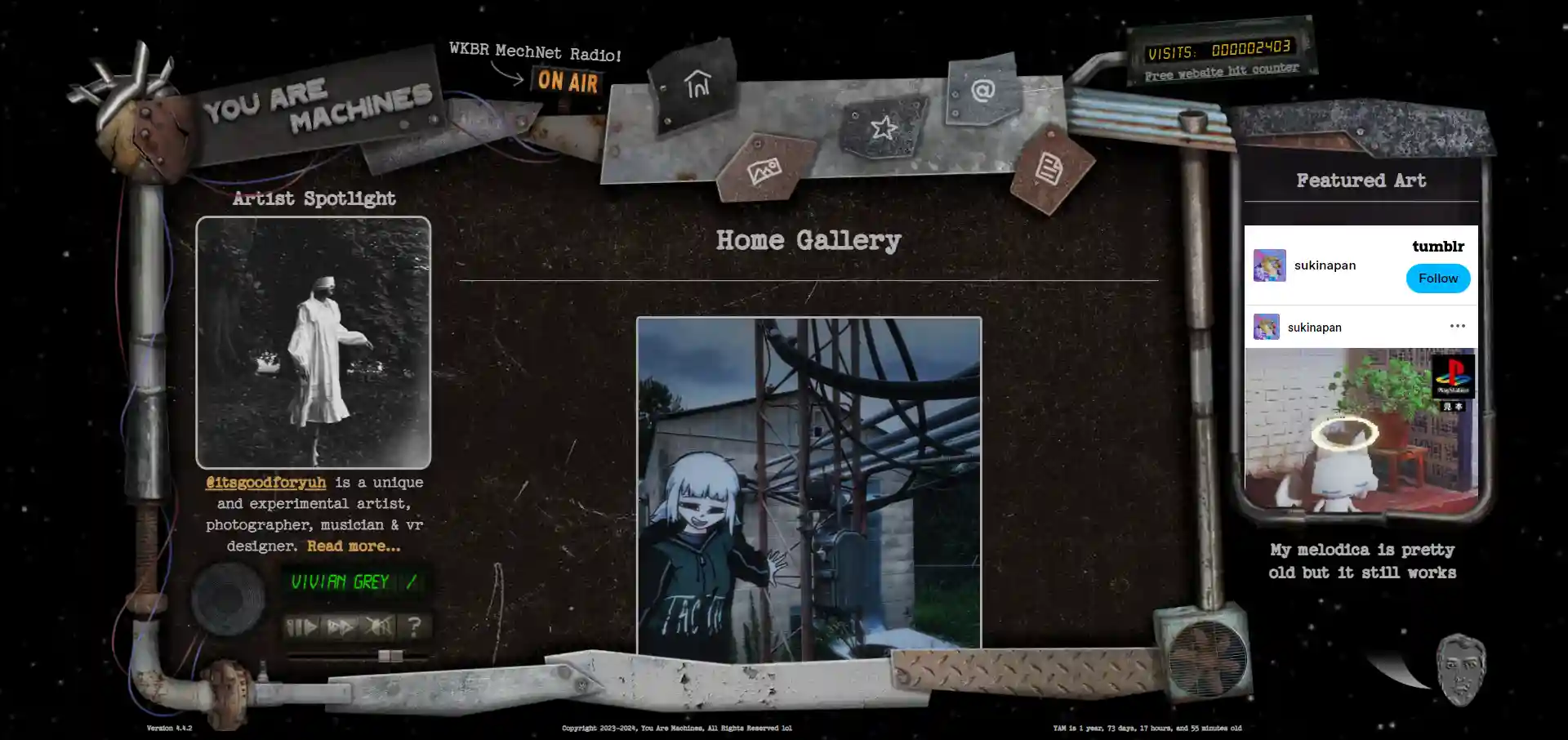
A Year of Work
By this point it has been a little more than a year since the project had started. There were many plans that changed multiple times throughout the process, but most of the site's art direction was inspired by the name 'You Are Machines'.
The Logo
There is some more detail about this project to be found in the 'Mechanical Heart' project page on my portfolio, but the tl;dr of this project is we needed an intriguing logo that was representative of the site and stood out from what was traditional in a logo.

Physical Media
We found it important for us to be able to create some physical media for our site. It was a fun idea to actualize our project in a more real and tangible way. There is some more detail about the magazine to be found in the 'YAMUM' project page on my portfolio.
The Radio Station
Yes, we have a live radio station! Still in its early stages, we have been very passionate about music, and wanted to find some way to curate and share a lot of these wonderful songs and projects. We have been doing our best to get proper credit to utilize these songs as well! Listen to the radio here!
Conceptualization
We had a lot of fun collaborating and coming up with cool ideas for the layout of the site. Something about it was very natural and didn't go through too many iterations to find something we were happy with.
Closing Thoughts
After college, I took quite a long time off of working in any design field. This is why. YAM is a massive project that continues to grow and has no end in sight. We have a lot of plans and are very excited to share them with everyone. It has been great working with a dedicated and passionate team.
See More!
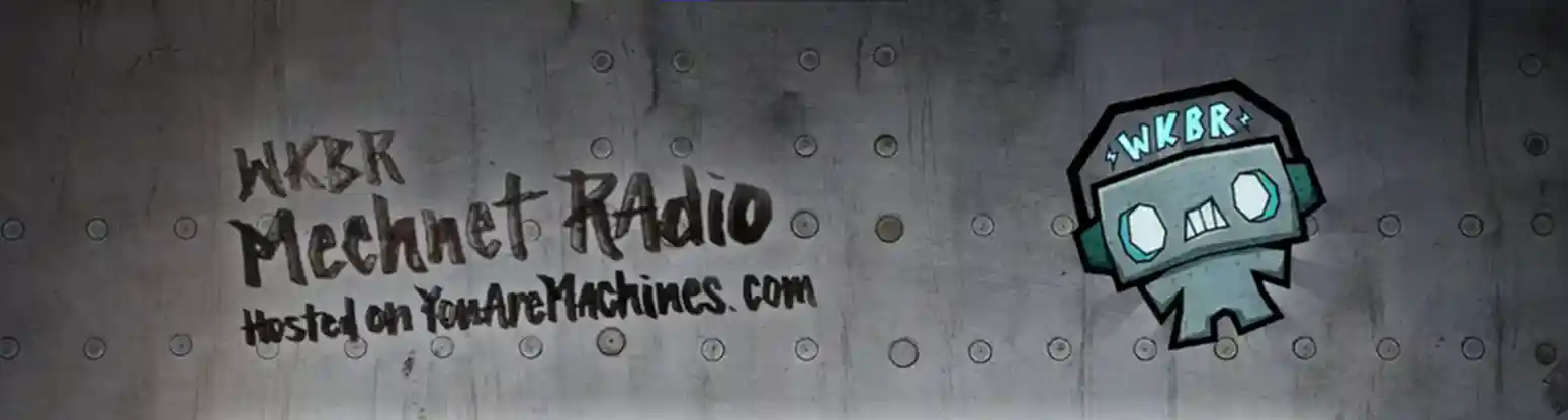
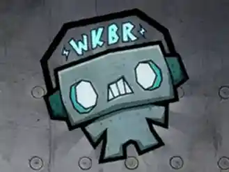
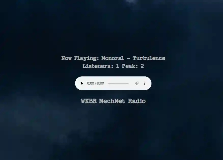
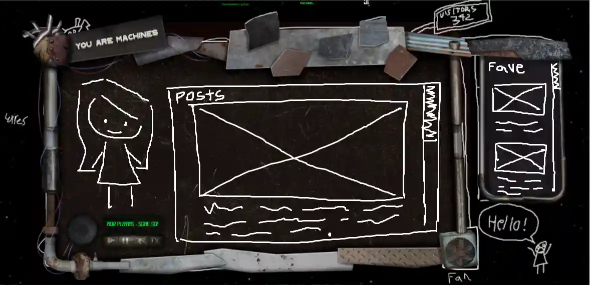
WKBR MechNet Radio
2025-Ongoing
WKBR MechNet Radio is a LIVE online radio station hosted by YouAreMachines.com. It's primarily comprised of electronic music, but various indie subgenres are sprinkled in. Our goal with MechNet is to share relatively unknown or (usually) smaller artists through a (somewhat) authentic radio experience. Check out MechNet here!
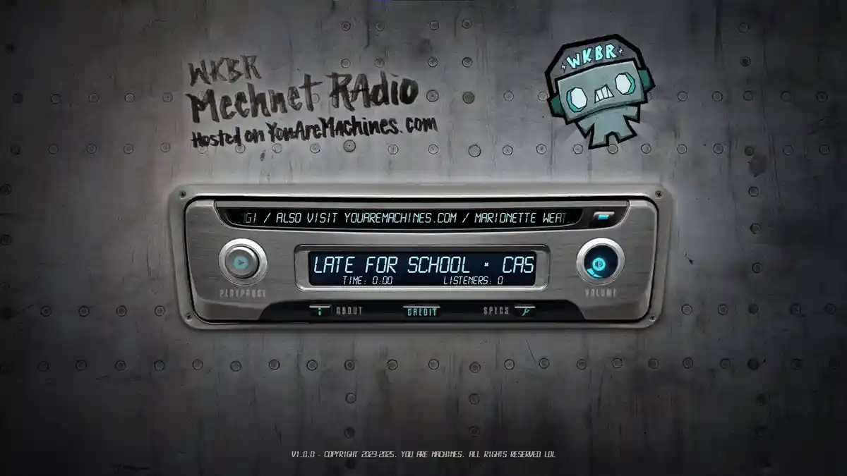
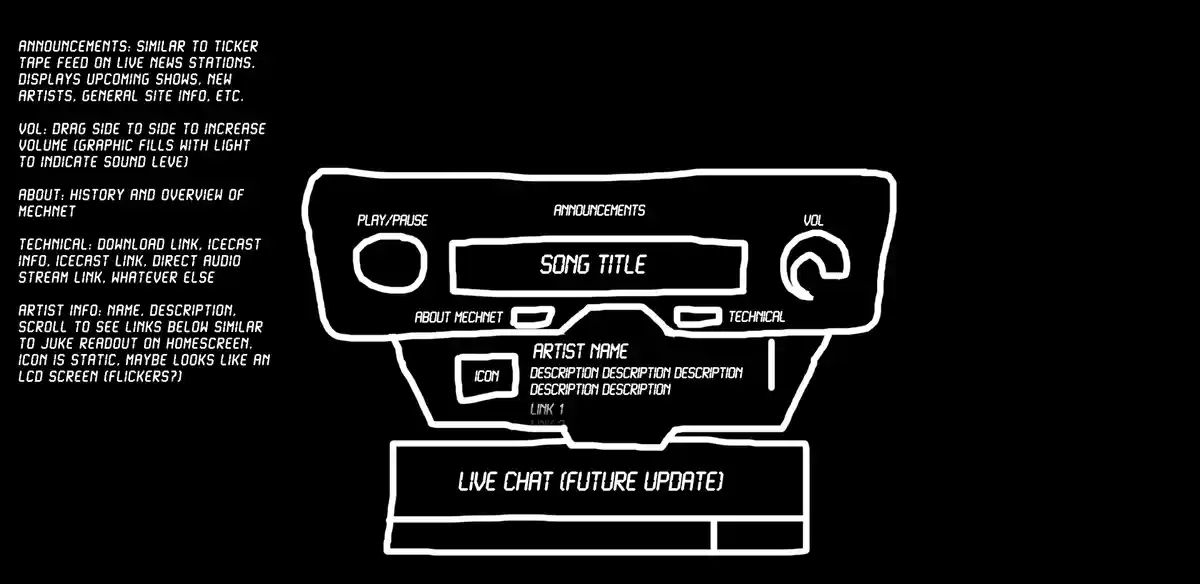
The User Interface
The UI is an important part of blah blah blah. I wanted to make the UI very graphical and engaging. We had one of the site members find a suitable, physical radio element, which was adapted for the web. This assists in our goal of making MechNet as authentic of a real radio experience as you could get online.
Wilbr
A mascot can be an important part of any project. Our mascot Wilbr also serves as MechNet's logo. Wilbr's presence on MechNet allows the user to feel like they always have company. This calms the user down, especially in cases where the music becomes very loud and scary.
Station Sweepers and IDs
You know when you're listening to the radio and they interrupt your favourite song with the station's name? Well that's called a station ID, which fully identifies the station as per FCC and other regulations. Sweepers are similar, but may not fully identify the station. In our goal of creating an authentic radio experience, we decided to create sweepers of our own, reminding people who the boss dog is. These three audio files are the IDs I was responsible for.
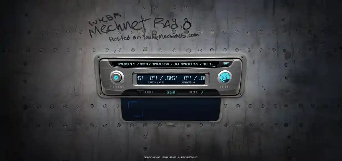
Drafting
A good UI starts with a good draft. Taking our physical radio element, I traced over it and wittled it down into something practical and usable, keeping in mind how I would implement it programmatically through Javascript, HTML and CSS along the way.
Humble Beginnings
MechNet used to look like this... For over a year... We're so sorry......
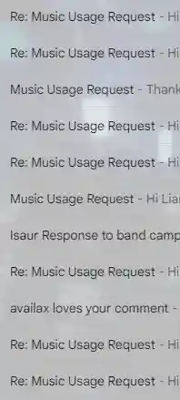
Requests
When it comes to the actual content on MechNet, we try our best to reach out to the bulk of
the musicians we feature on the station, especially when it comes to the smaller artists.
It's important to have proper clearance to utilize copywritten material in any media.
However, we are not monetized, and (at this point),
still quite small, so when it comes to playing a song by, say, Daft Punk, we can pretty
safely get away with it (until we get our first C&D order in our inbox...)
Again,
We are so so so very sorry...
Closing Thoughts
MechNet has been a rewarding project to be a part of. It was the source of a few of our websites first dedicated fans. It also has been a really amazing reason to reach out to musicians we actually listen to and talk to them. As time goes on, MechNet will become more and more fleshed out, more professional and more awesomer.
See More!
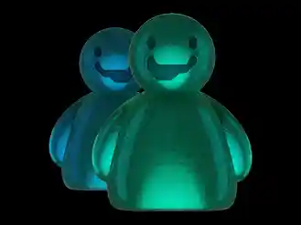
Users' Playground Forums
2025
UsersPlayground.com is a sister site to YouAreMachines.com. Its intent is to be a place various users of YAM can play games and interact with other users. Currently, it is only the host of the Users' Playground (UP) Forums. The forum api we utilize is Simple Machines Forums, and the base theme we styled the UI on top of is Purple Haze by 'TwitchisMental'.
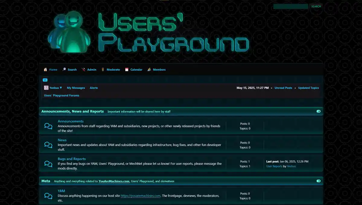
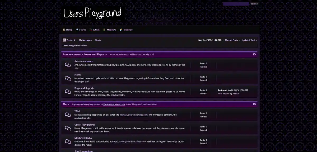
The Forum UI
The primary inspiration for the forum's look comes from the Frutiger Aero aesthetic that was popular throughout 2000s tech design, and has been having a resurgence in recent years. It's typically very glossy, colourful, and clean. We wanted to standout just slightly, so we've skewed the aesthetic to be a little darker, which is more in-line with our primary site, YouAreMachines.com.
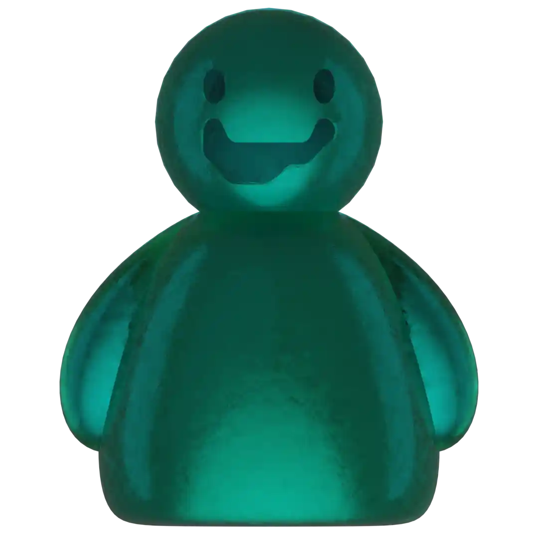
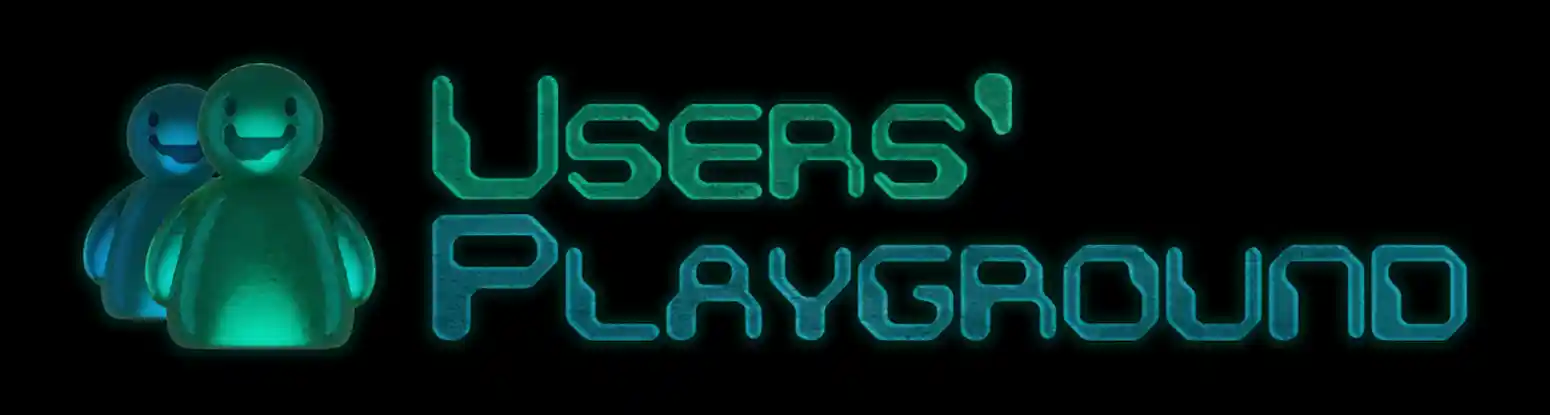
The Logo
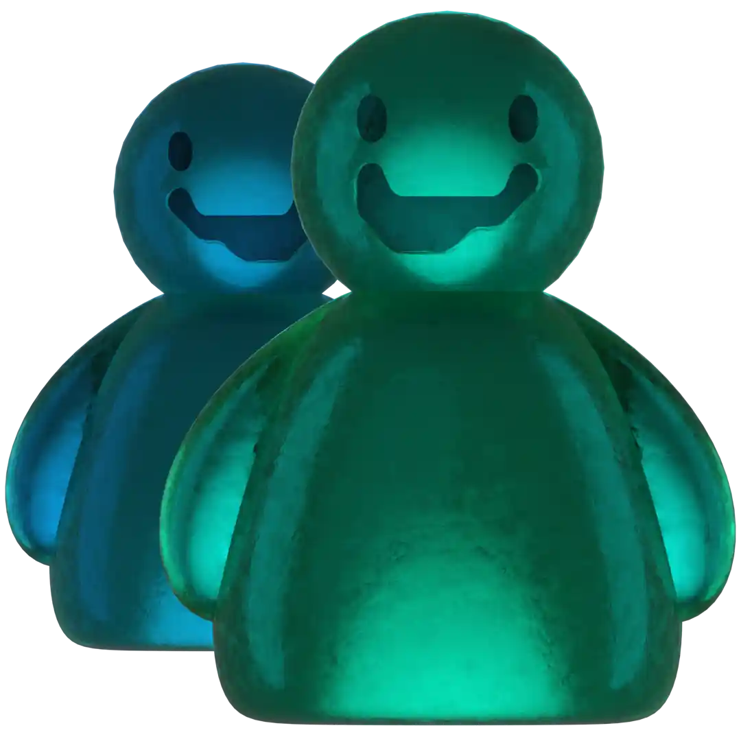
The logo is obviously based off the classic MSN Messenger gummy characters. When we were considering what a logo for "Users' Playground" would look like, we thought focusing on the idea of the 'user' would be a solid plan. It wasn't too long before we came to the conclusion, frutiger aero and the little gummy users that typically came along with the style were a good reference point. The characters were made in Blender and the rest was polished in Photoshop.
Closing Thoughts
We have a lot of plans still to come to fruition with Users' Playground, and the forums. Most notably advertising the forums in the months to come. Getting this section of the site polished up enough to be presentable was a very satisfying experience, and we're very excited to see what its future looks like!
See More!
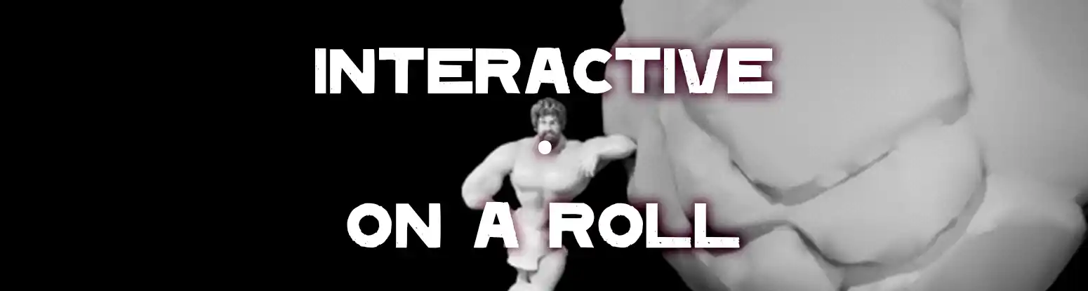
'On A Roll' Sysiphus Game Animation Assets
2023

"Animate 20 clips on a 3D rig in Maya in about two weeks with no prior experience in the
program." "Okay, sure."
Despite not knowing Maya, I know how to animate, and I did my best
to pick up the program and get some character animations done for this (shelved) project.
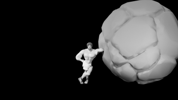
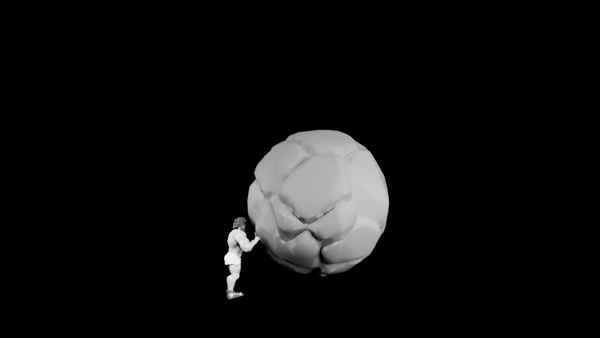
Some Animations
I've picked my favourite animations of the 19 or so that I ended up doing. The title/idle screen (first example) being my favourite, as it was the most personalized. A lot of these were left in a sort of semi-refined state, some better-off than others. (For the last example, he was meant to be hit by lightning then run over by the boulder).
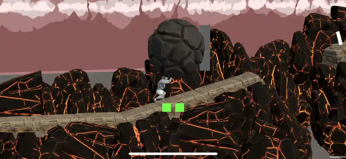
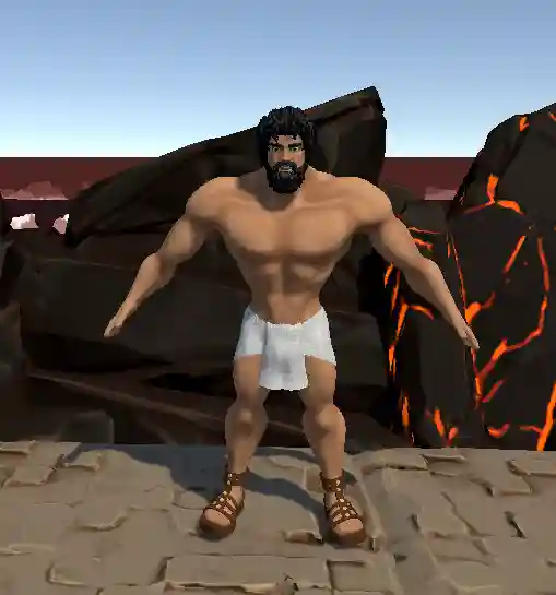
Some Context
This project was playing off the idea of Sysiphus and his boulder. It was meant as a mobile high-score runner, and I had to keep that small screen in mind when animating, meaning I had to be obvious and big with my motion.
Closing Thoughts
Learning a new program in such a short time with so many required deliverables (20+ if I continued working), it was a challenge to say the least. But I was excited to have been offered the position and explore some new areas of animation, with some real motivation and pressure behind it.
See More!
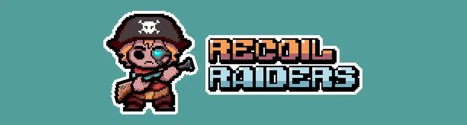
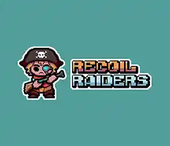
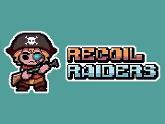
'Recoil Raiders' 7DRL Challenge 2024 Game Jam Assets
2024


One of the more 'official' game jam groups I joined, I had a few weeks (more like days) to get comfortable with importing my assets into Unity, as well as work on the assets themselves and their mockups. It did not turn out well... Play the game here and see for yourself!
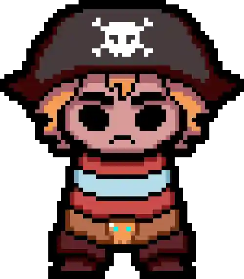
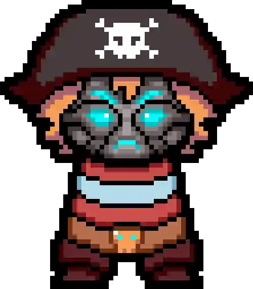
Logo and Characters
I was responsible for all the character designs in the game, as well as the title. They came out pretty nice in my opinion, but I've included only my favourite pieces here.
Mockups
Communicating my animated vision to the programmers and other integrators definitely requires some understandable mockups. We had a 3/4 topdown style, with a 2D/3D (2.5D?) effect, so the sprites needed some love to respect the cameras angle and 3D environment, but still suit their 2D style.
Closing Thoughts
In my opinion, the project was not particularly a success. With a team of about 7, and it being the first time we had all worked together, there was a lot for everyone to manage, and not such a clear direction with everyone wanting their ideas heard. There was lots of miscommunication within the artist's department, and lead to a strange mismatch. The idea from the start was more pixel/voxel art, but the environment ended up stylized-realistic. Some people were difficult to work with and that's ok, sometimes you have to get along with people like that and do the best work you can. Overall, I am glad I had some experience in a 'when it goes wrong' project, to learn from and move forward.
See More!
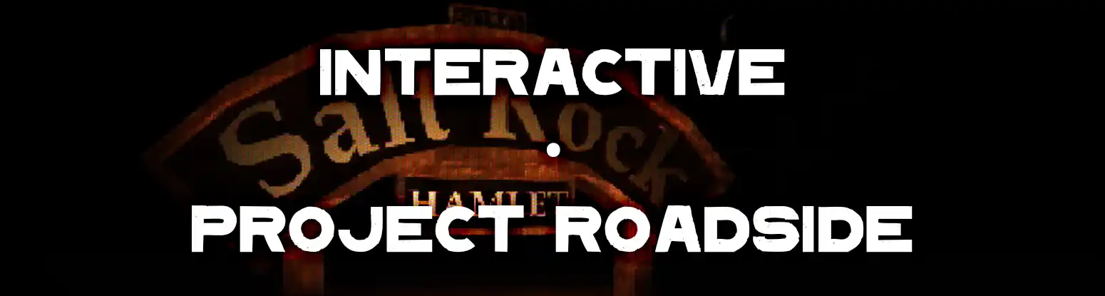
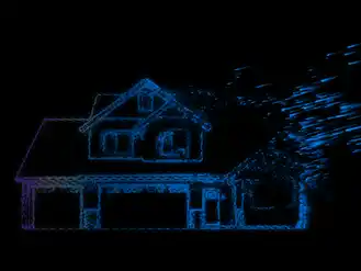
'Project Roadside' Horror Game Assets
2021
Your truck breaks down in the middle of the night near a rural mining town. The lights are on but nobody's home. Where has everyone gone?
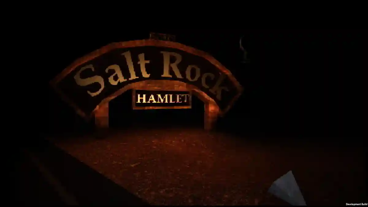
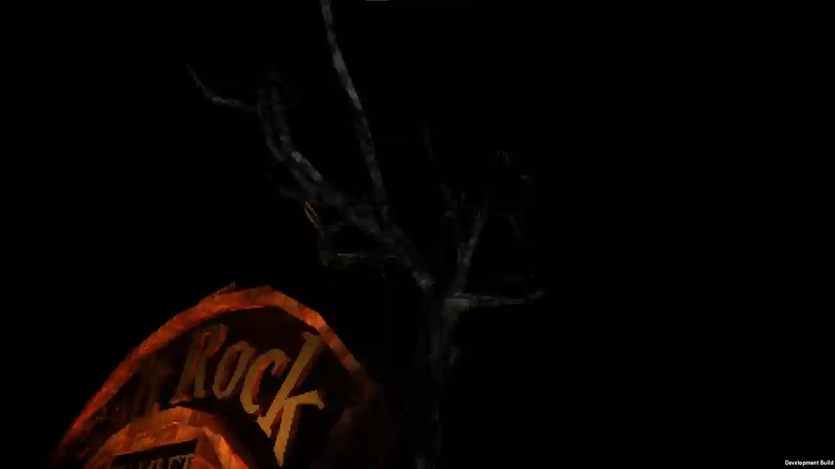
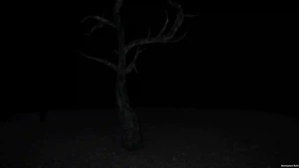
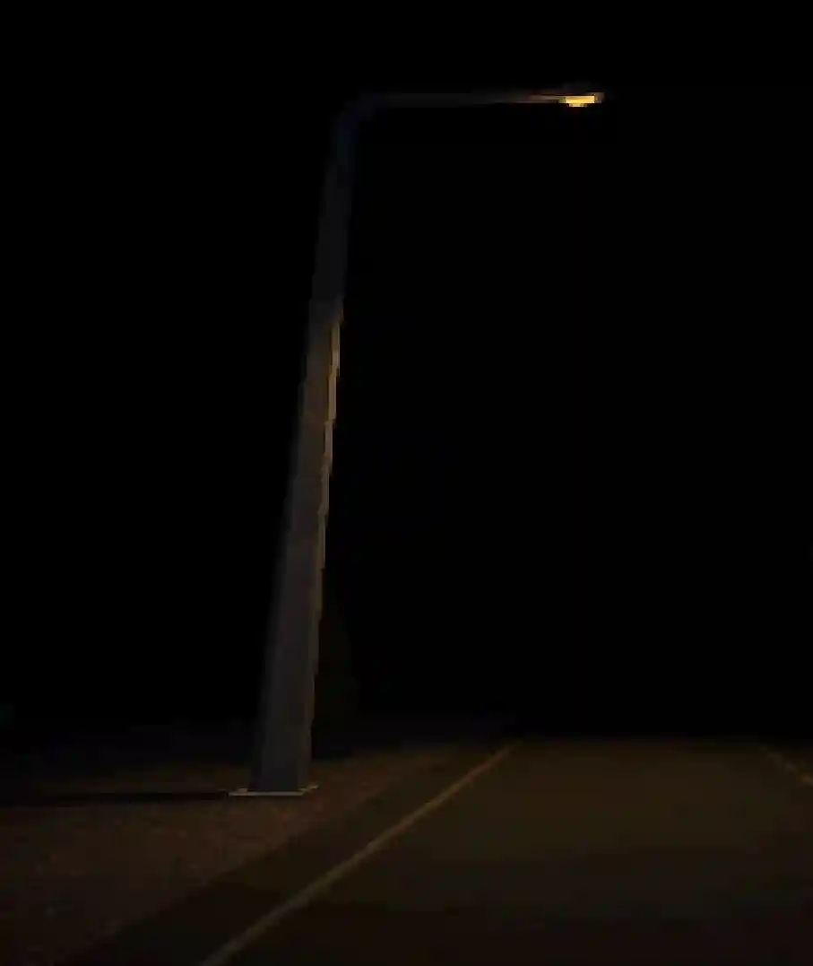
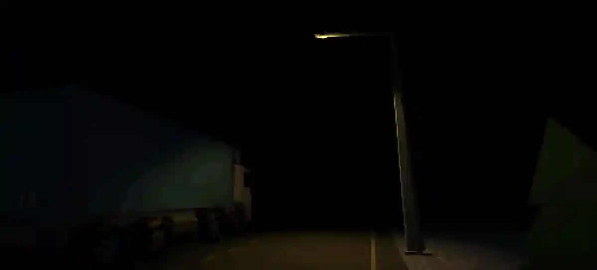
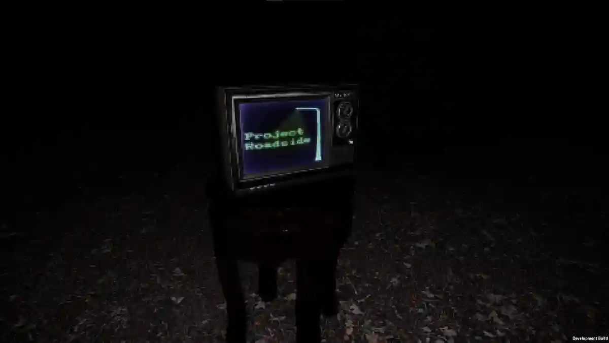
Asset Showcase
I was responsible for a few key 3D elements and mechanics, and had lots more planned before we put this game on the shelf. (I did not create the truck or television. My friend was responsible for the shader effects, level implementation and programming)
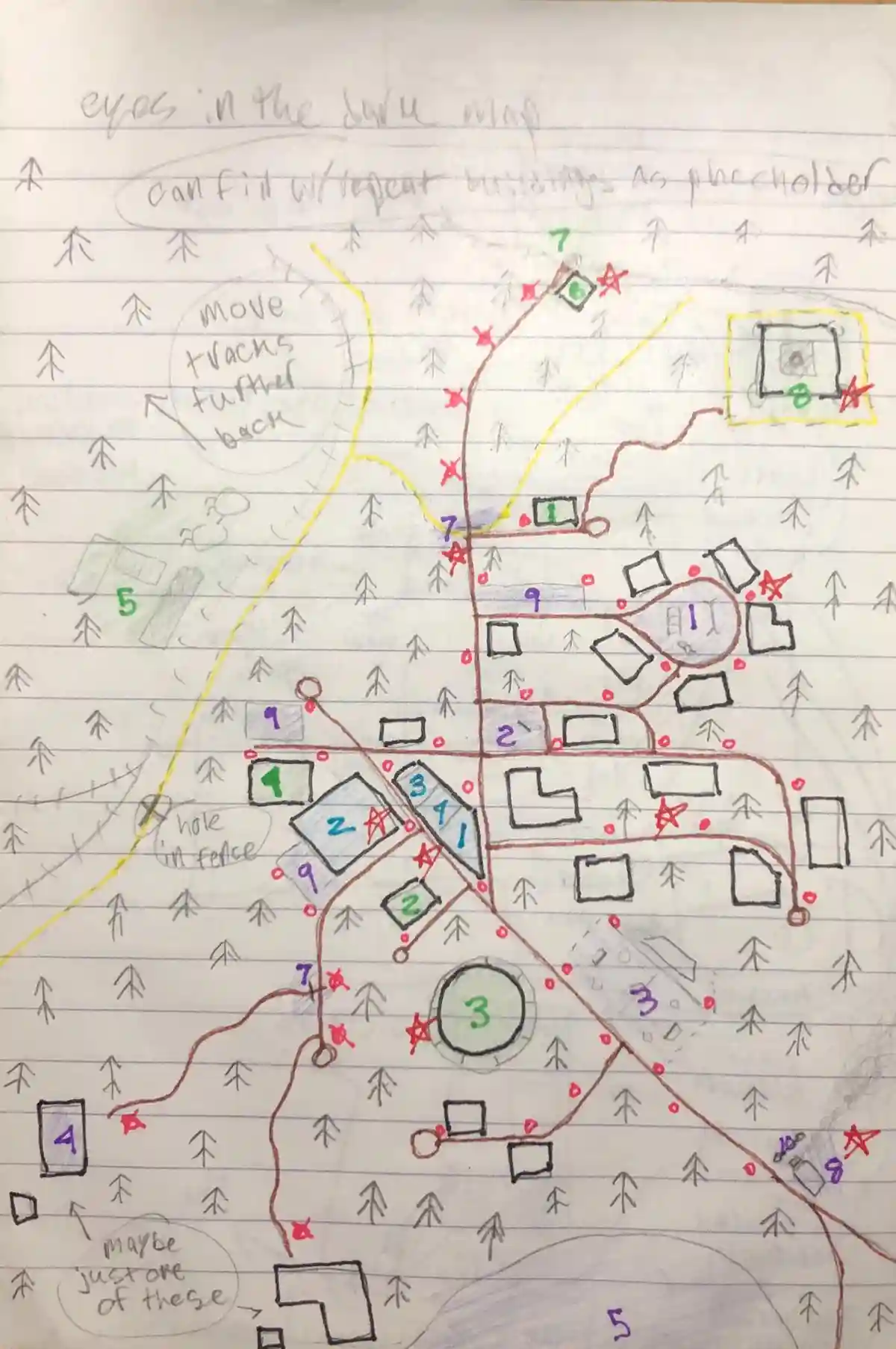
Map
One of the fun parts working in small indie game teams is that you can explore many more areas of design including general game design, mechanics, and map design! Everything was meticulously planned out, with every light post having a spot on the map.
Sound Design
I got to practice preparing some audio assets (foley), which unfortunately never got used.
Closing Thoughts
Sometimes the classic 'modern PS2 graphic horror game' is the perfect type of game to really explore some fun asset design. Especially when you're working with friends. I may not utilize 3D tools too much, but this was a great exercise in 3D for me.
See More!
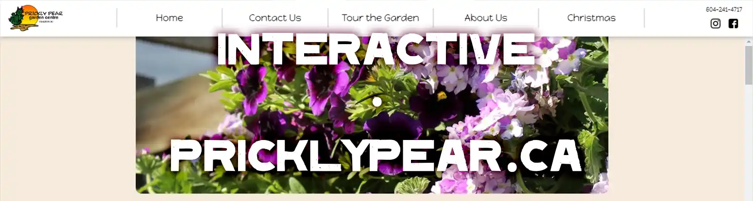
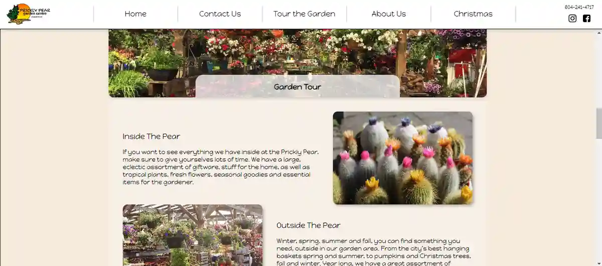
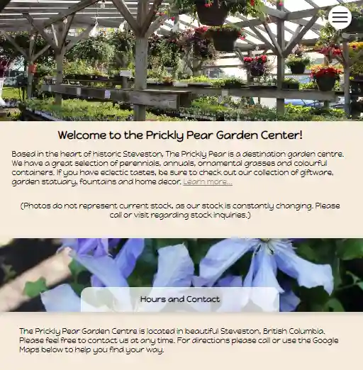
PricklyPear.ca
2023
I picked up a part-time job after college while spending most of my time working on YouAreMachines.com. Because of that webdev skill I came to pick up, I was approached to re-design the obsolete website of my workplace. Visit the site here.
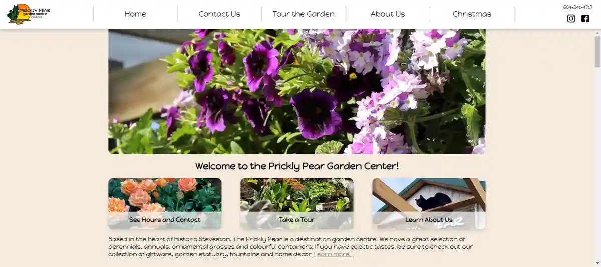
Desktop View
This is just a simple informational website. No logging in, no dynamics, no bells and absolutely NO whistles. It was a perfect type of site to work on with my new-found novice web-dev knowledge.
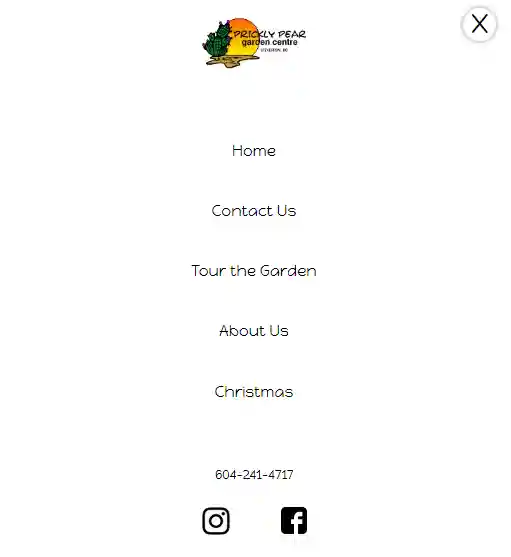
Mobile View
With this site being more traditionally-designed, it had to be responsive and as accessible as possible. There was lots of checking across browsers and devices to ensure the content had as much parity across platforms as possible.
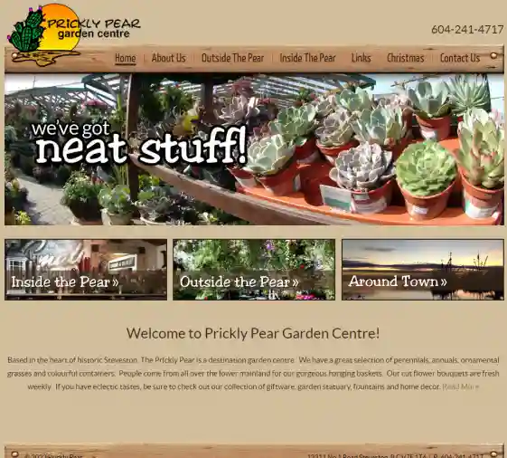
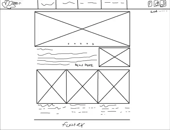
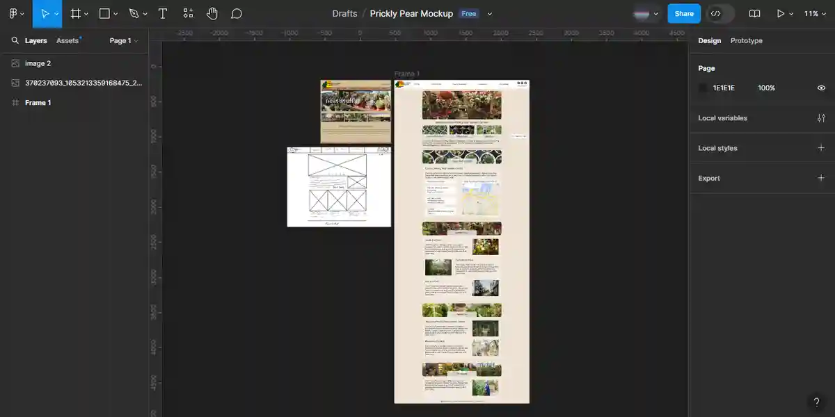
The Old Site and Redesign Process
2014 was likely the last time the site had been touched. Not just by a developer, but by anyone. Luckily for me the very first draft and mockup I had made in Figma was accepted by the client (wonderful news for me!), so I got to work right away, and didn't try to make anything too fancy, as it wasn't necessary. I prioritized what the typical user may use the site for, which is contact, hours, etc. Thus, information like that is the most easily/firstly accessible.
Closing Thoughts
I left them with a guide about how to change the photos properly with the server provider they use and still some of their uploaded photos were too small and thus blurry, so don't blame me haha. This may not be winning any design awards, but for the purposes of this mom and pop shop in my local area, it worked just fine for the shop and anyone that will be using it.
See More!
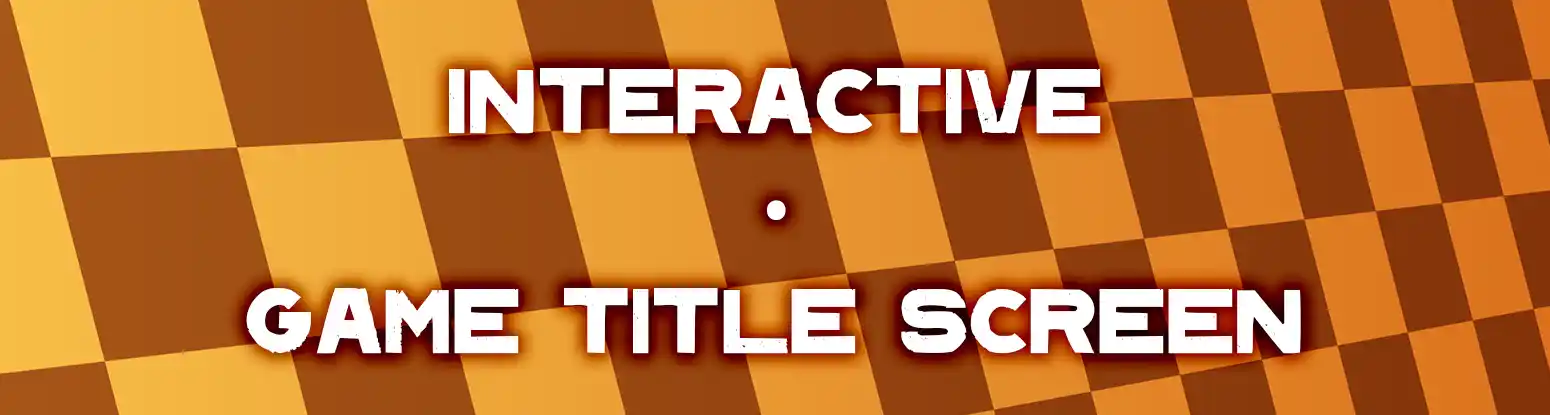
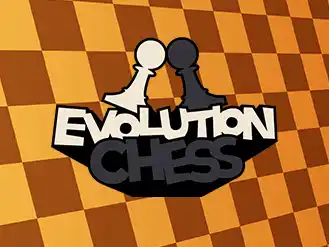
'Evolution Chess' Game Title Screen
2021
A simple game title screen for a friend's class project.
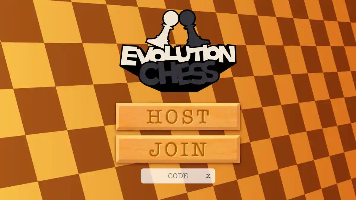
The Project
I was approached to design a title screen and some buttons for a multiplayer chess game my friend was tasked with at the time.
Closing Thoughts
This was a simple project, but was indicative of the sort of work I was really interested in at the time, and even till now. Making general game assets and little game jams were a really fun and new area of exploration for me soon after high school.
See More!
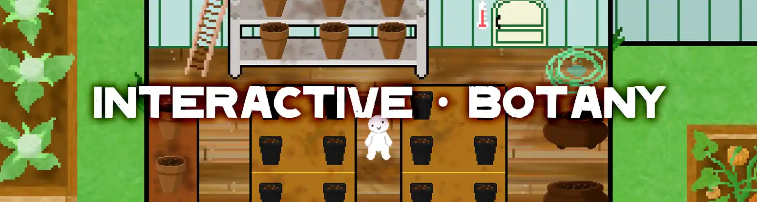
'Botany' Extra Credits Game Jam #6
2021
This was one of the few game jams that I had begun working on semi-regularly with a few friends years ago. This specific game was our proudest achievement, and final game together under our little novice studio. Play the game here!
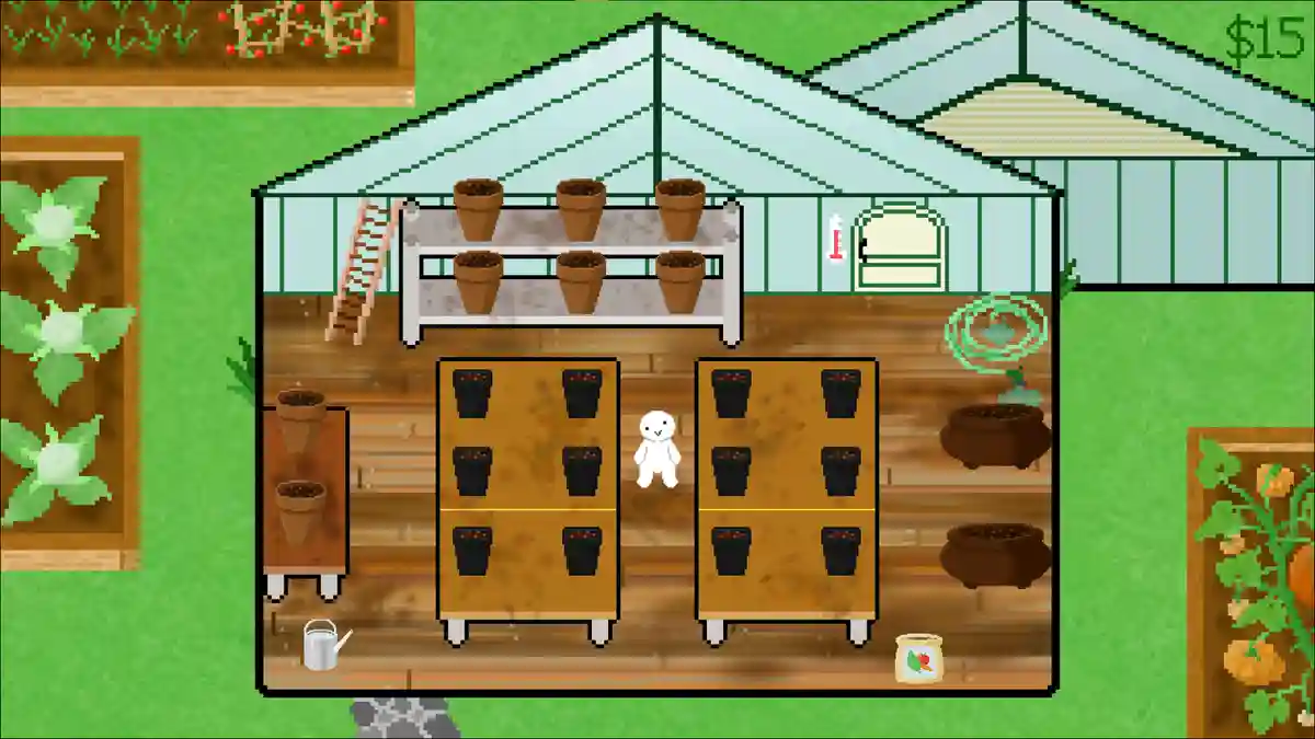
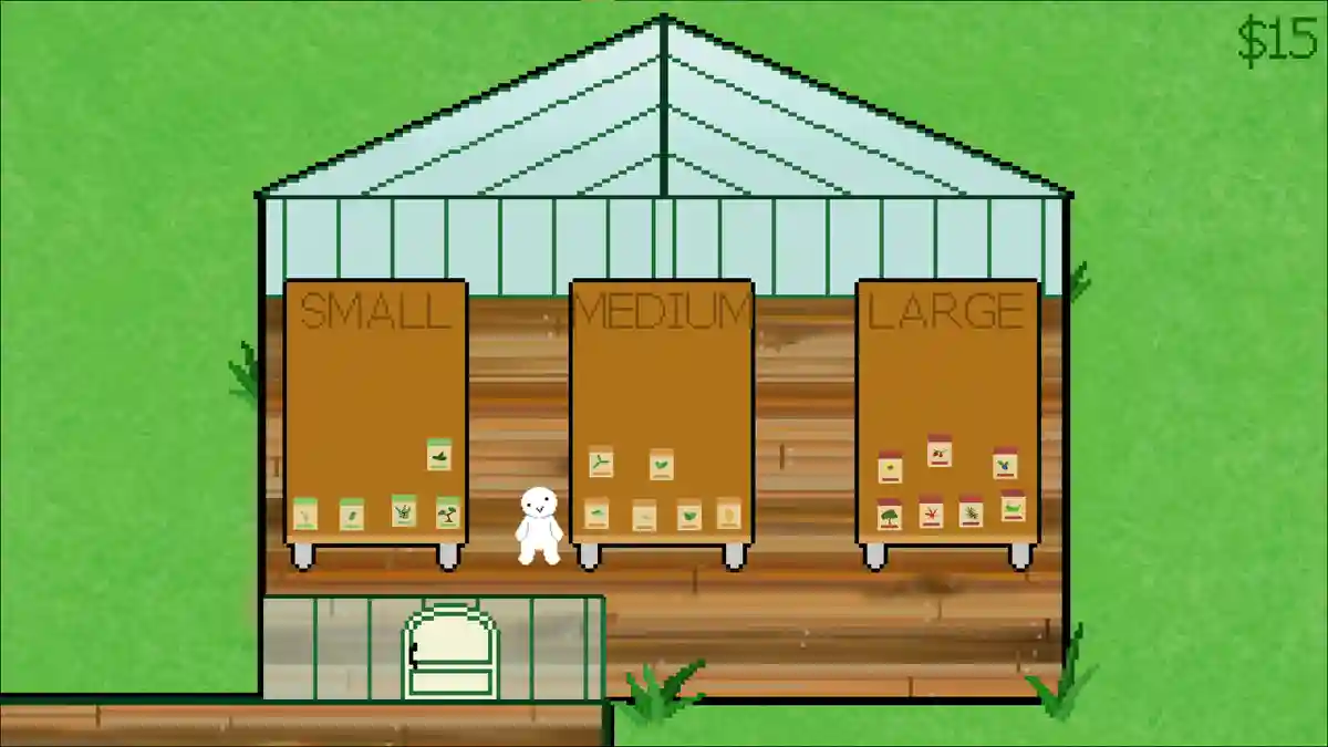
My Contribution
I was responsible for the environment design, as well as sound and music.
Closing Thoughts
Much of this was not my best work, but definitely something I was very proud of at the time given the 3 day timeframe. We were all very excited with it, and there is quite a bit of nostalgia to find in this project for me.
See More!
[X]